Video transcript
Every year, the same thing happens. Calendar, gifts, newsletter. All ordered late. There is a smarter way. Part one. The problem. A rushed calendar hurts you for a whole year.
A rushed calendar is not small. It sits there for twelve months. A weak one damages your brand for a full year. Nobody removes a calendar in March. They just stop noticing your brand. Treat the kit as one job, not five. Part two.
The answer. Three pieces, each with one job. Start with the calendar. It is the centrepiece. A brochure gets filed in a week. A calendar stays a full year. Cheapest long-running brand space.
Next, the gift set. Door gift: RM 3 to RM 10 each. Executive gift: RM 150 and up. Match the gift to the person, not to habit. The newsletter fills the gap. B2B (business-to-business) buying takes 6 to 18 months. Built from 5 to 7 reusable modules.
It keeps the brand warm the whole time. Part three. The takeaway. Timing decides quality. It all comes down to the timeline. Calendar design must start in August. A custom gift set needs its brief in July.
Wait too long and it shows. Squeezing past September cuts into the photography window, the time to shoot your photos.
A Bursa-listed property group signs off on the year-end gift in late September, and by mid-November the marketing team is staring at five separate procurement lines that should have moved as one engagement. The calendar is at a printer with the wrong state public-holiday strip on the Sabah and Sarawak spreads. The diary is two weeks behind because the brand colour was rebuilt in CMYK from an RGB swatch instead of from the brand guideline Pantone. The festive packets came back from a different supplier with a stamped foil that does not match the calendar cover. The sticker sheet was approved on a screen proof and printed without anyone noticing the bleed marks had been left in. None of those were creative mistakes. They were production-system mistakes, made because the kit was scoped as five separate jobs rather than as one coordinated engagement.
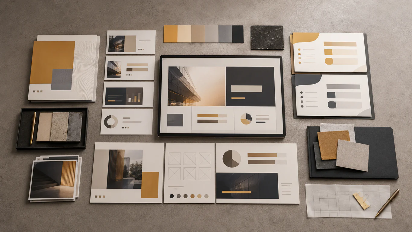
This piece walks through the discipline that holds a Malaysian year-end print kit together: the calendar at the centre, the corporate gift set around it, the newsletter that keeps the brand alive between issues, and the proofreading and trademark protection that close the kit before it ships. Frameworks and ringgit ranges come from work we run every year on the calendar and newsletter portfolios.
Walk Production is an integrated creative agency in Kuala Lumpur and Selangor, Malaysia. Since 2018, our 40 in-house specialists have delivered calendar, gift-set, corporate-newsletter and brand-system work for SMEs, Bursa-listed companies, GLCs, MNCs and statutory bodies. The calendar work sits inside the wider graphic design service for Malaysian brands, with the same team running brand strategy, calendar artwork, gift-set packaging and newsletter editorial.
Why the year-end kit is one engagement, not five
Corporate calendars in Malaysia are one of the few printed pieces that sit on a desk or wall for twelve months. Unlike a brochure that gets filed within a week, a calendar becomes part of someone’s daily environment. A rushed calendar quietly damages the brand for a full year. A coordinated kit (calendar, gift set, newsletter starter issue, all built from the same visual system) does the opposite, because the recipient sees one piece of considered work rather than five disconnected procurements.
The kit is also one of the rare moments when print, design, copywriting, packaging, photography and brand governance all have to land on the same date. Five separate suppliers means five separate colour builds, five separate timelines and five rounds of approval, with the brand drifting at every handover. One engagement (one creative director, one colour set, one timeline) is the discipline that turns a year-end procurement line into a brand asset, and usually costs less than five competing supplier quotes once handover overhead is counted in.
Calendar formats that actually get kept
The format decision shapes the print, photography, copywriting and packaging downstream. Four formats cover almost every Malaysian corporate calendar we produce.
Wall calendar. Hangs in offices, meeting rooms and reception areas. A2 or A3 gives room for full-bleed photography or illustration, and the monthly grid has to be readable at a distance. Strong typographic hierarchy, generous spacing and a confident colour system carry the most weight. For Malaysian audiences, seasonal spreads often align to Hari Raya, Chinese New Year and national holidays.
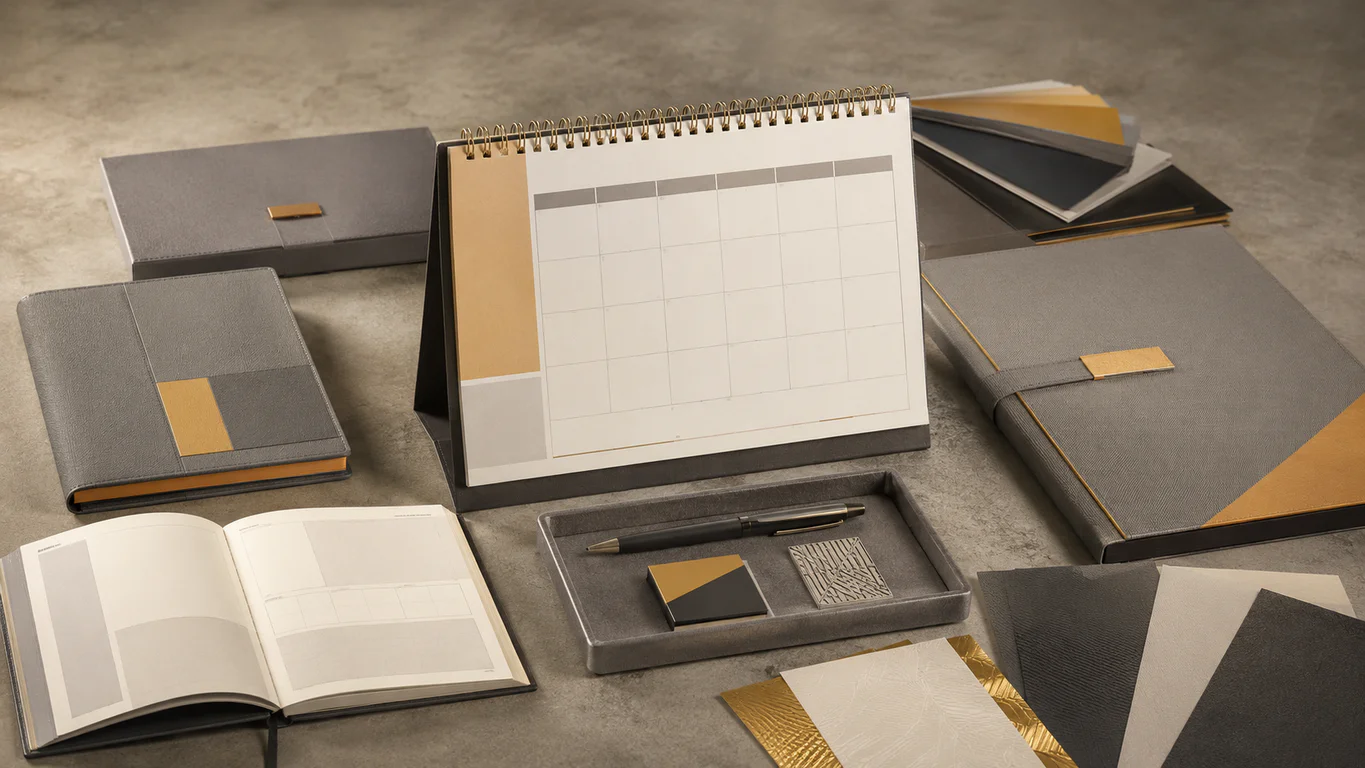
Desk calendar. Sits on a work surface and is read close up. Personal rather than communal, well suited to executive gifting and client appreciation sets. Common configurations are a tent-style fold or an A5 block with Wire-O binding that lets pages stand upright. Typography that works at A2 looks very different at A5, and colour use should account for the piece being read under office lighting at arm’s length every day.
Planner or diary. Combines a calendar with writing space. Functional rather than decorative, which is why a designed planner is often appreciated more than a pure wall calendar. The same brand system applied to the calendar should carry into the planner. For planners running past 80 pages, the binding default is thread-sewn rather than perfect bound, because a planner that loses pages in March is worse than no planner at all.
Gift set. Combines multiple pieces into a single branded package: a calendar, a diary or notebook, festive packets, stickers and a custom gift box, with matching design across every component. The BASF Malaysia calendar and gift set is a working example: each component carries the same superhero illustration concept, so the result reads as one coordinated gift rather than a collection of separate items.
The five elements of a strong corporate calendar
Five elements decide whether the calendar gets kept on a desk for twelve months or slipped into a drawer in February. Each is a design decision made before layout starts, not retrofitted after the photography lands.
Typography. Date numbers have to read at a glance, day labels sit as secondary information, and the month name sets the tone for the spread. Three levels of hierarchy (month name, day labels, date numbers) are usually enough. Pair a strong display face with a single body face and lock the sizes. A calendar earns trust through clarity, not flourish.
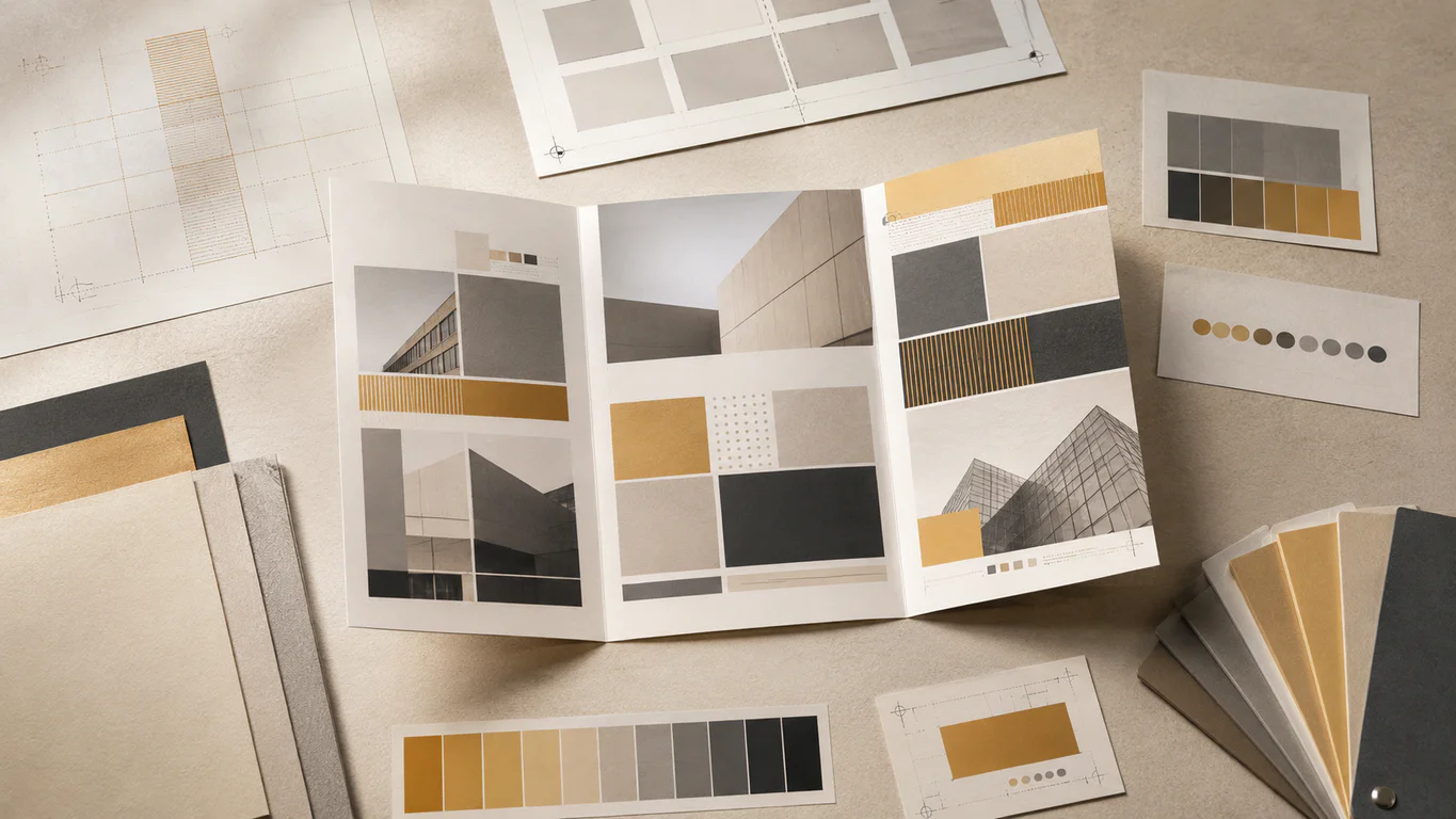
Imagery and illustration. Photography works for property, hospitality and industrial brands. Illustration suits FMCG, chemicals, insurance and companies where product photography is limited or technically dry. For companies with brand guidelines, the imagery style should extend the existing visual language rather than treat the calendar as a new-look opportunity. A spread printed at A2 needs images shot at high resolution, ideally with bleed area built in at capture.
Colour palette. The palette should align with the corporate identity. For companies with guidelines, work within the defined primary and secondary system. For companies without, the calendar often has to establish a seasonal palette that still reads as brand-coherent, which is itself a piece of brand governance the kit inherits. Festive colour accents for Lunar New Year or Hari Raya have to be planned early so they read as intentional, with a decision on whether the accent runs in photography, typography or page furniture before layout begins.
Grid layout. Consistent, legible and spacious enough for handwritten notes. A tight grid that leaves no margin for writing frustrates the user. A grid that is too loose wastes the page. The default is a grid with at least a third of each cell as quiet white space, so a meeting note has room to live.
Holiday and cultural accuracy. The highest-risk content element on a Malaysian calendar is the holiday strip. The federal public-holiday list comes from the Ministry of Human Resources via the Federal Gazette, and the state-specific additions sit with each state government. For Islamic observances (Hari Raya Aidilfitri, Hari Raya Haji, Awal Muharram, Maulidur Rasul), JAKIM is the authoritative source for the final dates, which are confirmed close to the date itself. The proofreading pass before press has to verify every date against the gazetted source rather than against last year’s calendar. Sabah, Sarawak, Selangor and the Federal Territory each carry their own additions, and the kit may need different print runs for different states if the audience splits that way.
Print specs locked: paper, binding, finishing
Print finishing is where a calendar moves from decent to memorable. The choices made here affect how the piece feels to touch, how pages turn and how long it holds up through daily use. The specs below are the defaults we run from at Walk Production, adjusted for the brief.
Paper and surface treatment
Uncoated paper gives a tactile, premium feel and is well suited to desks where writing on calendar grids is expected. Coated stocks are brighter and better suited to image-heavy wall calendars where colour fidelity on photography matters. Cover treatment options include soft-touch lamination, spot UV varnish, embossing and hot-foil stamping. These finishes increase cost but markedly improve how a calendar is perceived when first unwrapped, and for B2B gifting the cover finish is often the first impression that decides whether the recipient keeps the piece on display.
For digital print runs under 50 units (typical for executive gift lists or board-level prototypes), HP Indigo digital print is the default because it covers roughly 97% of the Pantone gamut and produces a brighter result than CMYK offset at small scale. RGB workflow is workable on HP Indigo, which means the same file used for digital channels can drive a small-run print without an additional colour conversion.
Binding
Wire-O binding is the most common choice for desk calendars and planners, because it allows pages to lie completely flat and makes flipping between months smooth. Saddle stitch works for thinner staple-bound formats under 32 pages, and is the default for slim wall calendars. Perfect binding gives a cleaner, book-like spine for diary and planner formats but is structurally less reliable on a piece that gets opened daily.
For planners and diaries running over 80 pages, thread-sewn binding is the default at Walk Production rather than perfect bound. The reason is structural: a perfect-bound planner that loses pages by August is worse than a thread-sewn planner that holds the full year. Hardcover binding with matt lamination and spot UV is reserved for premium executive editions and coffee-table-style year-end pieces, where the planner is meant to live on a boardroom shelf rather than a working desk.
Cover finish defaults
The cover finish is the surface a recipient touches first. Three defaults cover most year-end work. Soft-touch matt lamination reads as quietly premium and is the safest choice for most corporate gift lists. Spot UV on a matt cover adds a tactile contrast that works well for property, luxury and hospitality brands. Hot foil (gold or silver) adds a metallic punch reserved for festive editions, milestone anniversaries or brands that already carry a metallic accent in the corporate identity.
| Component | Default paper | Default binding | Cover finish | Print method |
|---|---|---|---|---|
| Wall calendar (under 32 pages) | Coated 150 to 200 gsm | Saddle stitch or Wire-O top edge | Soft-touch lamination | CMYK offset |
| Desk calendar (tent or block) | Uncoated 200 to 250 gsm inner, 310 gsm cover | Wire-O top edge | Soft-touch lamination plus optional spot UV | CMYK offset |
| Planner or diary (over 80 pages) | Uncoated 80 to 100 gsm inner, 310 gsm cover | Thread-sewn | Hardcover matt lamination | CMYK offset |
| Gift set (mixed components) | Mixed (per component) | Per component | Coordinated finish across set | CMYK offset, digital under 50 units |
| Festive packets | 120 gsm art card with foiled or stamped accent | Die-cut and gummed | Foil stamping or soft UV | CMYK offset |
| Sticker sheet | Self-adhesive vinyl or matt sticker paper | Kiss-cut individual stickers | Matt or gloss laminate | CMYK offset or HP Indigo |
These are starting defaults. Final specs are agreed against the client’s house standards, the production volumes and the budget envelope, not handed down as fixed rules.
The production timeline that protects the kit
The most common mistake in calendar production is starting too late. For a calendar delivered before year-end, design has to begin in August. A coordinated gift set with custom packaging needs the brief in July, because the custom gift box, die-cut festive packet templates and sticker sheet each add lead time beyond the calendar.
| Phase | Timing | Work |
|---|---|---|
| Brief and concept lock | July (gift set) or August (calendar only) | Format choice, concept direction, scope and quantity confirmed |
| Concept development | August to September | Two or three creative directions, art direction, photography or illustration brief |
| Layout and content | September to October | Full 12-month layout, holiday and event dates verified, copywriting and translation if bilingual |
| Final artwork and pre-press | October to November | Client approvals, colour proofing, separation, pre-press file checks |
| Print production | November to December | Plate making, press run, finishing (lamination, foil, UV, binding) |
| Delivery and distribution | December | Multi-site delivery, distribution lists, contingency stock |
Compressed timelines after September cut into the photography window, the bilingual translation window or the colour-proofing window, and the kit gets weaker in proportion.
Corporate gift sets as the kit around the calendar
The calendar is the centrepiece. The corporate gift set around it is what turns a single printed piece into a relationship gesture that recipients remember. Branded merchandise still works in Malaysia for a simple reason: a thoughtfully designed object sitting on a desk generates daily passive impressions for months, and the cost per impression is markedly lower than digital ad spend over the same period.
The difference between forgettable swag and a gift people keep comes down to two things: usefulness and design quality. A cheaply printed pen ends up in a drawer. A thoughtfully designed notebook with clean branding becomes part of someone’s daily routine. The same logic carries across drinkware, tech accessories, organisers and the calendar at the centre of the kit.
Categories that work for Malaysian B2B and corporate gifting
Practical everyday gifts are the workhorses of corporate gifting because they get used daily. Custom drinkware (insulated flasks, reusable bottles, stainless tumblers) suits Malaysia’s climate and travels with the recipient. Tech accessories (wireless chargers, power banks, cable organisers) fit both office and remote-work setups. Office stationery (branded notebooks, planners, quality pens) sits on desks and gets used in meetings. Bags and pouches (laptop sleeves, compact tote bags) carry good surface area for branding without looking like billboards.
Premium and executive gifts step up the presentation for VIP clients and milestone recognition. Themed gift boxes combine two or three quality items in custom-branded packaging where the unboxing experience carries as much weight as the contents. Personalised executive items (engraved pens, leather card holders, name-embossed stationery) turn a generic gift into something specific to the recipient. Festive hampers with locally sourced, halal-friendly items suit Chinese New Year, Hari Raya and Deepavali distribution lists.
Eco-friendly and ESG-aligned gifts have moved from a nice-to-have to a procurement requirement for many Malaysian companies, especially those producing sustainability reports against Bursa, GRI or IFRS S2 frameworks. Bamboo cutlery sets, cotton or recycled-PET totes, stainless-steel drinkware, FSC-certified notebooks and locally sourced artisanal items in minimal packaging now appear in most enterprise gift briefs, and align the year-end spend with the corporate sustainability narrative.
Budget bands by tier
| Tier | Per-unit band (RM) | Typical items | Use case |
|---|---|---|---|
| Door gifts and event giveaways | RM 3 to RM 10 | Pens, keychains, lanyards, badge holders | Conferences, exhibitions, large-volume distribution |
| Standard corporate gifts | RM 10 to RM 20 | Tumblers, notebooks, mousepads, phone accessories | Broad client and staff distribution |
| Mid-range gifts | RM 25 to RM 50 | Quality drinkware, tech accessories, stationery sets | Client appreciation lists |
| Premium gifts | RM 60 to RM 100 | Gift boxes, executive pens, leather accessories | Key clients and recognition events |
| Executive and luxury | RM 150 to RM 300 and above | Premium hampers, high-end tech, experience vouchers | C-suite relationships and milestone events |
The mid-range band is the sweet spot for most client appreciation lists, where the quality is visible without crossing hospitality-policy thresholds. Reserve the executive band for top-of-funnel C-suite relationships and milestone events where the gift signals investment in the relationship rather than a transactional thank-you.
Tax, anti-bribery risk and gift-register practice
The tax treatment of a corporate gift turns on whether it qualifies as a promotional gift in the eyes of LHDN, not on whether it carries a logo. LHDN Public Ruling 4/2015 on Entertainment Expense sets the boundary. Promotional gifts are generally deductible when they carry the giver’s logo or brand name and are given to the public on a non-discriminatory basis. Expensive gifts handed to selected recipients usually do not qualify as promotional gifts under that proviso and are treated as entertainment, which is only partially deductible. Confirm the treatment of any specific gift with your tax adviser before scoping it as a deductible spend.
Anti-bribery risk management is the other half of the conversation, and it sits with the internal gift policy rather than with the marketing brief. Most Malaysian listed companies and GLCs run an internal gift register that records recipient, occasion, value and business purpose, with thresholds set by the board’s anti-bribery policy under the corporate-liability regime introduced by Section 17A of the MACC Act 2009. Logo-branded items distributed broadly across a defined recipient list usually clear the policy with light documentation. Personalised luxury gifts to individual decision-makers usually need board-level approval and a clear paper trail, regardless of value. Run the kit’s recipient list against the client’s internal gift policy before the procurement order is signed.
The cultural calendar: CNY, Raya, Deepavali, Merdeka, year-end
Malaysia’s multicultural market is the single biggest design constraint on a corporate gift set. A gift that lands beautifully for one community can be inappropriate for another. The cultural moments below recur every year.
Chinese New Year. Red and gold packaging is auspicious. Mandarin oranges, premium hampers and gold-accented items work well. Avoid the number four, white or black packaging, clocks and sharp objects. The festive packet (ang pow) is the most distinctive printed item, and a designed packet with hot-foil treatment reads markedly differently from a generic bulk packet.
Hari Raya Aidilfitri. Halal-certified food items are essential. Dates, honey, traditional kuih and nuts in festive hampers are common. Green and gold themes suit the occasion. Non-halal items (pork, alcohol, non-halal-certified cosmetics) are not appropriate. The duit raya packet runs in the same design family as the CNY festive packet with distinct typography and colour build.
Deepavali. Sweets, candle sets and decorative items align with the Festival of Lights. Fruit hampers also work. Avoid leather items, which can conflict with Hindu beliefs, and white flowers, which are associated with mourning.
Merdeka and Malaysia Day. August and September. Independence-month framing in marketing communications, with a national narrative that connects the brand to the moment without sounding hollow. Less a gift-distribution event, more a brand-publishing moment for newsletters, social channels and printed editorial.
Year-end and Christmas. The most universal gifting moment. Premium gift boxes, hampers, calendars, diaries and notebook sets are appropriate across all backgrounds. December is the natural distribution window for the full kit.
Where the recipient’s background is unknown, the safest choices are quality drinkware, tech accessories, branded stationery and well-designed calendars or diaries. The kit built around a neutral calendar is harder to get wrong than a kit that leans hard into any single festive moment.
Corporate newsletter design: the year-round companion
A corporate newsletter is the year-round companion to the year-end print kit. The kit lands once a year and earns daily passive impressions. The newsletter lands every month or every quarter and earns active reading time. Together they keep the brand present in the recipient’s working life across the full year, and the same brand system carries both.
What a corporate newsletter is for
A newsletter does three jobs at once. The first is stakeholder retention: members, regulators, partners and long-tenured clients need a regular reminder that the brand exists and is still credible. The second is thought leadership: the topics chosen, the people quoted and the data shared signal what the organisation cares about. The third is quiet sales: B2B buying cycles in Malaysia run six to eighteen months, and a newsletter keeps the brand warm in the inbox so when the brief drops, the name is the one the buyer pulls up. A newsletter that tries to do only one of those jobs usually fails at all three.
The five decisions that decide whether a newsletter survives
Most newsletters do not fail on copy. They fail on structure.
Block hierarchy: five to seven reusable modules. The biggest predictor of whether a newsletter survives twelve issues is whether the editor can drop content into a fixed set of modules without re-deciding the layout each time. Below five the issue feels thin. Above seven the editor renegotiates the grid every month, which is when production slips.
Bilingual rhythm: parallel, not appended. Where the audience reads in two languages, run them in parallel. Same modules, same hierarchy. Treating Bahasa Malaysia as an appendix at the bottom of an English issue signals the BM reader is second tier, which is worse than monolingual delivery.
Mobile rendering: most opens are on phones. Single-column layouts render most reliably across the email-client mix, especially Outlook desktop, which still uses Word’s rendering engine and breaks multi-column layouts in ways that look fine in Apple Mail. Body copy at 16 pixels minimum, line height 1.4 to 1.6, tap targets at 44 pixels square. Test in dark mode and light mode before every send.
Archive linkability: every issue has a permanent URL. Email arrives, gets read and disappears. The archive URL keeps earning. Every issue should publish to a permanent URL with a clean slug, the publication date and the same modules rendered as a web page.
Believable cadence: monthly is sustainable, weekly almost never is. For most in-house editorial teams of one to five people, monthly is the cadence that holds. Quarterly works for print-style longer-form issues, especially for industry associations and member organisations. Commit to the cadence for twelve months minimum.
A working newsletter shape: the MRC anchor
The Malaysian Rubber Council STRETCH e-newsletter is the title in our portfolio that best illustrates an industry-association publication done with care. The audience is mixed: members on one side, regulators and policy-watchers on the other, with overseas trade buyers and journalists reading over the shoulder. That mix sets every editorial choice.
The editorial rhythm leans on three recurring shapes. Policy clarity, where a new regulation, tariff line or standard is unpacked in language a non-lawyer can follow. Market data, with price movements, export figures and sector benchmarks placed in chart-led spreads readers can lift for their own briefings. Member or stakeholder spotlights, where a planter, a manufacturer or a downstream buyer gets a long-form treatment that leaves the reader knowing them better. Every issue is archived as a referenceable PDF, and over time the back catalogue becomes a living record of the rubber sector.
Brand consistency and trademark protection for the kit
The year-end kit travels into thousands of offices for twelve months. That makes brand consistency both the highest-impact lever and the highest-exposure risk. Four pieces of brand governance protect the kit before it ships.
A written brand guideline. Logo lockup with clear-space and minimum-size rules. Colour build in Pantone, CMYK, RGB and HEX, with the calendar press build spelled out alongside the digital channel build. Typography hierarchy with fixed sizes. Photography direction, illustration spec and cropping ratios. Application templates for the calendar, diary, festive packet and sticker sheet, so the design team is not renegotiating the brand each time a new component is added. Read more on why brand guidelines hold a corporate identity together across recurring publications.
A documented design system. The guideline is the rule book; the design system is the working file set. Reusable layout blocks for the calendar pages. A locked grid for the diary spreads. A festive packet template that scales between CNY and Raya without rebuilding the artwork. A sticker sheet template that turns the illustration system into a kiss-cut grid. The design system is what lets a second designer pick up the kit in November without breaking the brand.
An archive of approved assets. A central digital asset library holding the current logo files, brand colours, typography licences, photography library, illustration system and print-ready master files. Vendor stationery, print suppliers and the in-house design team all draw from the same source. The library is the biggest defence against the slow drift that breaks brands over multiple production cycles.
Trademark registration on the brand mark. A calendar that travels into thousands of offices for twelve months is one of the most exposed pieces of brand collateral the company will ship that year. SSM registration records the business name. It does not give exclusive trademark rights, and two businesses can hold similar SSM-registered names in different states. Only a MyIPO trademark registration gives exclusive, enforceable rights to use the mark across Malaysia under the Trademarks Act 2019 (Act 815). The administering authority is MyIPO under the Ministry of Domestic Trade and Cost of Living (KPDN). Malaysia is a contracting party to the Madrid Protocol, which allows a single international application from MyIPO to designate protection across more than 100 member jurisdictions.
For brand and gifting work, two Nice classes matter most: Class 16 (paper goods, stationery, calendars, diaries, packaging) for the print kit, and Class 35 (advertising and business services) for the broader corporate identity. Registering across the relevant classes before the kit ships is materially cheaper than dealing with a similar mark that surfaces in the same category eighteen months later. We cover the full MyIPO context in the corporate branding strategy playbook.
Editorial quality control before the press date locks
The most expensive mistakes on a year-end kit are not design mistakes. They are content mistakes that survive into the press run because the proofreading pass was treated as a final spell-check rather than a structured editorial discipline. A printed wrong revenue figure on a chairman’s foreword, a misspelled executive name on the back cover, a missing state public holiday on the Sarawak run: each one is permanent for twelve months. A structured proofreading process applied at the right stages catches them.
The four editorial stages
Structural editing examines the big picture: content organisation, section completeness, logical flow, reader engagement. For a calendar foreword or a newsletter lead, this is where the editor asks whether the piece covers what the reader expects, in the right order.
Line editing refines the writing at sentence and paragraph level: tone, voice consistency, transitions, readability. The calendar’s monthly captions and the newsletter’s lead copy get aligned with brand-voice guidelines, and financial or technical jargon gets simplified.
Copy editing checks grammar, punctuation, spelling, style-guide adherence and factual consistency. This is where a style sheet becomes critical, recording decisions on capitalisation, number formatting, abbreviations and corporate-specific terms. Without one, every editor makes the same micro-decisions slightly differently and the drift surfaces in the finished proof.
Proofreading is the final pass on formatted, near-final documents. It catches typos, formatting errors, layout problems, widows, orphans and spacing issues. It does not involve rewriting. This is the last check before press or digital publication.
Fact-checking on corporate publications
Errors in financial data or executive details carry regulatory and reputational risk. The discipline runs through every piece in the kit and across the recurring newsletter work.
- Cross-reference every financial figure against audited financial statements.
- Verify executive names, titles and designations against the latest board records.
- Validate statistics against their original sources. If a source cannot be verified, remove the specific number and rephrase as a qualitative observation.
- Verify image captions match the content of each image, especially on calendar spreads.
- Cross-check public-holiday dates against the gazetted federal source and the relevant state government sources.
- Confirm bilingual terminology is consistent between the English and Bahasa Malaysia versions, using Dewan Bahasa dan Pustaka references for BM spelling and corporate terminology.
For the broader editorial discipline that sits underneath the kit, our in-house copywriting and editorial QC for corporate publications is the companion piece. Bilingual annual reports, company profiles and tender documents use the same four-stage workflow, and the year-end kit inherits it.
Selected Walk Production year-end and newsletter work
Six projects from the calendar and newsletter portfolios show how the same production discipline adapts to very different organisations. The audience drives the format, the brand drives the visual register, and the same in-house team carries the work from concept through to delivery.
1. BASF Malaysia: a values-led superhero gift set
The BASF Malaysia calendar and gift set is the working example of a coordinated year-end kit. The concept turns BASF’s company values into superhero characters with custom comic-style illustrations across every month. The set includes a desk calendar, personalised notebook, festive packets, sticker sheet and custom gift box. The calendar uses recycled paper with Wire-O binding, and the gift box is produced with laminated art paper. The notebook is personalised with each employee’s name, which turns a mass-produced gift into something the recipient reads as made for them.
2. MSIG Insurance: a sustainability-led calendar and diary
The MSIG Insurance calendar and diary is a coordinated calendar plus planner set built around a sustainability narrative. The visual language weaves environmental themes through both publications with a nature-inspired illustration style and a green-forward palette that fits the corporate identity. A branded sticker set extends the illustration system into a tactile, shareable format. The diary uses a week-per-spread structure with monthly feature pages carrying MSIG’s sustainability messaging in short-form editorial.
3. Berjaya Corporation: a conglomerate calendar
The Berjaya Corporation calendar is a calendar built for a diversified conglomerate, showcasing the broad portfolio while functioning as a premium business gift. The challenge is one of architecture rather than illustration: how the parent brand sits visually alongside multiple sub-brands across the twelve spreads, and how the design system reads as Berjaya rather than twelve disconnected divisions. The work covered art direction, calendar design, graphic design, copywriting and print delivery.
4. MCL Land: a property-developer calendar as lifestyle editorial
The MCL Land calendar is treated as lifestyle editorial rather than project catalogue. Each month focuses on a different aspect of modern living: green spaces, community areas, architectural details, interior moments. The layout uses generous margins, refined typography and a neutral palette that positions the calendar as a premium product consistent with MCL Land’s market positioning.
5. MPRC: a government-linked industry showcase calendar
The Malaysia Petroleum Resources Corporation (MPRC) calendar is a government-linked calendar produced as part of a bundled publication project alongside MPRC’s Corporate Report. Each spread pairs full-bleed industry photography with clean date layouts using MPRC’s corporate palette. Bundling the calendar with the Corporate Report created production efficiencies in design coordination and print logistics, which is a common pattern for statutory bodies and industry councils running annual publication cycles.
6. Malaysian Rubber Council: the STRETCH quarterly e-newsletter
The MRC STRETCH e-newsletter is the newsletter project in our portfolio. STRETCH keeps international stakeholders informed about developments in Malaysia’s rubber sector, covering market movements, export data, policy updates and industry events for industry professionals and policymakers worldwide. The production scope runs across content strategy, editorial writing in English, illustration design, data visualisation and layout, with the final output delivered as a high-resolution interactive PDF with navigable sections and hyperlinked references. The back catalogue forms a living archive for the sector.
More calendar and newsletter projects sit in the calendar portfolio and the newsletter portfolio.
RM cost ranges by tier
The ranges below come from project tiers we run every year. Where a project lands depends on quantities, paper stocks, finishing techniques, bilingual scope and how much editorial and photography Walk Production owns rather than the in-house team.
Calendars and planners
| Engagement | RM range |
|---|---|
| Single-format desk or wall calendar (design, SME scope) | RM 8,500 to RM 10,500 |
| Coordinated calendar plus diary or planner | RM 9,500 to RM 13,500 |
| Multi-page desk planner or diary | RM 11,000 to RM 15,000 |
Gift sets
| Engagement | RM range |
|---|---|
| Coordinated gift set: calendar, diary and festive packets | RM 12,000 to RM 16,000 |
| Larger gift set with coordinated packaging | RM 16,000 to RM 22,000 |
| Bespoke executive hampers integrated into the kit | Per-recipient RM 150 to RM 500 plus design and packaging on top |
Newsletter design
| Engagement | RM range |
|---|---|
| Newsletter design system plus first 3 issues setup | RM 3,500 to RM 12,000 |
| Print plus email integrated newsletter retainer (quarterly print, monthly email, 12-month) | RM 25,000 to RM 48,000 |
| Full editorial production retainer (writing plus design plus dispatch, monthly) | RM 8,000 to RM 20,000 per month |
Anything below RM 3,500 for a newsletter launch is usually a template purchase rather than a designed publication. Anything below RM 8,500 for a corporate calendar is usually a single-format reskin of a stock template rather than an original engagement.
Hidden costs to factor in
Beyond the per-unit print price, budget for design customisation on each gift item (logo printing, engraving, embossing), premium packaging (adds RM 5 to RM 20 per unit), multi-location delivery logistics, trademark filing fees if a new brand mark is being registered alongside the kit, and a contingency for state-specific reprints if the holiday strip varies by audience. Bulk orders above 200 units or RM 5,000 in aggregate typically qualify for volume discounts. For broader retainer-and-procurement economics that sit underneath the kit, see design retainer in Malaysia: when it pays off, what to pay and what to sign.
How to brief the year-end kit
Three questions get a useful brief on the table.
Who receives the kit, and what is the relationship? Be specific. Client appreciation list, staff, members, regulators, GLC stakeholders, board of directors. Different audiences justify different print specs, copywriting tones and distribution logistics, and a single kit rarely lands well across all of them.
What does success look like in twelve months? A retention conversation when next year’s RFP lands. A staff engagement signal. A regulator relationship maintained. A board sponsor moment. Pick one primary outcome. A kit designed for three usually achieves none.
What is the brand baseline? Brand guidelines, master logo files, photography library, colour build, typography licences and prior-year artwork. A brief that arrives without the brand assets attached extends the timeline by two to three weeks while the design team rebuilds what the client already owns.
The kit also benefits from a single named senior sponsor on the client side. A committee of four with no nominated owner slips the timeline. One named senior signing off keeps the work on schedule.
Common mistakes that cost real money
Four mistakes show up across most of the year-end conversations we have with Malaysian companies. Each one is recoverable, but each one is also more expensive than the discipline that would have prevented it.
Starting too late. August is the realistic earliest start for year-end calendar delivery. July is the earliest start for a full gift set. October briefs produce rushed artwork or compressed print timelines, and the brand pays the cost across the year that follows.
Treating imagery as an afterthought. Photography or illustration direction should be part of the concept phase, not sourced after the layout is built. A layout designed around placeholder images rarely survives the real image placement, and the final calendar reads as a compromise rather than a designed piece.
Inconsistent holiday marking. Missing or incorrect public holidays on a printed calendar are permanent errors. Malaysian public holidays vary by state, and the gazetted source has to be verified before press rather than copied forward from last year’s calendar.
No governance on the brand after launch. A brand that lives only in a guideline document drifts within months. The next-quarter newsletter uses slightly different colour builds; the next gift set uses last year’s logo on the packet. A central digital asset library, a quarterly review and a single named brand custodian are the disciplines that hold the kit together across production cycles.
Where to start
If the year-end kit is on the calendar for this year and the brief has not yet landed, the first conversation is usually a 60-minute scoping call. We will say honestly whether the scope is a single-format calendar, a coordinated calendar plus newsletter retainer or a full multi-component gift set, even when the honest answer is the smaller piece of work. The next step is a brief that maps the calendar, the gift set, the newsletter and the brand governance as one engagement rather than as five.
Browse the calendar portfolio for year-end work across chemicals, insurance, property, government and conglomerates. Browse the newsletter portfolio for the STRETCH industry e-newsletter. Read the calendar design service page and the newsletter design service page for the deliverable map and the service tiers. When the brief is ready, start a conversation with our team.