Video transcript
A landing page does one job One page, one action Send ads to a homepage instead and the budget quietly leaks away Here is how to plug the leak Part one The problem Clicks come, sales do not A paid ad aimed at HR managers
Clicks land on the homepage Six menu tabs, two carousels Three buttons competing Slow load on a mid-range Android Healthy click rate on the dashboard But the pipeline barely moves The gap between homepage and landing page is where budgets quietly leak Part two
The answer A page that does one job A landing page is the opposite Remove the menu Narrow it to one action Every element points to one step Plan it as seven sections Hero, trust strip, benefit blocks Social proof, then the form
Repeated call to action FAQ with privacy notice Build it mobile first Phone ownership is 99.5% in Malaysia Keep the form to 3-5 fields Bloated forms run 9-12 Every extra field loses people Part three The takeaway
Prove it, keep what wins Watch the speed Largest Contentful Paint under 2.5s The time the main thing appears A slow page converts less Then test it Run A/B tests in priority order Start with the headline Change one thing at a time
A Malaysian SaaS team launches a paid campaign aimed at HR managers. The clicks land on the homepage. The homepage carries six top-level navigation tabs, two carousels, three competing CTAs, and a slow load on a mid-range Android. The ad dashboard shows healthy click-through. The pipeline barely moves. That is a recurring pattern we audit on retainer engagements, not a one-off.
That gap between a homepage and a properly built landing page is where Malaysian campaign budgets quietly leak.
A landing page does the opposite of a homepage. It strips navigation, narrows the conversion goal to one action, and routes every element on the screen toward that action. Done well, it pairs message-matched copy with a thumb-zone CTA, a 3 to 5 field form, a clear trust signal, and a sub-2.5 second LCP on a mid-range Android. Done poorly, it inherits a desktop layout, hides the CTA below five hero animations, and asks for an IC number on the first interaction.
This guide is the technical-execution companion to our web design cost and agency-choice hub. It pulls together five years of Walk Production retainer work into the parts of landing-page execution that consistently move the conversion rate for Malaysian sites: the section anatomy, the mobile-first build pattern, the multilingual setup for BM/EN/CN audiences, the Core Web Vitals thresholds Google measures, the A/B testing priority order, the local trust elements (FPX, Touch ‘n Go, GrabPay, WhatsApp, Halal where relevant), and the PDPA notices that any form on a Malaysian site needs in place.
A landing-page audit is usually the first thing Walk Production runs on any new website or campaign engagement, ahead of any redesign work. That habit comes from being an integrated creative agency in Kuala Lumpur and Selangor, Malaysia, where, since 2018, our 40 in-house specialists across eight creative disciplines have handled WordPress development, landing-page builds, A/B test rollouts, performance work, and multilingual hreflang setups for corporate websites across listed companies, healthcare, technology, manufacturing, and professional services.
What a landing page actually is
A landing page is a standalone web page built for a single conversion goal. The goal might be a demo booking, a quote request, a guide download, a webinar registration, or a one-product checkout. Whatever the goal is, the page is structured so every element points toward it.
A homepage is the opposite. It is a hub that links outward to services, portfolio, blog, careers, contact, and language switchers. Most homepages serve five or six different audience intents at once, and most ad clicks landing on a homepage convert at a fraction of the rate of clicks landing on a dedicated page that matches the ad.
Four things separate a landing page from a regular content page:
- Single objective. One conversion action. Other links exist, but they support that action rather than compete with it.
- No main navigation. The header navigation is usually stripped or reduced to a logo. Footer links may stay for legal pages, but the visitor’s main job is to fill the form or click the CTA.
- Message match. The H1 mirrors the headline of the ad, the search ad, or the campaign source that brought the visitor in. A mismatch between ad copy and landing-page copy raises bounce rates even when the page itself is well built.
- Conversion-focused layout. Every section, from the hero to the trust signals to the CTA, is arranged to move the visitor toward the conversion point.
A landing page is a tactic. A campaign without a dedicated landing page is paying ad budget to send qualified traffic to a hub page that was never designed to convert it.
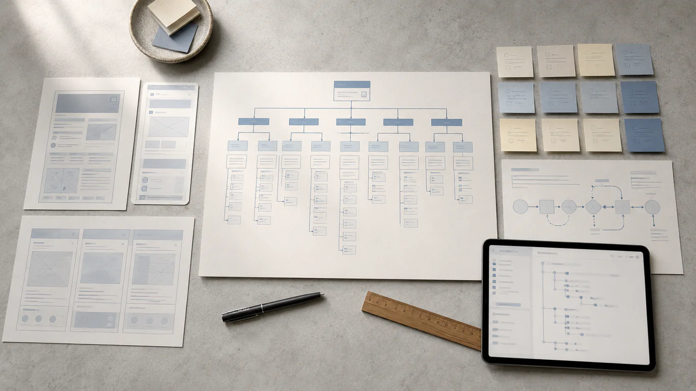
The seven-section anatomy of a landing page
Plan the page in sections. Each section has one job in the conversion flow. The seven below are the ones that consistently show up on landing pages that perform well for Malaysian buyers, regardless of industry.
| # | Section | Job |
|---|---|---|
| 1 | Hero with headline + sub | Match the ad. State the benefit. Show the CTA above the fold. |
| 2 | Trust strip | Logos, ratings, or named clients reduce first-impression friction |
| 3 | Benefits or problem-solution | Three to five reasons to act, in scannable blocks |
| 4 | Social proof | Testimonials, case studies, or named results |
| 5 | Form | 3 to 5 fields. Submit button labelled with what the visitor gets |
| 6 | Repeated CTA | Same primary action, repeated after the body content |
| 7 | FAQ + legal | Common objections + privacy notice + footer links |
Section 1: hero and message match
The hero is the first viewport. It carries the headline, a one-sentence subheadline, a hero image or short video, and the primary CTA button. Most decisions about whether to stay or leave are made in the few seconds after the visitor first sees this section.
Three rules for hero copy:
- Mirror the ad. If the Meta ad promised “Free PDPA audit for SMEs”, the hero headline should not read “Welcome to our consultancy”. The promise that drove the click should be the first thing the page confirms.
- State the benefit. Lead with what the visitor gets, not the product’s internal name. “Cut payroll admin time by half” beats “Introducing HRPro v3.2”.
- Keep it short. Headlines under 10 words tend to read better on mobile. Pair with a 15 to 25 word subhead that adds the second-most-important point.
Place the primary CTA button inside the hero, above the fold. On mobile, that means within the first viewport without scrolling. The CTA label should describe the action (“Get my free quote”, “Book a 15-min demo”) rather than read “Submit”.
Section 2: trust strip
A short strip of client logos, partner badges, ratings, or industry certifications sits below the hero. It exists to reduce the “is this real” friction before the visitor reads any body copy.
For Malaysian audiences the local elements that earn the most trust are usually:
- Recognisable local client logos, especially listed-company or regulated-industry names
- Halal logo where the product touches food, beauty, or cosmetics
- FPX, Touch ‘n Go, and GrabPay payment icons on e-commerce flows
- A short results stat from a real engagement, written with the client’s name
Avoid stock-image faces, generic “as featured in” rows with no actual press, or invented “5-star rating” badges without a source. Local buyers spot these quickly.
Section 3: body copy and benefit blocks
The body sits below the hero and expands on the offer. Structure it as scannable benefit blocks, not as long paragraphs. Each block answers one question the visitor has before they convert.
A useful pattern is three to five blocks, each with:
- A bold benefit headline (one line)
- Two sentences of supporting copy
- An icon or short visual
For a simple lead-generation page, 200 to 400 words of body content is usually enough. For a higher-commitment action like a paid product or a long-term retainer, the page may run to 800 to 1,500 words because the visitor needs more confidence before acting. Good copywriting is the difference between a page that informs and a page that converts.
Section 4: social proof
A named testimonial, a one-paragraph case study, or a strong client result lands below the benefits and before the form. The pattern that tends to work on Malaysian B2B pages:
- A real client photo (not a stock face)
- The client’s full name, title, and company
- A specific quoted result, not a generic “they are great” line
- Optional: a link out to the full case study
A page with a single sharp, named testimonial can perform better than a page with five vague unattributed quotes. Specificity is what makes a testimonial credible.
Section 5: form design
Forms are where most landing pages lose the conversion. The pattern we keep seeing on Malaysian corporate sites is a 9 to 12 field form on a B2B page where 3 to 5 fields would do the job.
The mechanics:
- Limit fields to 3 to 5. Name, work email, one of phone or company, and one qualifying question at most. Anything else can be collected after the visitor converts.
- Avoid sensitive fields early. Do not ask for IC numbers, full residential addresses, or payment details on the first form. These belong post-conversion.
- Use inline validation. Show field errors as the user types rather than after submission. Failing on submit forces the user to scroll back and find the broken field.
- Use visible labels. Placeholder text inside the field disappears the moment typing starts. Keep a label above the field so the user can confirm what they are entering.
- Label the submit button with the outcome. “Get my free quote” or “Send my PDPA audit” beats “Submit”. The user is more likely to act when the button restates what they get.
- Pair the form with a WhatsApp CTA. WhatsApp is a widely used messaging channel in Malaysia, and many local visitors prefer a quick chat over a longer form. Place a small “Prefer WhatsApp?” link beneath the submit button that opens
wa.me/<number>with a pre-filled message.
Section 6: repeated CTA
The same primary CTA repeats lower on the page, after the body content and case study block. Visitors who scrolled past the hero CTA without acting often come back to the offer after the social proof.
The repeat CTA can be the same button or a “sticky” version that follows the visitor down the page on mobile. A sticky bottom bar with a single CTA button is a common pattern on Malaysian e-commerce mobile pages.
Section 7: FAQ and legal
The FAQ block at the bottom handles the common objections that the body content did not cover. Five to seven questions, each answered in two to three sentences, tends to be enough.
A short legal strip sits below the FAQ:
- Link to the privacy policy (required if the page has a form)
- Link to the terms (required for paid products)
- A line that names the data controller and references the privacy notice for PDPA compliance (covered later in this guide)
This section is small but the legal links are not optional. A landing page without a privacy policy link is not a complete landing page.
Mobile-first design: the Malaysian default
Malaysian audiences are highly connected, and a large share of digital activity happens on phones. The DataReportal Digital 2026 Malaysia report puts internet penetration at 98.0 percent of a population of 35.4 million. DOSM’s 2024 ICT Use and Access survey puts mobile phone ownership at 99.5 percent. Combined with Google’s mobile-first indexing for rankings, the practical implication is that landing-page testing on a phone should happen early in the build, not after launch. Desktop-first builds that get squeezed onto mobile afterwards usually carry layout, performance, and tap-target issues that surface on real devices.
Mobile-first is a methodology, not a screen size. The build sequence is: design and code for the smallest viewport, then use CSS min-width media queries to add complexity as the screen widens. This is the opposite of desktop-first, where the full desktop layout is built and features are stripped away on smaller screens using max-width queries. The codebases that come out of the two approaches are not the same. Desktop-first builds often carry layout, performance, or asset-loading issues unless mobile behaviour is handled deliberately at the asset and CSS level.
Progressive enhancement vs graceful degradation
| Aspect | Mobile-first | Desktop-first |
|---|---|---|
| Starting point | Smallest screen, scales up | Largest screen, scales down |
| Media queries | min-width (adds features) | max-width (hides features) |
| Performance | Lean base, loads fast on mobile | Often loads unused desktop assets |
| Content discipline | Forces priority on essentials | Risks mobile bloat from desktop leftovers |
Walk Production’s WordPress and Elementor builds start with a 375px wireframe (standard iPhone viewport) and expand from there. The mobile wireframe is the primary deliverable; the desktop layout is an expansion of that foundation, not the other way around.
Thumb-zone interaction
Hand-held screens have three interaction zones based on one-handed use:
- Easy reach (bottom centre). Primary CTAs, the language switcher, and main navigation belong here.
- Moderate reach (lower sides). Secondary actions and supporting links.
- Hard reach (top corners). Avoid placing critical interactive elements here on phones larger than 6 inches.
A sticky bottom CTA bar on a long mobile landing page is a thumb-zone decision, not a design flourish. The CTA stays inside easy reach as the visitor scrolls.
Tap targets and typography
Three published standards govern minimum touch-target size:
- Google Material Design: minimum 48 by 48 dp with 8dp spacing
- Apple Human Interface Guidelines: minimum 44 by 44 pt
- WCAG 2.2 AA: minimum 24 by 24 CSS pixels
A useful test: tap every button and link on the live mobile page with your thumb. If you miss the target or hit an adjacent element, the touch targets are too small or too tightly packed. Fix in CSS by adjusting padding and margin on button and link widgets.
For body text, 16 px is the practical minimum on mobile. On iOS, form input font sizes below 16 px trigger an automatic zoom that breaks the page layout. Keep input fields at 16 px or above. Line height between 1.4 and 1.6 is the comfortable range for body copy on small screens, and contrast ratio at 4.5:1 or higher meets WCAG AA for normal text.
Mobile performance budget
A useful mobile performance budget for a landing page:
| Resource | Target |
|---|---|
| Total page weight (initial load) | Under 1 MB |
| LCP (mobile field data) | Under 2.5 s |
| INP | Under 200 ms |
| CLS | Under 0.1 |
| HTTP requests | Under 50 per page |
| DOM nodes | 300 to 700 |
Heavy WordPress page builders are the usual reason DOM nodes climb past 1,500. Three or four common performance issues are typically running on any mobile-slow landing page at the same time, and the redirect-map and maintenance checklist later in this guide pair with our website maintenance guidance for the recurring cleanup.
Core Web Vitals and landing-page performance
Google evaluates page experience through three Core Web Vitals metrics, measured from real-user visits via the Chrome User Experience Report. All three are measured on mobile field data and need to meet the “Good” threshold at the 75th percentile, per web.dev’s Core Web Vitals reference.
| Metric | What it measures | Good | Needs improvement | Poor |
|---|---|---|---|---|
| LCP (Largest Contentful Paint) | Time to render the largest visible element | ≤ 2.5 s | 2.5 to 4.0 s | > 4.0 s |
| INP (Interaction to Next Paint) | Latency from a user input to the next paint | ≤ 200 ms | 200 to 500 ms | > 500 ms |
| CLS (Cumulative Layout Shift) | Unexpected layout shift score | ≤ 0.1 | 0.1 to 0.25 | > 0.25 |
INP replaced First Input Delay (FID) on 12 March 2024, so any guide still referencing FID is out of date.
Core Web Vitals are part of Google’s page experience signals. Per Google’s page experience guidance, they can contribute to success in Search, especially when many relevant results are otherwise similar. They are not a substitute for helpful content. For landing pages, the practical implication is simpler: a slow page also tends to convert less, regardless of where it ranks.
The seven landing-page performance issues we keep seeing
On any given Malaysian landing page that scores below 50 on PageSpeed Insights mobile, three or four of these are usually running together:
- Uncompressed hero image. A 3 MB Canva export at full resolution wastes capacity and is the most common LCP failure. Convert to WebP, compress to 75 to 85 percent quality, resize to actual display dimensions.
- Hero image lazy-loaded by mistake. Lazy loading pushes the LCP element down the priority list. Use
loading="eager"andfetchpriority="high"on the hero image, and use an<img>tag rather than a CSS background so the browser discovers it immediately. - Render-blocking JavaScript and CSS. Add
deferorasyncto non-critical scripts. Inline above-the-fold CSS. Move the rest to load after first render. - Slow Time to First Byte. TTFB over 300 ms usually points at shared hosting or PHP misconfiguration. Target under 200 ms with managed cloud hosting and a Kuala Lumpur or Singapore point of presence.
- Excessive third-party scripts. Analytics tags, chat widgets, heatmaps, and font loaders all add latency. Audit the page and remove anything that no longer earns its keep.
- Layout shifts from late-loading images and fonts. Set explicit
widthandheighton every<img>. Usefont-display: swapand preload above-the-fold fonts. - Heavy page builder DOM. Elementor and similar builders can push DOM size past 1,500 nodes on a single landing page. Disable unused widgets, prune empty sections, and consider a minimal-widget rebuild of the highest-traffic page.
For the technical detail behind these fixes, our technical SEO audit and link building guide covers the underlying layer-by-layer audit.
Multilingual landing pages: BM, EN, CN
A Malaysian buyer mid-decision will often search a product in English, click into a BM brochure, and check a Chinese-language review on social before filling out a form. That cross-language journey is a common pattern locally. A single-language landing page can miss part of that journey.
A multilingual landing page is one URL per language, served through a clean URL structure with hreflang tags and a content workflow that prevents missed strings. Three points decide whether it works.
URL structure
The default that works for Malaysian businesses targeting one country with multiple languages is the subdirectory pattern:
example.com/en/landing/quote/for Englishexample.com/ms/landing/quote/for Bahasa Malaysiaexample.com/zh/landing/quote/for Chinese
All three versions share the same domain authority. Link equity from backlinks benefits every version. The setup runs cleanly on a single WordPress installation with WPML, Polylang, or TranslatePress.
Subdomains (en.example.com, ms.example.com) split domain authority and rarely earn back the added complexity for a single-country setup. Separate domains per language fragment authority entirely and are only suited to businesses targeting different countries, not different language speakers within Malaysia.
hreflang for Malaysian sites
hreflang tells Google which language version to show to which user. For a trilingual Malaysian landing page, the tags look like this:
<link rel="alternate" hreflang="en-my" href="https://example.com/en/landing/quote/" />
<link rel="alternate" hreflang="ms-my" href="https://example.com/ms/landing/kuotasi/" />
<link rel="alternate" hreflang="zh-my" href="https://example.com/zh/landing/quote/" />
<link rel="alternate" hreflang="x-default" href="https://example.com/en/landing/quote/" />
Four rules:
- Every page references all language versions including itself (self-referential tag) per Google’s hreflang documentation.
- Links are bidirectional. If BM references EN, EN must reference BM.
- Use region-specific codes (
en-my,ms-my,zh-my) so Google can serve the most relevant localised version where available, rather than defaulting to a generic language match. - Include
x-defaultfor users whose language preference matches no listed version.
Plugin choice for WordPress depends on team size. WPML suits larger corporate sites with developer support. Polylang is a lighter option for SMEs comfortable in WordPress directly. TranslatePress offers a visual front-end editor that non-technical staff can manage, which works well on Elementor Pro builds.
Typography and text length
Three rendering differences matter on a multilingual landing page.
- BM expands. Bahasa Malaysia translations of English copy tend to run 15 to 25 percent longer. Buttons, navigation labels, and headings sized for short English words can break when translated. Use flexible containers with auto-height settings instead of fixed-width buttons.
- Chinese is more compact. Chinese characters are denser than Latin text, so a container sized for English paragraphs can look sparse in Chinese. Design with real translated content rather than placeholder text from the start.
- CJK needs more line height. Chinese body text reads better at 14 to 16 px with 1.6 to 1.8x line height on mobile. The same line height that works for English (around 1.5) feels cramped in Chinese.
The language switcher belongs in the global header, labelled in each language’s own script: “Bahasa Malaysia | English | 中文”. Do not use flags to represent languages, since flags represent countries. On mobile, the switcher needs a minimum 44 px touch target. Store the user’s choice in a cookie so returning visitors land on their preferred language.
Cultural cues for Malaysian audiences
A few visual choices land differently across the three audiences:
- Neutral palettes (blues, greens, warm earth tones) work across all three communities.
- Red and gold carry strong positive associations in Chinese culture and are effective on Chinese New Year campaigns.
- Warm, earthy tones align with Malay cultural aesthetics during Hari Raya.
- For mass-market imagery, use visuals reflecting Malaysia’s multicultural makeup rather than single-ethnicity stock photos.
- Avoid idioms and wordplay that rely on one language. They rarely survive translation.
Malaysia-specific trust elements
A landing page that ignores local trust signals leaves conversion on the table. The elements below show up consistently on the Walk Production landing pages that earn strong engagement from Malaysian audiences.
Payment and messaging signals
- FPX, Touch ‘n Go, and GrabPay icons on any e-commerce or paid-product page. Showing locally familiar payment options at checkout tends to reduce friction for Malaysian buyers.
- WhatsApp CTA as an alternative to the form. WhatsApp is a widely used messaging channel in Malaysia. A “Prefer WhatsApp?” link with
wa.me/<number>and a pre-filled message can pick up visitors who would otherwise skip a longer form.
Certification and credibility signals
- Halal logo where the product touches food, beauty, or cosmetics. The official certification body is JAKIM, and a Halal claim should reflect a current certificate, not a marketing aspiration.
- SIRIM or MS ISO badges where the product is regulated equipment, building materials, or testing services.
- Local client logos, especially recognised listed-company or regulated-industry names where Walk Production or the client has a real engagement. Never invent a client logo.
Local references
- RM currency, not USD or generic ”$”.
- KL, PJ, Selangor, Penang, JB written in their common abbreviated forms.
- Local phone format (
+60-X-XXXX-XXXX), and a Malaysian address in the footer. - A “Kuala Lumpur and Selangor” line near the contact section makes a Walk Production page read locally even on a corporate-sounding hero.
PDPA: what a form actually needs
Any landing page that collects personal data falls under Malaysia’s Personal Data Protection Act. The regulator is Jabatan Perlindungan Data Peribadi (JPDP). The 2024 Amendment Act, in force in three phases through 2025, sharpened both the obligations and the penalties.
Six points actually affect a landing page operator:
- HTTPS is the practical baseline. The PDPA Security Principle does not name a specific protocol, but encryption in transit is the working expectation for any page collecting personal data. A landing page on plain HTTP that submits a form has a real exposure.
- Privacy notice at the point of collection, in Bahasa Malaysia and English. Every form needs a visible notice stating what data is collected, the purpose, third parties who may receive it, and how individuals can access or correct their record. A link to a full privacy policy is fine, but a one-line notice next to the form, with a link, is the practical pattern.
- 72-hour breach notification. From June 2025, any data breach must be notified to the Commissioner within 72 hours under the JPDP Data Breach Notification circular (Pekeliling DBN). Affected individuals must be told within seven days if significant harm is likely.
- Data Protection Officer (DPO) threshold. A DPO is required for organisations processing personal data of more than 20,000 individuals, sensitive data of more than 10,000 individuals, or carrying out regular and systematic monitoring. Thresholds are set out in the JPDP DPO appointment circular (Pekeliling DPO).
- Right to object and data portability. Data subjects can object to direct-marketing processing in writing at any time, and can request that their data be transmitted to another controller.
- Penalties. Under Section 5(2) of the Personal Data Protection (Amendment) Act 2024 (Act A1727), breach of the seven data protection principles carries a maximum penalty of RM 1,000,000 and up to three years imprisonment. Failure to notify a breach carries up to RM 250,000 and up to two years imprisonment. Directors and officers may be held personally liable.
| Offence | Maximum fine | Maximum imprisonment |
|---|---|---|
| Breach of data protection principles (Section 5) | RM 1,000,000 | 3 years |
| Failure to notify a data breach | RM 250,000 | 2 years |
Cookie consent without a cookie law
Malaysia has no dedicated cookie law, and there is no statutory requirement for a GDPR-style cookie banner. JPDP’s own privacy notice (English · Bahasa Malaysia) lists IP address among the technical information collected from online interactions with its site. That is a useful reference for how the regulator describes its own data collection, but it is not blanket guidance that every IP address is personal data on every site.
A conservative compliance pattern is to treat non-essential analytics and marketing cookies as requiring consent: add a banner, hold off firing pixels until consent is given, link to a detailed cookie and privacy policy, and let visitors change their preferences later. This is a working approach, not a statutory cookie-banner rule. Strictly technical cookies that do not process personal data can usually sit outside this requirement.
A note on scope: Walk Production is not a law firm and this section is not legal advice. Use it to brief your DPO or external counsel, not to replace them.
A/B testing: priority order and sample size
A/B testing compares two versions of a page element to determine which performs better in a controlled experiment. Most Malaysian campaign pages we audit either never run a test, or run one without enough traffic to learn anything.
The technical requirement is statistical reliability. Required sample size depends on the baseline conversion rate, the minimum detectable effect you care about, and your chosen confidence and statistical power. Test duration and sample size should be set by these inputs, not by a fixed visitor count or week count. Use a published sample-size calculator (Evan Miller’s or a similar tool that exposes the same parameters) before launching a test so the run-time is grounded in the test maths, not in a generic “let it run two weeks” rule. As a rough screening heuristic, low-traffic Malaysian sites with fewer than 10,000 monthly sessions usually need longer run-times, focus on their highest-traffic pages, or accept directional rather than statistically significant results. One variable should still change at a time.
Priority order for what to test first
Test the elements with the highest expected impact before working on the smaller ones.
| Priority | Element | Why first |
|---|---|---|
| 1 | Headline | Tends to be the leading factor in whether visitors stay or leave |
| 2 | CTA button (text, colour, placement) | The conversion point itself |
| 3 | Form length | A 9-field form versus a 4-field form is usually a large delta |
| 4 | Hero image or video | Often a measurable LCP and engagement lever |
| 5 | Body layout (above-the-fold content) | Affects scroll depth and time on page |
| 6 | Trust elements (logos, testimonials, badges) | Smaller but still measurable on B2B |
| 7 | Colour and visual hierarchy | Last, because changes are usually smaller |
A common mistake is testing element 7 before element 1. The expected return is the reverse.
How to run a valid test
Define one clear hypothesis before opening the test tool: “Changing the CTA from ‘Submit’ to ‘Get my free PDPA audit’ will increase form submissions for ad-traffic visitors.”
Then:
- Change one variable. Changing headline, CTA colour, and form layout in one test makes the result uninterpretable.
- Run the test long enough. Stopping a test after the first day because the variant looks ahead is the most common reason teams reach a wrong conclusion.
- Segment by device, traffic source, and language. A variant that wins on desktop English may lose on mobile BM. A whole-page average can hide both.
- Document the result, win or lose. A losing test is a learning, not a failure.
Common A/B testing mistakes
- Ending tests early because the variant “looks like it’s winning”
- Testing elements that are below the fold or rarely seen
- Running tests without a clear hypothesis (“let’s just try a new colour”)
- Ignoring segmentation, so a winning variant for one segment is rolled out to a segment where it loses
- Running multiple tests at the same time on the same page, so results contaminate each other
Pair the testing schedule with a broader content strategy so the landing pages stay aligned with the campaigns that send the traffic.
Three Walk Production landing-page engagements
The case studies below are live Walk Production websites with verifiable URLs. The scope summaries are drawn from the published portfolio records.
Aegis Cloud: B2B service landing pages and long-running SEO
Aegis Cloud is a Malaysian cloud services provider specialising in backup, disaster recovery, and data protection. The Walk Production engagement spans the original website build, a subsequent revamp, and a long-running SEO retainer alongside ongoing managed cloud hosting.
The relevant landing-page work sits inside that engagement. Dedicated service-category pages cover backup, disaster recovery, and managed cloud hosting, each structured around how B2B buyers research technology partners: clear scope, a logical evaluation path, and contact points placed at decision moments. The UI/UX direction keeps the visual presentation professional without burying the conversion paths.
The subsequent revamp modernised the visual layer and expanded keyword targeting across additional service categories while keeping the underlying landing-page architecture in place. The managed cloud hosting underneath supports the load times that B2B buyers expect when evaluating a cloud services provider.
Kakitangan: multilingual HR software with conversion-focused service pages
Kakitangan.com is a Malaysian human resource management platform offering payroll, attendance, and HR administration to employers across the region. The Walk Production scope covered UI/UX design, website development, custom illustrations, content writing, blog management, and SEO.
The site was developed in three languages (English, Bahasa Malaysia, Chinese) to reach Malaysia’s diverse business community. Each language received original copy rather than direct translation, which is the pattern that tends to produce trilingual landing pages that actually read naturally rather than feeling machine-translated. The technical architecture supports language switching without disrupting user sessions, so a visitor researching in English can continue from their session in BM without restarting the flow.
The feature pages are structured to present complex HR capabilities in digestible sections, with form integrations that allow visitors to request demonstrations directly from each feature page rather than routing everyone to a single “Contact” CTA at the top of the navigation.
Dr. K & Associates Clinic: treatment landing pages and managed hosting
Dr. K & Associates Clinic is a Malaysian aesthetic and wellness practice. The Walk Production scope covered UI/UX design, web content writing, website development, SEO, blog management, and managed cloud hosting.
The landing-page pattern across the site is treatment-centric rather than service-block-centric: each treatment category has its own dedicated page, organised around what a prospective patient needs to know before booking, with the consultation enquiry as the conversion goal. The visual presentation balances clinical professionalism with the approachability that an aesthetic clinic needs, and clear call-to-action placement guides visitors toward booking without crowding the medical content.
For migration and performance examples, the Nippon Instruments Corporation website is one example of careful international landing-page work for a scientific instrumentation client, and the RMA Fiventures website shows conversion-focused service pages with responsive layouts, managed cloud hosting, and clear CTAs.
Common landing-page mistakes we keep fixing
Seven issues account for most of the preventable conversion problems on Malaysian landing pages.
Hero CTA hidden below the fold on mobile. A desktop hero with a CTA on the right often pushes that CTA below the first viewport on a phone. Test the hero on a real mid-range Android, not just Chrome DevTools mobile mode.
Form length doubled “just in case”. Marketing wants a 4-field form. Sales asks for two qualifying fields. Operations adds an industry dropdown. The form ships at 9 fields and the conversion rate can drop noticeably. The fix is to negotiate fields out of the form, not into it.
Navigation kept on the page “for SEO”. A landing page does not need the main site navigation to rank. Removing the nav reduces exit points and tends to improve conversion. Keep a logo link to the homepage and a footer for legal pages.
Weak message match. The ad promises “free PDPA audit” and the page hero reads “Our consultancy services”. Mirror the ad copy in the H1. Each ad group or campaign should usually have a dedicated landing page.
Stock-image faces. Generic smiling-team stock photos are a credibility cost on Malaysian B2B pages, not a benefit. Use a real client photo with a named quote, or use no face at all.
No WhatsApp CTA. The form is the only conversion path. Adding a WhatsApp link beneath the submit button captures the visitors who prefer messaging and would have abandoned the form.
No privacy notice. A form without a visible privacy notice line, in BM and English, near the submit button is a PDPA exposure. Adding the notice takes minutes and reduces a clear compliance gap.
Bulk redirecting all old campaign URLs to the homepage. When a campaign ends, the old landing-page URL often gets a 301 to the homepage. Topical signal is lost. Redirect each old URL to its closest topical replacement instead, and our website maintenance guide covers the redirect-map process for migrations and redesigns.
Where to start
If the landing page has never been audited, work through this sequence. It is the same starting checklist Walk Production runs on every new WebDesign or campaign engagement.
- Run a PageSpeed Insights test on mobile and record LCP, INP, and CLS. This becomes the baseline.
- Test the hero on a real mid-range Android. Confirm the CTA is above the fold without scrolling.
- Count form fields. If there are more than 5, negotiate a smaller form with sales and operations.
- Check message match. Open the ad or campaign source in one tab and the landing page in another. Does the page H1 confirm the ad headline?
- Verify the WhatsApp CTA. If there is no WhatsApp link near the form, add one.
- Confirm HTTPS. Any plain-HTTP form on a Malaysian site is a PDPA exposure.
- Confirm the privacy notice. A visible line near the form in BM and English, linking to a full policy.
- Audit Trust signals. At least one named client logo or named testimonial above the fold or in the trust strip.
- Plan the first A/B test. Start with the headline. Define one hypothesis, change one variable.
- Plan the redirect map. If the page replaces an older landing page, every old URL needs a 1-to-1 301 to its closest topical match.
From there, build the recurring schedule: monthly performance check, quarterly conversion review, annual full audit. The pages that drive the most pipeline deserve the most attention.
How Walk Production can help
Walk Production runs web design, content marketing, and digital marketing as one discipline from Kuala Lumpur and Selangor. Our 40 in-house specialists work on corporate websites and campaign landing pages across listed companies, healthcare, technology, manufacturing, and professional services. WebDesign and WebCare retainers bundle the landing-page build, mobile-first wireframes, multilingual setup, Core Web Vitals work, and PDPA-aware configuration described in this guide into a single engagement.
Speak with the team if a campaign landing page, a multilingual site build, or a redesign with conversion-rate protection has a launch window in the next two quarters.