A common Malaysian SME scenario: open the website, the latest sales deck, the customer-service email, and the LinkedIn page of the same company side by side, and you can usually count four different shades of corporate blue, several logo lockups, a few competing tag lines, and body type in a font nobody on the management team could identify. The logo file is the same across all of them. Everything around it has drifted. That is the gap between owning a logo and owning a brand identity, and it is one of the more common reasons Malaysian companies pay for the same brand twice in five years.
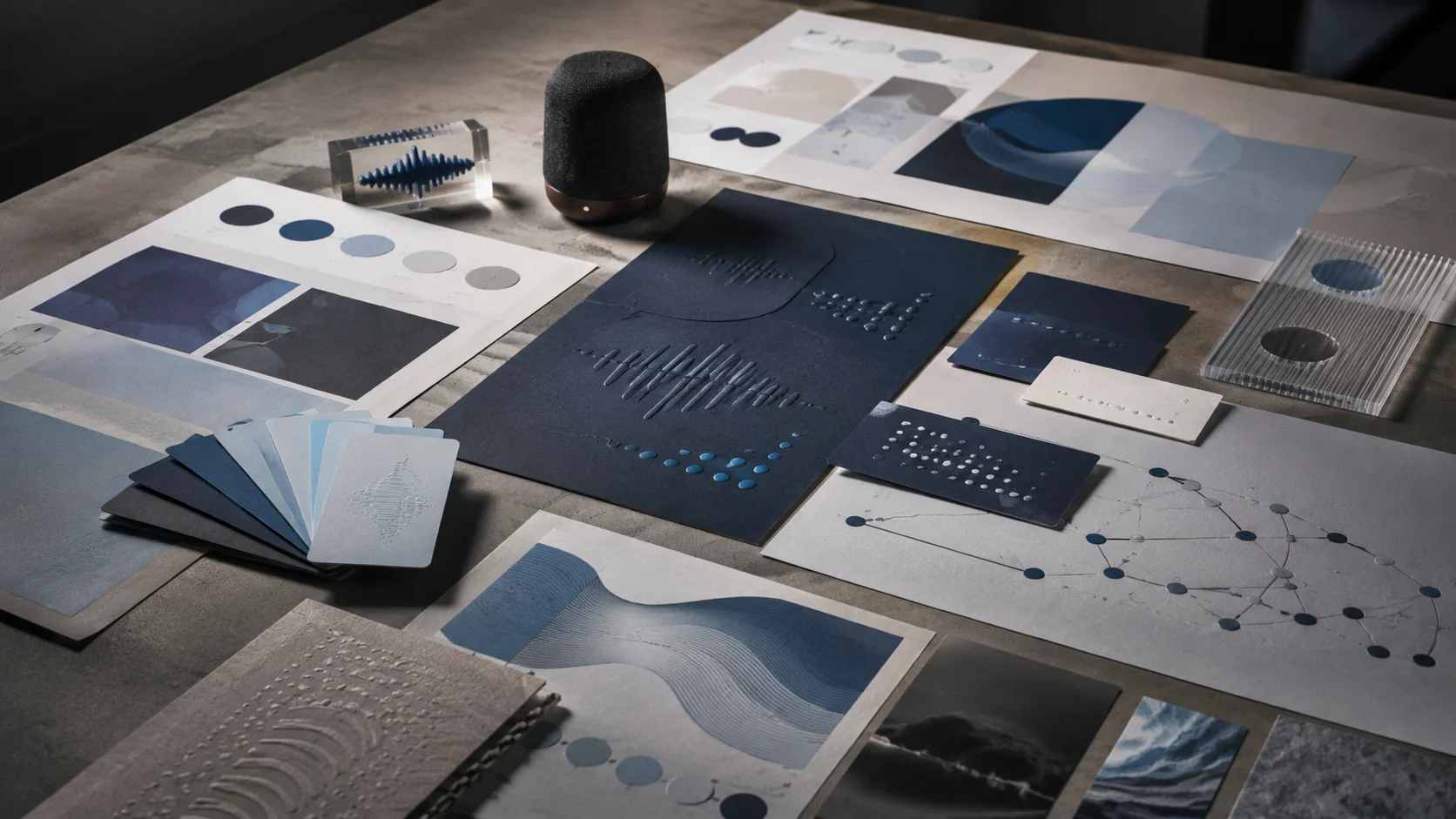
Brand identity is the operating system the company uses to look and sound like one organisation across every surface a buyer, investor, regulator, or hire ever sees. It covers the visual half (logo, colour, typography, imagery, layout, corporate identity application) and the verbal half (positioning, voice, tone, vocabulary, story). When both halves are designed together and documented in one set of guidelines, the brand reads as one company.
Walk Production is an integrated creative agency in Kuala Lumpur and Selangor (HQ in Shah Alam), Malaysia. Since 2018, our 40 in-house specialists have run more than 100 branding projects for growing SMEs, Bursa-listed companies, GLCs, and MNCs across Malaysia, Singapore, and the wider Asia-Pacific region. This playbook covers the three terms that get confused, the seven elements of a corporate identity, the five phases of a typical engagement, the verbal identity work that closes the visual gap, the Malaysian multilingual reality, and five verified Walk Production projects where the visual and the verbal were designed in the same room.
For the corporate branding strategy layer above identity (architecture, naming, employer brand, agency selection, cost tiers), see our corporate branding strategy practitioner playbook. For a sector lens in property, see effective property branding strategy. For the year-end print kit that carries the identity into calendars, gifts, and newsletters, see corporate calendar elements.
Brand identity, visual identity, corporate identity: three terms, one system
The three terms get used interchangeably in Malaysian briefs, and the mix-up shows up later as a scope problem. They are not synonyms; each describes a different layer of the same system, and knowing which one you are commissioning tells you what the deliverable should contain.
Brand identity is the broadest of the three. It covers the strategic framework: purpose, vision, mission, values, personality, positioning, brand promise, target audience, voice and tone, and the visual identity that expresses all of that. It answers the question who are we as a brand, and it sets the direction every visual and verbal decision downstream has to defend.
Visual identity is the design layer inside brand identity: logo system, colour palette, typography, imagery direction, iconography, layout grids, and the rules that govern how they hold together across applications. It answers the question what does the brand look like. A designer cannot make a useful visual decision until the brand identity is documented; without that input, the design defaults to category convention.
Corporate identity is the tangible application of the visual identity across the materials a company produces: stationery, business cards, letterheads, presentation templates, brochures, annual report covers, vehicle livery, building signage, uniforms, digital assets. A medium-sized Malaysian company produces 30 to 50 different branded materials a year; corporate identity is the discipline that keeps every one of them reading as one organisation.
Think of it as an iceberg. Brand identity is the mass below the waterline: purpose, values, personality, positioning, voice. Visual identity is the part above: logo, colours, type. Corporate identity is the part you can touch: the printed card, the painted wall, the signed letter. Remove the strategic foundation and the visible part drifts within a year. Remove the corporate identity discipline and the visible part fragments across vendors within months.
In our agency experience, businesses that arrive asking for “a logo and a colour scheme” usually need all three layers, and the cost of fixing the inconsistency later tends to run higher than the cost of building the full system in the first round.
The seven elements of a corporate identity
Every corporate identity system we have built, from a 20-person SME to a Bursa-listed group, is constructed from the same seven elements. The difference between a system that holds and one that drifts is how precisely each element is specified and how consistently it is enforced when a third-party printer in Klang opens the file at 4pm on a Friday.
1. Logo system
A functional logo system includes a primary version, a secondary lockup, a logomark used alone, a logotype, and monochrome variants for embossing, engraving, and single-colour print. Each version needs defined clear space, minimum size rules, and approved colour variants. Malaysian corporate identities also need bilingual or trilingual lockups, because annual reports, government tender documents, GLC stationery, and signage often need Bahasa Malaysia alongside English, and in some sectors Chinese characters alongside both. For how the mark itself is selected, see our companion guide on logomark, wordmark, and the seven logo types.
2. Colour palette
Colour is one of the fastest ways people identify a brand. A corporate colour palette is a functional system, not a moodboard. Primary colours dominate logo and key headings. Secondary colours support charts and accent panels. Neutrals handle body text and backgrounds. Each colour is specified across Pantone (spot-colour print), CMYK (offset), RGB (screen), and HEX (web). Without these specifications, the corporate blue looks different on every printer and every monitor.
In Malaysia, colour carries cultural weight. Red is associated with prosperity in Chinese contexts. Green carries Islamic associations and shows up frequently in halal-certified brands and government institutions. Yellow is reserved for royalty in several Malaysian states. These associations do not mean a brand has to avoid certain colours; they mean the choice should be made with awareness.
3. Typography
Typography is how the brand sounds visually. A geometric sans-serif signals modernity. A serif signals tradition and authority. A rounded sans-serif feels approachable. Most corporate identity systems include a primary face for headlines, a secondary face for body copy, and a system fallback (such as Arial or Calibri) for situations where licensed fonts cannot load. Hierarchy rules cover heading sizes, weight variations, and line spacing across applications.
Font licensing is a practical consideration in Malaysia. Premium typefaces with per-user or per-device licences get expensive across a 200-person organisation; Google Fonts and other open-licence libraries offer credible alternatives at no per-seat cost. The licensing question belongs in the brand guidelines, not in a finance dispute six months after launch.
4. Templates and layout systems
Templates translate logo, colours, and typography into functional documents. A typical Malaysian template set covers business cards (front and back, bilingual), letterhead, email signature, master deck, proposal and quotation templates, invoice and delivery order templates, and report cover layouts. Each template follows a grid that defines margins, columns, spacing, and content hierarchy. Without a defined grid, every new piece of collateral becomes an improvisation: the brand uses the right colours and fonts and still looks different every time because spacing and alignment shift unpredictably.
5. Stationery and business collateral
Printed stationery remains a meaningful Malaysian brand touchpoint. Business-card exchange is embedded in business culture; at networking events and trade shows, the card is often the first physical impression of the brand. A complete suite covers business cards, letterheads and continuation sheets, compliment slips, envelopes (DL, C4, C5), folders, and name tags. Paper stock, printing method, and finishing are all brand decisions: a 350gsm cotton-stock card with blind emboss communicates differently from a digital print on 260gsm art card. For tender bidders and Bursa-listed filers, the stationery and template stack feeds the cover materials reviewed by procurement officers, regulators, and analysts; inconsistency tends to read as carelessness.
6. Signage and environmental design
Signage is often the largest physical application of the identity, covering building facades, reception areas, directional wayfinding, vehicle livery, exhibition stands, and uniforms. Local council rules (Majlis Perbandaran or Dewan Bandaraya) govern dimensions, materials, placement height, and illumination, and vehicle livery falls under Jabatan Pengangkutan Jalan rules. A company operating across multiple states may need to adapt signage specifications for each council while keeping the identity intact. Uniforms for banks, airlines, retail chains, and hospitality operators extend the corporate identity onto staff, turning every shift into a brand touchpoint.
7. Digital assets
Digital assets carry most of the brand-touchpoint volume for most Malaysian companies. The corporate identity has to specify the website (colour, type, button styles, image treatment, grid), social media (profile and cover templates across LinkedIn, Instagram, TikTok, X), email (signature blocks, newsletter templates), digital documents, and presentations.
For Bursa Malaysia-listed companies, the digital layer extends into investor relations: annual report covers, integrated reports, sustainability disclosures, AGM circulars, and quarterly results presentations. These public-facing documents are read by analysts, rating agencies, and institutional investors, and in our agency experience, the audience tends to read presentation discipline as a proxy for operational discipline.
A complete corporate identity covers all seven elements as one system; drop one and the rest weakens. For how those rules are documented after the system ships, see why brand guidelines matter.
The five-phase brand identity process
The process below is the one we run on most identity engagements. Phases overlap on tighter timelines, but the sequence does not change. When a phase gets skipped (in our agency experience, commonly discovery), the project tends to fail downstream: three concept rounds that all miss the brief, and a rebrief in week six. The five-phase sequence runs 12 to 14 weeks end to end on a full corporate identity project.
Phase 1: Discovery and research (weeks 1 to 3)
Stakeholder interviews, internal team surveys, a competitive audit, audience research, and a usage audit across the existing website, deck, signage, and vendor stationery. The output is a written brand audit report identifying strengths to keep, inconsistencies to resolve, and opportunities to differentiate. The audit also flags the brand architecture question, because architecture decisions made later tend to cost more than the same decisions made in week three.
Phase 2: Strategy and positioning (weeks 3 to 6)
The audit findings feed into a positioning platform: brand purpose, vision, mission, value proposition, personality attributes, and messaging hierarchy. For corporate clients, this stage runs alignment workshops with C-suite leadership and board representatives. A logo presented before positioning is signed off invites every stakeholder to argue about colour preferences instead of the strategic question underneath.
Phase 3: Design exploration (weeks 6 to 10)
With strategy locked, the creative team moves from sketches to refined concepts as mockups. A typical exploration produces two to three creative directions, each with a logo concept, colour palette, typography, and sample applications. Presenting concepts in context (business cards, website headers, signage mockups, annual report covers) helps stakeholders evaluate real-world performance rather than judging logos on a white background.
Phase 4: Refinement and testing (weeks 10 to 12)
After a direction is selected, the team refines the chosen concept through one or two rounds of iteration, testing across applications, sizes, backgrounds, and colour modes. Key tests: does the logo hold up in black and white, does the palette work on light and dark backgrounds, does the typography stay legible at small sizes, and does the bilingual lockup read at the same visual scale as the English version.
Phase 5: Guidelines and activation (weeks 12 to 14)
The final phase produces the brand guidelines document that internal teams, external agencies, vendors, and partners reference for years. Guidelines cover logo usage rules, clear-space and minimum-size rules, colour specifications across Pantone, CMYK, RGB, and HEX, typography hierarchy, imagery direction, application templates, and tone-of-voice rules. Activation runs alongside: internal launch, employee training, vendor briefing kits, and the first wave of branded materials all ship in this window. A brand that exists only in a PDF guideline has not been launched.
The table below summarises the deliverable map across the five phases.
| Phase | Weeks | Lead role | Output |
|---|---|---|---|
| Discovery and research | 1-3 | Brand strategists | Brand audit report, stakeholder interviews, competitive benchmark |
| Strategy and positioning | 3-6 | Brand strategists + Creative Director | Positioning platform, messaging hierarchy, narrative framework |
| Design exploration | 6-10 | Creative Director + Design team | Two to three creative directions, logo concepts, mockups |
| Refinement and testing | 10-12 | Creative Director + Design team | Refined identity system, application tests, file packages |
| Guidelines and activation | 12-14 | Creative Director + Project Manager | Brand guidelines manual, launch materials, internal training |
Execution work (signage fabrication, vehicle wraps, environmental rollout) sits outside the 14-week design window and adds 3 to 6 months depending on the number of sites.
Brand voice and tone: the verbal half of identity
Most Malaysian companies invest in the visual half of identity and treat the verbal half as a copywriting afterthought. The result is a brand that looks like one company across every surface and sounds like four different people. Open the website, the LinkedIn feed, the customer service email, and the chairman’s letter of the same Malaysian B2B firm, and in our agency experience you can usually tell three or four writers produced them. The logo is the same. The voice is not, and that is the gap that undoes the rest of the brand work.
Brand voice is the stable personality the brand communicates across every channel and every writer. It reflects values, positioning, and character, and it stays the same whether the writer is producing a press release, a social caption, or a system error message. Brand tone is how that voice expresses itself in a specific situation. The same personality can sound measured in a regulatory disclosure and warmer in a Raya campaign because only the setting has changed.
Think of it as a person. A senior consultant does not change who they are when they move from a board presentation to a Friday lunch with colleagues; they adapt how they speak. Voice is governed by principles and stays fixed. Tone is governed by scenarios and shifts with the reader. Knowing which one is on the table tells you where to look in the documentation when someone asks whether a draft is on-brand.
The practical reason voice matters for Malaysian companies is consistency under multilingual and multi-channel pressure. A brand without a defined voice tends to drift the first time it has to translate a campaign into Bahasa Malaysia, the first time a junior copywriter produces a LinkedIn caption, and the first time a customer-service agent has to respond to a complaint at 11pm.
Defining three to five brand voice attributes
Brand voice is made workable through three to five core adjectives. Fewer than three gives writers too little direction. More than five becomes difficult to apply consistently when the same writer is producing copy for a press release in the morning and a TikTok caption in the afternoon. The adjectives alone are not enough; every attribute needs paired do-and-don’t examples or different writers will interpret the same word differently.
The workshop sequence we run with Malaysian leadership teams to land the right adjectives runs in three steps.
Run a brand personality workshop. Gather the marketing lead, an in-house writer, a client-facing team member, and a senior decision-maker. Give everyone a list of about twenty personality adjectives. Ask each person to pick five that describe the brand as it is today, and five that describe how it should sound. Where responses cluster, the voice pillars surface.
Reference brands as anchors. Ask which existing brands sound closest to how the company wants to communicate, and why. Malaysian references are useful here. ZUS Coffee communicates a young, anti-elitist, locally proud voice. Petronas communicates poetic emotional depth across its Raya and Merdeka work. Maybank communicates financial authority paired with genuine approachability. AirAsia communicates bold, inclusive, challenger-brand energy. CIMB communicates modern, clean, and digital-forward. None of those descriptions overlap, which is the point: the voice should be specific enough that a competitor in the same category cannot claim the same one.
Validate against the audience. Cross-check the adjectives against how target customers describe the brands they trust. If the team wants to be “approachable” but customers value “expert”, the attribute might need reframing as “expert without the jargon” to bridge the gap.
Once the three-to-five adjectives are agreed, every attribute needs a do-and-don’t table. If one attribute is “direct”, the do column says “state the outcome first, then the context.” The don’t column says “do not lead with disclaimers or qualifications.” These tables are the working layer of the voice system: what a copywriter reaches for when they are unsure whether a sentence is on-brand, and what an editor uses to give annotated feedback on a junior writer’s first draft.
Tone by channel across EN, BM, and Mandarin
The same brand voice applies everywhere. Tone shifts with the reader and the channel. The tone-by-channel matrix is the most operational artefact in a voice document because it tells a copywriter how to dial personality up or down on each surface.
Website copy sits at a medium-to-high formality level. Personality should be present, but clarity and credibility come first. Long explanations work because the reader has chosen to engage.
Social media is where personality is most visible, and the tone shifts per platform. LinkedIn leans toward professional insight. Instagram rewards brevity and personality. TikTok moves fastest and accepts the most irreverence. X sits closer to LinkedIn in Malaysian B2B and closer to TikTok in consumer categories. The voice character stays the same across all of them; the setting changes.
Email marketing varies by stage in the buyer journey. An awareness-stage email is informative. A consideration-stage email is direct about what the brand can do. A retention email is warm and appreciative. The reader’s stage in the funnel sets the tone.
Customer service is where many brands lose consistency. A playful social-media voice has to shift to empathetic and problem-focused when a customer with a complaint reaches the inbox. The underlying character still comes through; warmth and resolution take priority over wit.
Press releases sit at high formality. Even an irreverent brand writes structured, factual press releases because trade press and regulators are reading them. Voice shows through in word choices and framing, not in humour.
Regulatory and investor communications. For Bursa Malaysia-listed companies, the chairman’s letter, MD’s review, sustainability narrative, and AGM circular all sit under brand voice at high formality. A measured, specific chairman’s letter tends to read as a more credible company than one filled with generic platitudes about commitment and excellence.
The Malaysian language reality adds another axis. Most B2B buyers in Malaysia move between Bahasa Malaysia and English in the same meeting. Consumer-facing categories often add Mandarin and Tamil for retail. A brand voice written for English only will lose meaning the first time it is translated.
English carries the formal, globally-accessible voice for most service industries and urban-audience marketing.
Bahasa Malaysia is not optional for brands that take local relevance seriously. It is the language of national campaigns, Merdeka content, Raya campaigns, and communications aimed at Malay-majority audiences. BM done well signals the brand is part of the community, not just selling to it. Government and public sector-facing communications require BM as the primary language. See our bilingual copywriting in Malaysia playbook for the writing layer.
Mandarin connects with the ethnic Chinese community and certain consumer segments. Chinese New Year campaigns, community-facing retail, and segments of the financial advisory and trustee markets read in Chinese before they read in English. Mandarin needs a writer who lives in the language, not a translator working from an English draft.
The critical principle across all three is transcreation, not translation. A tagline that lands in English often loses its resonance when converted word for word into BM or Mandarin. Each language version should be its own expression of the same brand voice, adapted for the cultural and emotional register of that language. Petronas’s Raya films are the standing reference: poetic BM narration during Hari Raya, a different register for Chinese New Year, all within one brand voice that holds its character.
Code-switching, the natural blending of English, BM, Mandarin, and occasionally Tamil that runs through Malaysian conversation, is a real feature of social media. Manglish phrases like “confirm lah”, “jom”, or “sure can wan” can work in informal digital channels when they feel like conversation rather than broadcast. McDonald’s adopted “Mekdi” as a brand-owned nickname in its Malaysian work, turning everyday slang into a campaign platform. The practical rule: English for function, BM for cultural connection, Mandarin for community celebration, code-switching used selectively, and native-speaker review on every BM and Mandarin asset before it ships.
Documenting voice inside brand guidelines
Documentation is where voice decisions become enforceable. A verbal agreement about how the brand sounds is not a system; a written, structured reference every content-producing team can find at any time is.
The voice section sits alongside the visual identity rules in the brand guidelines, not after them. The two halves of identity should appear with the same weight in the document because they do the same weight of work. The core sections expand the six artefacts in the callout above with worked examples.
Voice attributes page. Each adjective gets a paragraph and a do-and-don’t table. Place each attribute on a spectrum where useful (formal to casual, serious to playful, expert to accessible) and show where the brand sits on each so a writer can calibrate quickly.
Vocabulary guide. Three layers: approved words and phrases that reinforce the voice; words and phrases to avoid with preferred alternatives; an industry-jargon policy that answers whether technical terms are used as-is, explained on first use, or replaced with plain alternatives. Include conventions on contractions, product-name capitalisation, and punctuation.
Before-and-after copy comparisons. Side-by-side tables are the most operational section in any voice document. Show an off-brand version, an on-brand version, and the principle the rewrite demonstrates. For example, “We deploy proprietary methodologies to improve brand equity outcomes” becomes “We build brands people recognise and trust.” One reads as a press release nobody finishes. The other reads as a sentence a real person would say.
Tone-by-channel matrix. For each major channel (website, LinkedIn, Instagram, TikTok, email, customer service, press release, regulatory disclosure, BM campaign, Mandarin campaign), state the formality setting, the personality setting, and two to three annotated example posts.
Writing checklist. A short pre-publish sweep. Does the sentence match the attributes? Does the vocabulary avoid the banned list? Does the tone match the channel? Does the BM or Mandarin version transcreate rather than translate?
The document should be owned by someone, reviewed annually or after a major brand change, and stored where every writer, designer, and marketer can find it, not buried in a folder from the last brand project.
Independent research suggests consistency at this level tends to show up in commercial outcomes. A widely cited Lucidpress study covering more than 200 organisations reported revenue increases of up to 33 percent for brands maintaining consistent voice and visual identity across touchpoints, and that while most companies have brand guidelines on paper, only about a quarter actively enforce them. In our agency experience, the gap between owning a guideline and applying it is a training and culture problem, not a documentation problem.
Brand storytelling: the editorial spine
Brand storytelling is the editorial spine that runs through the website, sales deck, annual report, careers page, and executive speeches. It is not a separate workstream from brand voice; it is the through-line that keeps every channel saying the same thing in a way that compounds across the year rather than contradicts itself.
Most brand “stories” we read on Malaysian company websites collapse on one of four counts: no recognisable character, no real stakes, no clear obstacle, and no defined role for the brand at the end. Get those four right and the story holds. Miss any one and the page reads as corporate copy nobody finishes.
Character. Who the brand is for, written in their own language, not in marketing language. “Decision-makers in the logistics sector” is not a character. A freight forwarder in Shah Alam who has fifteen minutes between calls and needs to know whether a shipment will clear is a character. Could the person walk into the room and recognise themselves in the page? If yes, you have a character; if no, you have a segment.
Stakes. What the character stands to lose or gain. In B2B, stakes are usually commercial: a missed quarter, a missed connection, a property portfolio with vacancy past 15 percent. In consumer stories, stakes are personal: time, money, status, peace of mind. If a reader cannot tell what is on the line, the story has no pull.
Conflict. The obstacle in the way: the shape of the market, information the buyer does not have, or a process nobody has bothered to explain. Conflict is where most brands underplay the difficulty so the resolution looks easier; buyers tend to notice.
Resolution. The role the brand plays in solving the problem. Not “we sell X.” Rather, “here is what changes for you when X is in place.” Resolution is the only place the brand is allowed to be the hero; everywhere else, the customer is.
A working pattern: on the Raya Airways rebrand, the brand narrative was built around connecting people and businesses through service excellence in regional air logistics, with reliability as the editorial spine. The visual identity carried that line into the aircraft livery, the corporate profile, the brand-activation collateral, and the corporate video and photography, so the rebranded business read consistently across air-cargo audiences rather than fragmenting across each channel.
Brand storytelling in Malaysia also has to survive conditions a Western template does not anticipate. Most B2B audiences move between BM and English in the same meeting. Regulator-watching categories (financial services, telco and digital, pharma and wellness) need every line to be defensible under compliance review. Institutional credibility for GLCs and Bursa-listed corporations needs measured tone, named outcomes, and a track record that can be checked. Storytelling in those contexts is not drama; it is clarity under examination.
Why boards fund identity and voice work
Brand identity, corporate identity, and tone of voice are not marketing line items dressed up. The CFO and the managing director sign off on these engagements because they touch operational efficiency, regulatory compliance, and revenue events. Four reasons show up most often on the cover page of an approved business case.
Consistency across 30 to 50 branded materials a year. A medium-sized Malaysian company produces 30 to 50 distinct branded materials in a year. Without a documented identity, each piece gets designed in isolation; colours drift, logos get stretched, fonts change between departments. A working identity gives every team, vendor, and printer a single reference point, and the rework round stops being baked into every reprint schedule.
Stakeholder trust. Investors, partners, and procurement officers form impressions from the materials they see. A proposal with inconsistent formatting or a pixelated logo signals carelessness; a polished, unified document set signals professionalism. For companies courting institutional investors, joint-venture partners, or government-linked counterparties, the buyer is reading the materials as a proxy for how the company is run.
Bursa Malaysia and regulatory documentation. Bursa-listed companies produce annual reports, integrated reports, sustainability disclosures, AGM circulars, and quarterly results presentations on a fixed calendar. A working corporate identity means templates are in place, so each cycle does not start from scratch. For the publication side of the calendar, see our annual report types and design playbook.
Government tender documentation. Government procurement often requires standardised documentation, and submissions that look professional and consistent tend to score better on subjective evaluation criteria. Companies that submit tenders regularly benefit from a ready library of branded templates that meet the standards without rework on every bid.
A linked benefit shows up in retention rather than on the cover page: talent. Senior candidates in technology, finance, ESG, and engineering roles increasingly research the employer brand before accepting an offer, and an off-brand careers page, LinkedIn feed, or interview process tends to read as a proxy for how the rest of the operation is run.
Selected Walk Production identity and voice work
Five Walk Production projects show how the same identity-and-voice discipline adapts to very different organisations. In each, the visual identity and the verbal identity were designed in the same engagement, in the same office, on the same editorial line. The strategy work and the production work sit on the same team, which is what keeps the visual and the verbal from drifting apart in the year after launch.
1. SuperDNA: scientific credibility paired with consumer accessibility
SuperDNA is a Malaysian genetic testing service offering DNA analysis for health, ancestry, and family planning. The brief asked for an identity that communicates scientific precision without intimidating consumers new to DNA testing. Walk Production developed the brand from scratch: strategy, logo, visual identity, packaging, brand guidelines, and a distinctive genetic-testing report template.
The brand mark combines the initial ‘S’, a DNA helix, an infinity symbol, and arrows enclosed in a square. The colour palette uses the four DNA nucleotide colours (blue, red, yellow, green), connecting the visual system to the scientific foundation. The tagline “Unlock the power of your DNA” captures the brand promise in a line a consumer can repeat. Voice runs accessible across consumer touchpoints (test kit packaging, results delivery) and tightens to technical-but-plain on the report template so users can read complex genetic data without specialist training.
2. GET Trustee Group: a bilingual EN-CN trustee identity
GET Trustee Group is a Malaysian fiduciary firm handling trust and estate planning for individual and family principals. The brief asked for an identity that read as credible to high-net-worth audiences from launch, and a website that worked for both English and Chinese-speaking clients in one user journey. Walk Production delivered logo, corporate identity, company profile, master deck, brand guidelines, marketing collateral, copywriting, and a dual-language EN-CN website with translation.
A separate Chinese-name version was drawn alongside the English mark, weighted to read at the same visual scale rather than as a smaller subtitle. The tagline “Your Trusted Financial Compass” was written to land in both English and Chinese without either version feeling like the secondary read. Voice was set for fiduciary credibility: measured, specific, and precise enough that a family-office reader and a regulated trustee would both find their own register on the same page.
3. TGA: an automotive detailing rebrand for corporate buyers
TGA, formerly The Glass AutoSpa, is a Malaysian automotive detailing operator that had grown into a corporate-client base and needed an identity that read at corporate-buyer standard. Walk Production ran a three-month rebrand covering new name, logo, corporate identity, brand manual, company profile, master slides, product packaging, and website.
The shorthand “TGA” replaced “The Glass AutoSpa” as the trading name. The tagline “Driven to Detail, Built to Lead” carries both halves of the brand: precision in the work and a credible posture in front of corporate buyers. Brand voice was rewritten in shorter sentences with fewer adjectives, so the company sounded like the operating team it is rather than a marketing-led retailer. The brand manual was written for a client whose team would self-execute future collateral, with colour and typography specified by usage scenarios rather than as a flat palette swatch.
4. Raya Airways: a cargo carrier rebrand and brand storytelling
Raya Airways is an air cargo carrier providing freight services across Asia-Pacific. The complete rebrand covered brand strategy, brand logo, corporate identity, corporate profile, master slides, brand guidelines, website, corporate video, photography, and brand activation. The logo is a combination mark featuring a 3D box with arrows symbolising forward movement, paired with yellow and navy blue.
The brand narrative was built around connecting people and businesses through service excellence in regional air logistics. The editorial line ran through the company profile, the cargo website, the master deck, and the social feed, so the corporate identity carried the same argument across surfaces rather than reading differently on each channel.
5. Lianson Fleet Group Berhad: a Bursa-listed rebrand on a name change
Lianson Fleet Group Berhad (LFG) is a Bursa Malaysia-listed marine logistics and offshore support company, previously listed as ICON Offshore Berhad. The brief was to deliver the new corporate identity on the same day as the name-change announcement so investors reading the Bursa announcement landed on a website, a company profile, and a master deck that already wore the new identity.
The work covered brand strategy, corporate identity, brand guidelines, company profile, master deck, marketing collateral, copywriting, and the new corporate website. The CARE values (Communication, Appreciation, Reliable, Efficiency) were written to translate into both internal culture and external posture. The corporate identity reads across both an investor-relations document and a charterer-facing document without forcing a different palette for each surface, and the application standards extend to the regulated communications a Bursa-listed company produces on a fixed calendar. A name change is one of the more demanding identity projects because every material has to update at once.
The pattern across the five projects is consistent. Strategy sets the argument. Visual identity carries the argument into every surface where a stakeholder is looking. Verbal identity holds the argument together across writers, languages, and channels. More projects across other sectors sit in the branding portfolio.
Common identity and voice mistakes
Four mistakes show up across most of the second-round conversations we have with Malaysian companies. Each one is recoverable, but each one is also more expensive than the discipline that would have prevented it.
Treating the logo as the brand. A logo is a single visual mark. A brand is the full system: strategy, visual identity, verbal identity, corporate identity application, guidelines, and activation. Budgeting only for the logo creates inconsistency on every other touchpoint, and the cost of fixing that a year later tends to run higher than the cost of building the full system in the first round.
Skipping voice while investing in visuals. A brand with a clean visual identity but no defined voice tends to sound like a different company on every channel within a year. The fix is to design voice and visual identity in the same engagement, with the voice attributes briefed into the visual exploration so the two halves land together.
Auto-translation across BM and Mandarin. A brand voice that reads well in English and gets dropped into a translation queue tends to lose its meaning the first time it lands in BM or Mandarin. Transcreation by writers who live in each language is the discipline that holds a multilingual voice together.
No governance after launch. A brand that lives only in a guidelines PDF drifts within months: the deck looks slightly different in every pitch, the website hero stops matching the brand photography direction, the vendor signage uses last year’s logo. A quarterly consistency review plus a central digital asset library is the discipline that holds the brand together after launch. For how those rules are documented and enforced, see why brand guidelines matter.
A related discipline that sits outside this anchor but matters for naming work is trademark protection. SSM registration gives a Malaysian company the right to trade under a name, not exclusive trademark rights. Only a MyIPO trademark registration gives exclusive, enforceable rights across the relevant Nice classes (45 classes total, with goods in 1 to 34 and services in 35 to 45). For the full naming, architecture, and trademark sequence, the corporate branding strategy playbook covers the SSM, MyIPO, and domain-registry checks together.
Where to start
If your current brand is leaking credibility (on the proposal cover, the investor deck, the careers page, or the customer-service email), the fix is rarely a logo refresh. It is a structured brand identity and tone of voice engagement that takes the strategy, the visual system, the corporate identity application, the verbal voice, and the activation work as one piece of work rather than as five disconnected projects.
Walk Production runs branding services engagements from our KL and Selangor offices, with 40 in-house specialists across strategy, design, copywriting, and content marketing. The voice work and the visual work happen on the same team in the same office, which keeps the editorial logic consistent across every touchpoint, channel, and language.
To see the work in context, review the branding portfolio or talk to our team.
Marcovy Duwin is the Creative Director at Walk Production, an integrated creative agency in Kuala Lumpur and Selangor with 40 in-house specialists. He leads visual design across branding projects and corporate communications, with over 100 projects completed for SMEs, listed companies, and government agencies across Malaysia.