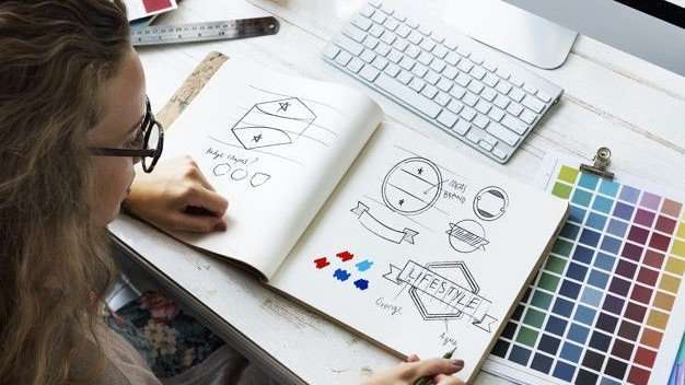
As we’ve emphasised before, a company’s branding is essential to its identity and success.
That said, nothing holds a more forthright prominence than a brand’s corporate logo.
It’s the first visual element that’s instantly recognisable to consumers; the cornerstone of any thriving business.
In a world that’s splattered with logos, this unique emblem has the efficacy to determine how people perceive your brand.
Your corporate logo should carry the very essence of your organisation’s personality, conveying what, why and how you do what you do.
It’s the first impression embedded on your company website, social media platforms, powerpoint presentations, company profile and more.
You want your logo to stand out in the market saturated with all kinds of designs.
But how can you create one that encompasses your company’s purpose and values, while evoking a positive attitude towards your product?

Don’t worry, we’ve got you covered.
For those navigating the design process or planning a facelift for your brand identity, read on for 10 useful tips in creating the best corporate logo for your business.
First of all, you may want to identify your brand’s core personality and what feelings you want customers to associate with it.
Try writing down a few words that accurately embodies this, as your logo should represent your company’s purpose and guidelines.
Here are a couple of questions to consider when defining your brand identity:
- Why do we do what we do?
- What are our beliefs and values?
- What makes us different and better than others?
- What three words do we want customers to use when describing us?
Now that we’ve got that down, it’s time to brainstorm ideas and find inspiration for a logo that best suits your business!
1. Pay attention to colour psychology, shapes & fonts
Colour psychology is a real thing, kids.
Believe it or not, it plays a significant role in the message your logo communicates to audiences. Think about what emotions you want your logo colours to elicit.
Studies have reported that consumers tend to associate warm tones like red and orange with boldness, energy and passion; whereas cooler tones like blue and green are linked to tranquillity, professionalism and nature.
Similarly, the shape of your logo can reinforce your brand’s overall meaning and provide some insight into your personality.
Let’s take a look at the ideas that specific shapes and lines portray:
- Circular designs: positivity, community, endurance, and sometimes femininity.
- Square designs/sharp edges: balance, strength, symmetry, and professionalism.
- Triangles: masculine, powerful, legal, scientific, and sometimes religious.
- Horizontal lines: tranquillity and community.
- Vertical lines: strength and masculinity.
Like how a person’s handwriting is a telltale of their personality, fonts behave the same for corporate logos.
How do fonts disclose your brand’s messages?
Angular fonts can depict your brand as assertive and vigorous, while more rounded fonts come off as gentle and youthful.
Bold fonts are seen as more masculine and cursive as more feminine.
Whatever font you choose, it should be blatant and easy to read.
READ MORE: Corporate Design in 10 Unique Ways
2. Keep your design clean
You don’t want your consumers to strain their retinas squinting at your overly-convoluted logo.
People should be able to read and interpret your logo from a distance or when it’s miniaturised. Keeping your design “clean” is fundamentally designer speak for having lots of black space.
A clean, minimalistic logo can invoke a sense of calmness in your audiences.
When your logo design consists of black space, it’s also easier to integrate it into different formats—for example, incorporating your logo in brochures, calendar, coffee table book and other marketing schemes.
3. Be unique
These days, nothing is truly original, although that’s always the goal.
Many brands struggle with creating an outstanding logo that hasn’t already been done.
However, coming up with a unique design doesn’t mean avoiding imitation altogether. It’s crucial to get creative and design something innovative and out-of-the-box.
4. Research the competition
Now, we’re not saying you should copy design fads just to keep up with the times.
Looking at the same variations of designs everywhere can be quite tiresome.
Nonetheless, it doesn’t hurt to understand the latest trends and work out what’s good about them as well as the clichés to be avoided.
Stake out your competition and pinpoint the differences between your business and theirs.
Then, you can envision how your logo can distinguish you from competitors.
5. Use visual double entendres
A visual double entendre is a fancy term that describes two pictures warped into one through the interpretation of a concept.
You may do well to utilise this clever technique, as it makes for a smart and memorable logo.
Take the logo below for example:

This logo takes the shape of a green leaf, which represents their environmentally friendly company.
At the same time, the leaf is shaped like a tongue with a droplet of what can only be assumed as saliva; paying tribute to their name: ecotaste.
6. Use custom type
Who doesn’t love custom lettering?
The effort poured into your logo design matters just as much as the typeface you use for your company name.
It’s easy for your typeface to be ripped off by other designers, but having a custom hand-drawn font can maintain the uniqueness of your logo.
7. Choose a timeless design style
Trendy designs can be all the rage at a given time, but they tend to fade out quickly.
When deciding on an aesthetic, keep in mind that you want your logo to be timeless.
A classic design can show that your brand is down-to-earth and reliable; a retro vibe can invoke feelings of nostalgia and convey how important history is to you; a minimalist style can communicate that you’re modern and cool.
No matter which style you choose, make sure it best exhibits your brand and that it’s here to stay.
8. Get literal
We are all aware that Apple’s logo is not an overpriced smartphone—it’s an apple.
So, if your firm’s name is a thing, don’t be afraid to implement that thing in your logo. Being blatantly inclined doesn’t equal being lazy.
After all, Apple’s logo is literally an apple. People may automatically associate your logo to your brand.
9. Have a logo contest
There’s no surer way to determine the winning candidate than a fun contest.
Drawing up several logos makes it simpler to eliminate contenders, and the first few ideas are always the most generic ones.
This way, you can play around with different designs and perfect the ideal logo.
It’s also imperative that you communicate with your designer.
Write down a clear brief explaining as much information about your organisation as you can, so your designer thoroughly understands what you’re about and what you need.
Don’t hold back on any feedback as to what you want to change or improve on.
10. Build on what you have
If you want to rebrand yourself, don’t reinvent your logo completely. Such a drastic change can generate confusion among consumers.
Take Pepsi, for example.
Their logo looks different than it did decades ago, but the transformation was gradual as they were building on their original brand instead of trading it for a new one.
Refurbish it, not toss it away.
Feel free to try out different logo designs and ask family members, friends or coworkers to weigh in on the action.
If you’ve worked with professional designers before, you’ll know they don’t merely present one option.
It can be an inspiring exercise figuring out the best corporate logo for you—savour the creative process!

Are you seeking to create the best corporate logo for your business?
Walk Production is the way to go. We are a creative agency specialising in enhancing brand awareness as well as online presence.
Some of our expertise include graphic design, copywriting, content marketing and search engine optimisation (SEO).

