A logo is the first impression of a brand, and unlike meeting someone subsequently, your brand may not get that second chance.
It’s what consumers see when they’re cruising the shelves stacked with dozens of other similar products.
Your logo could be the deciding factor on their verdict, and even make them feel like you were the right choice.
As with all things, there’s an underbelly of psychological factors at play when it comes to logo design.
From its colour to shape to font to symmetry—every individual element plays a role in representing the brand in which it belongs.
The psychology of a logo can incite excitement, trust, affordability or whatever emotions you want customers to associate with your company.
Designing the perfect logo not only heightens brand awareness but subliminally sways prospective clients to your favour, persuading them that you’re the best in the market.
What makes simplicity at its finest?
Nowadays, many firms are pursuing the modern and chic route; be it their logo or website.
It’s not unheard of to copy a firm’s successful design because it works.
While imitation is coined as the sincerest form of flattery, there’s an underlying reason why people tend to gravitate towards clarity and minimalism.
Allow us to dive into the inner psyche of consumers’ minds.
A study conducted by Harvard in 2013 showed that different demographics preferred different web designs and had alternate tastes for what they considered aesthetically pleasing.
However, the universal rule of thumb was that the more visually complex it was, the lower its visual appeal.
But why is simplicity more alluring?
Simple: it’s scientifically easier for our brains to process.
Designs that are low in complexity don’t require as much work for our eyes and minds to process and store the material.
Our retinas convert visual information into electrical impulses to our brains, which transmits colour and light information.
The more complicated this information is, the harder your brain must work to translate and remember it.
Consequently, the solution is, once again, simple.
You should communicate as much about your company’s messages as you can with as little as possible.
READ MORE: Corporate Design in 10 Unique Ways
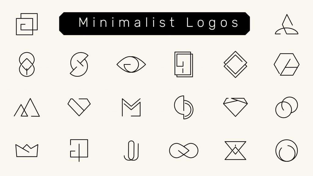
How is minimalism used in logos?
Back then, even Nike’s or Apple’s famous logos weren’t minimalistic. It took years of evolution and rebranding to perfect the symbols we all recognise today.
Good news for you; that means there are endless opportunities to improve the design of your existing logo.
We live in an age of information overload.
Gone were the days when complexity was the trend; in with the simplicity that smartphone-using consumers long for.
These days, our attention spans aren’t what they used to be. Persistent notifications and online mentalities have reduced your audience’s time and energy to retain new information.
Unlike other fleeting fads, minimalism is here to stay.
Memorable logos such as that of the aforementioned brands have flat designs, which are minimalist and straight-to-the-point.
Instead of overcrowding your logo with multiple fonts and colours, lose the frill.
Simple concepts can easily be used across various backgrounds and mediums, such as your website, social media platforms, marketing tools and so on.
READ MORE: What is Branding and how it helps SMEs in Malaysia?
Examples of simple logo designs
Let’s pull inspiration from some examples of well-known brands with minimalist yet effective logo designs.
1. Netflix
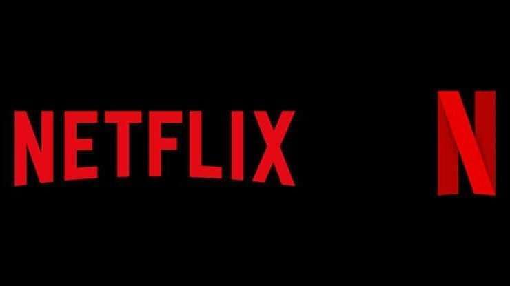
Many of us probably don’t even remember this version of Netflix’s logo.
As you can see, it used to be tricoloured with their name in a shadowed, 3D font.

They since moved on to a flat logo design with only two colours, increasing its versatility.
Now, whenever we see the single red ’N’, we instantly think of what shows to stream next. This change also reflects their revolution into a more modern streaming service.
2. Airbnb
How about this one? Remember this?
Airbnb discarded their convoluted typeface in exchange for a simpler yet incredibly creative logo.
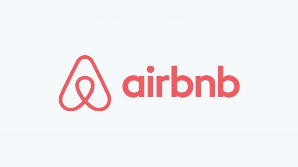
Airbnb’s rebranding of their new monogram is far from boring.
The ‘A’ was specially designed to depict the community and inclusivity that makes up the brand’s personality. Pardon the unintended rhyme.
Their new identity took almost a year to complete, and it was well worth it.
This goes to show that minimalism can still be witty and memorable.
3. Louis Vuitton
Another popular monogram logo we’ve come to know and love is from none other than Louis Vuitton.
The high-end business pays attention to detail by using the serif font with an italicised ‘L’.
Even in its simplest form, the logo doesn’t fall short of communicating the brand’s taste for luxury and class.
READ MORE: 10 World Famous Logo Sample and What You Can Learn From Them
Why less is more
Several factors contribute to the success of a minimalist logo:
I. Recognisable and memorable
Having a simple logo that can be recognised at first glance could never be harmful to your business.
A logo has the power to burrow its way into your subconscious even before you consciously examine it.
So, if your logo can spark the image of your brand at the split of a second, you know it’s useful.
Logos are also considerably more memorable than, say, a body of text. Viewers should be able to associate your corporate logo with your product and service immediately.
Nonetheless, it can be hard to accomplish when a new one pops up every day.
Don’t turn your logo into a body of text when you can keep it straightforward, as people are counting on visuals to be.
II. Prompts emotional reaction
The point of branding is to elicit an emotional reaction from customers; the same goes for your logo.
When your design is simple, people can process it quickly and let their feelings take over.
On the other hand, when the logo design is complicated, too much cognitive processing is needed, which leaves no room for any emotional impact.
III. Industry relevance
In the events that you decide to venture into other sectors, a minimalist logo offers the flexibility that you need.
For example, let’s say you own a bakery and your logo is incorporated with all kinds of baked goods—it’s going to take some revamping for you to expand into other types of business.
Therefore, you should consider appropriating the practice of less is more to keep your future options open.
Designing the best corporate logo for your company is an art form.
Don’t hesitate to invest sufficient time and energy into this, because it will reflect directly on you.
Need some assistance after everything we bombarded you with?
Walk Production is a creative agency that specialises in elevating your brand awareness.
We offer a full-fledge B2B branding services including corporate identity design, graphic design, copywriting, content marketing and more.
With a brilliant understanding of less is more, rest assured you’ll be in good hands.

