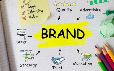
Building a business or building a brand involves creating a logo that is instantly simple, instantly recognisable and hopefully, leaves a lasting impression in the minds of consumers.
Symbols and logos are an efficient way to communicate information about your business.
It would be a mistake to consider a logo design is unimportant or insignificant.
Logos are an essential part of your business as it is the face or the front door of your company.
Therefore, every business owner should invest and prioritise how they want to brand themselves through their logos.
A well-designed logo is more than just an image; but it conveys to your target audience that your business is credible, professional and provides quality products and services.
With that said, let’s take a look on some of the world-famous logos around us.
Explore what we can learn from them to create a successful logo that is recognisable, reflect your brand’s message and stand out from the crowd.
10 World Famous Logo Sample and What You Can Learn From Them
1. Apple
Apple‘s first logo in 1976 looked nothing like its logo now. Back then, Apple used a rainbow-coloured logo design to match with their first colour display computer.
The logo then evolved into shiny chrome and then a flat colour, just like the logo we see today.
The simplicity of the design demonstrates sleekness, sophistication and style.
The minimalistic logo that includes a “bite” out of the apple sparked interest in consumers saying that it referred to the word “byte” (e.g. gigabyte, megabyte); or as a metaphor for a bite of knowledge from using the Apple products.
Overall, what we can learn from the Apple logo is that it completely matches the personality of the brand.
The logo displays the traits of its products in its design: sleek, sophisticated, intelligent.
The simplicity of the logo also plays a part in leaving a lasting impression on the consumer’s minds so that they won’t forget about it so quickly.
READ MORE: What is Branding and how it helps SMEs in Malaysia?
2. Google
In 2015, Google relaunched its logo with a new and modernised typeface with saturated and vibrant colours. It is the same logo we know as of today.
The simplicity in Google’s logo is evident in its design. Since Google chose a wordmark for its brand, the use of colour is essential in their logo.
Google used primary colours to give its logo a design that pops.
This company is also not afraid to use some negative space that provides a contrast to the primary colours, symbolising the way Google stands out from the competition.
What we can learn from Google’s logo is its design that reflects local or world events. It is a creative touch to stay exciting and relevant to your consumers.
The Google logo also gives great insight into how you use the colours for your logo, what it represents and how much space you want in between your letters and surrounding.
3. Target
What better way to explain your brand called ‘Target‘ by using an actual target for your logo?
Target’s design stands out because of its simplicity, and its bold use of the colour red.
The circle-within-a-circle communicates universally where the circle symbolises friendship, community and endurance.
All these traits are equally important to Target.
The colour red also denotes passion and importance, while white conveys cleanliness, virtue and health.
Hence, what we can learn from Target’s logo is its simplicity in the design, making use of shapes, the use of bold colours and a right balance of negative space to avoid clogging up your design.
Plus, create an overall design that matches with the company’s vision and purpose.
READ MORE: Brand vs Business: Know the Difference
4. Coca-Cola
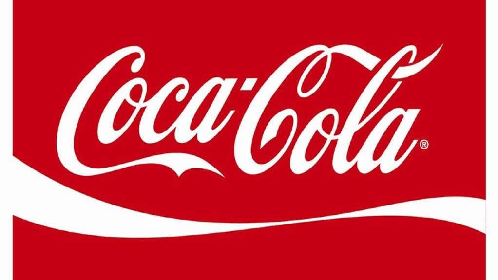
Coca-Cola‘s first logo in 1886 was black and white. Over time, it evolved, but the classic and script lettering remained the same.
By 1958, the brand’s famous red with white lettering officially became part of the logo and stayed stuck in the minds of consumers.
What is it about Coca-Cola’s logo that makes it one of the most memorable and successful brands in the world today? That would be its originality and class.
The Coca-Cola logo represents a classic Americana, with the fashionable style of the brand personified in the unique lettering.
Plus, the use of a powerful colour such as red evokes excitement, energy and power.
It’s no wonder the Coca-Cola logo is instantly recognisable and loved by people all around the world.
What we can learn from Coca-Cola’s logo is to be original, innovative and simplistic in your logo design! Their logo also teaches us to lead with colour and custom fonts.
This logo inspires us to use colour psychology to find a primary colour that fits our brand, and apply custom fonts for uniqueness to match the personality and identity of the brand.
5. FedEx
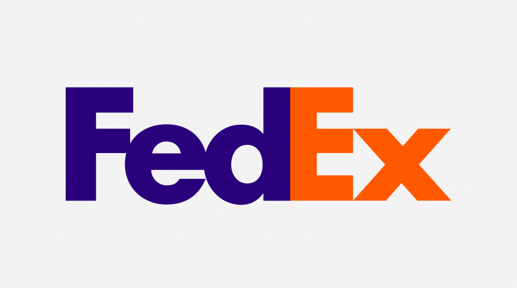
FedEx company introduced its new logo in 1994 with a blue and orange wordmark and the iconic white arrow in between the second E and the letter X.
The iconic arrow gives a subtle message conveying its speed, movement and precision as a delivery and logistics company.
Another interesting feature about FedEx is its innovative use of colours in representing the different services it provides.
For example, while the most common colour combination of FedEx Express is purple and orange, other services feature the “Fed” part that maintains its purple colour design, and the “Ex” portion changes colour based on the products and services.
What we can learn from the FedEx logo is the application of colour psychology, and the use of different font colours for multiple products offered in the company.
By changing one of their logo colours, the company can symbolise each aspect of the business in different ways.
6. LG
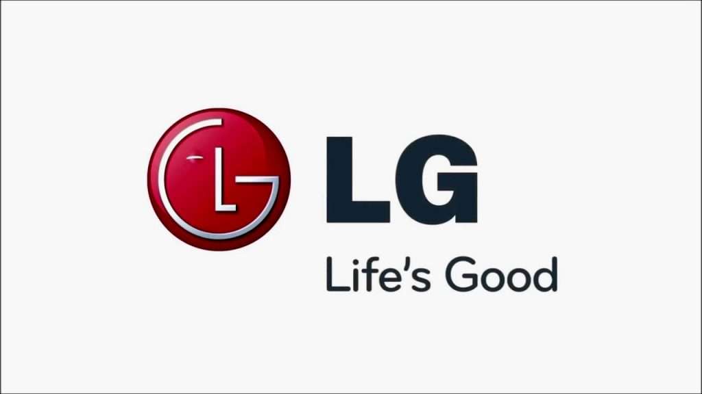
In 1995, the LG we all know rebranded with an original logo and a slogan that said “Life’s Good”.
The logo is made up of the letters L and G curved around the left side of the design. The logo was upgraded in 2011 with a glossy, 3D effect design till this day.
When we take a look at LG’s logo, we can instantly recognise a winking face.
After all, what better way to convey your “Life’s Good” slogan than by bringing these words to life with a happy face?
Plus, the letter ‘G’ in the logo is also designed to look like an on-button, which is quite fitting for an electronic company.
What we can learn from LG is that simplicity is key when designing your logo.
It goes to show that business and companies can convey their brand attributes through the simple use of colour, a few shapes and letters.
Not only that, but we can take away the example of a hidden image used by LG in their logo, such as the winking face.
Not only can we be creative and innovative with our logos, but we also don’t have to go overboard to stand out!
7. Toyota
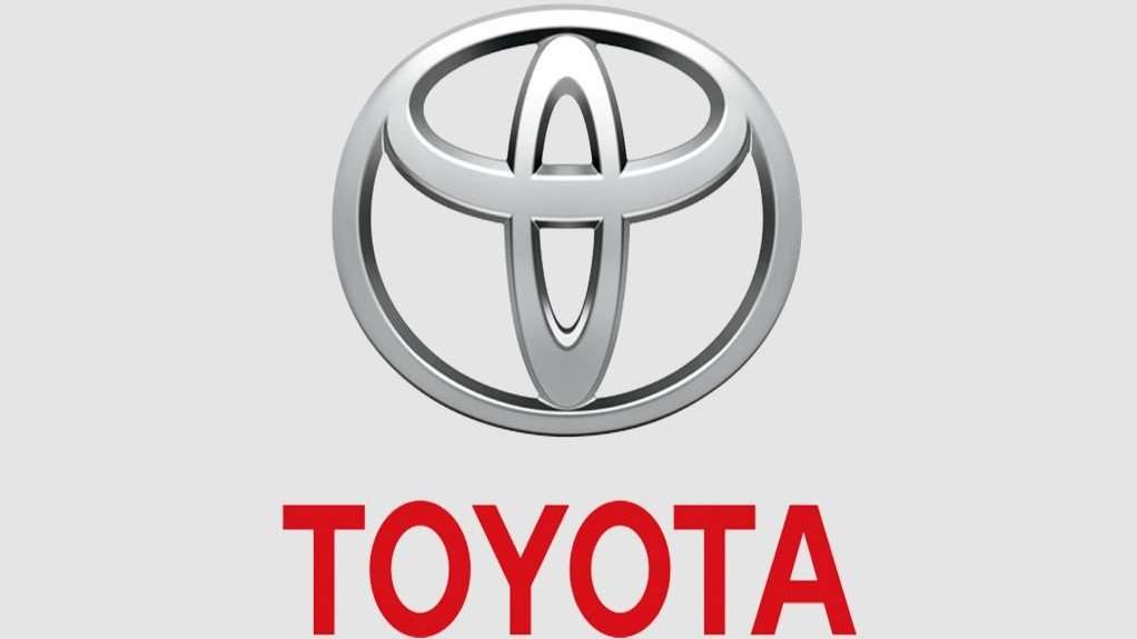
Toyota‘s logo has a similar design to the previous logo designs mentioned here.
For example, Toyota uses the colour red as its primary brand colour.
Besides that, the silver or grey colour of the logo also shows a metallic shine, adding a feeling of high value and quality.
The overall logo represents conventionality, dependability, professionalism and safety.
Toyota stated that the two perpendicular ovals inside the larger ovals represent the heart of the customer and the heart of the company.
They overlap to portray a mutual relationship between one another.
The two ovals inside also form a letter ‘T’, resembling the first letter of the company, and even a steering wheel shape.
What we can learn from Toyota’s symbol, is its creativity behind the design that includes hidden meanings pointing towards the care and sophistication you put in your business; and building a relationship between you and your customers.
The logo also shows a good example of contrast—the curved edges of the design and striking colour of the font.
8. Starbucks
Who can leave out Starbucks from the list? At first glance, we’re pretty sure customers from all around the world know where to get their coffee fix.
The inspiration for an image created the iconic Starbucks logo.
The company wanted to capture the history of seafaring and sea trade in 1971.
Hence, a symbol of a mermaid was then designed by Terry Heckler after going through many old marine books.
Therefore, what we can learn from the Starbucks logo is in its simple use of colours —the logo only consists of dark green and white!
Not only that, but there is a history behind the logo, causing consumers to think and ask what is the real meaning behind this design.
The history of the logo is also a great source of creativity and the design itself.
With that said, business owners can take some time and think about what they want to portray from their logo, and what makes the brand so impressive that it will spark some questions or interest in the minds of the consumers.
9. McDonald’s
We have gone through some designs that are famous and memorable for their iconic colours and unique shapes.
With that said, McDonald’s is no exception with its simplistic design and a colour combination that is instantly recognisable.
McDonald’s iconic red and yellow colour branding creates a rich visual experience.
They make the company and the products more attractive, affect our moods and subtly shape action.
Unlike its other fast-food competitors, McDonald’s capitalises its use of colours by dominating the colour combination.
The golden arches of the ‘M’ are highly recognisable, but the colour combination alone can make people think of McDonald’s right away.
With that said, what we can learn from McDonald’s is again that simplicity is key in a logo design.
This logo also teaches us not to be afraid of making colour the main focus of the logo.
The usage of strong, powerful and bold colours in the logo can represent the brand and captures the eyes of your audience.
10. Nike
Nike is another world-famous logo that is instantly recognisable.
Of course, it would be; it’s so simplistic!
The ‘swoosh’ that is the entire Nike logo resembles a check mark, which signifies a ‘yes’ as a symbol of positivity and reinforcement.
Besides that, the logo also could mean ‘acceleration’, ‘speed’ and even ‘power’—traits that the company wants you to feel through its simple design.
Therefore, one of the things we can learn through Nike’s logo is on how to convey attributes through shapes.
For example, the ‘swoosh’ evokes motion and speed, which is very fitting for a sports brand.
On top of that, don’t be afraid to display your logos without texts. When your logo is done right, they’re just as memorable and influential than logos with texts.
Overall, these world-famous, successful logos each captured the brand perfectly in displaying an identity that can relate with the consumers.
Not to mention, they are also successful in capturing the hearts and minds of their customers, leaving an unforgettable and lasting impression.
With that said, your business brand can also stand alongside these big names by keeping it simple and perfecting your use of colours, shapes and letterings.
Logos are more than just an image.
Bearing this in mind, don’t forget to pay attention to what you want your consumers to know and feel when they look at your brand.
That concludes our article for today! We hope that this will give you a positive kick-start in creating an impression.
Remember that a great logo is not the sole-contributor to your business’ success.
Still, an eye-catching and impressive one can land your business a good reputation, and establish yourself as a competent competitor in the marketplace.
If you feel unconfident in your brand-building, or need some quality help with logo designs, why not engage a creative agency for all the services you need in growing your business.

