Paper carries the message before the reader has read a word. The same layout, the same typography and the same colour system can read corporate, casual, premium or cheap depending on the stock under the ink. After years of supervising press runs for annual reports, sustainability reports, coffee table books, catalogues and corporate stationery suites, our production team treats the paper specification as a design decision in its own right, not a finishing detail handed to a printer at the end.
This guide collects the printing paper types that work in the Malaysian market, then walks through the rest of the print production chain that sits around them. You will find paper categories, GSM weights, coating choices, binding methods, finishing techniques, final artwork specifications and the questions Walk Production asks before any job moves to plate. Most print decisions in Malaysia, from a 16-page company profile to a 222-page integrated annual report, come down to a small set of rules that, once you know them, prevent most of the reprints we see.
Walk Production designs and produces print collateral in Kuala Lumpur and Selangor. Since 2018, our 40-person in-house team has handled copywriting, design, photography, print production and finishing for corporate publications across SMEs, corporates and government clients. For the wider case on why a printed publication still earns its place in 2026, see company profile benefits.
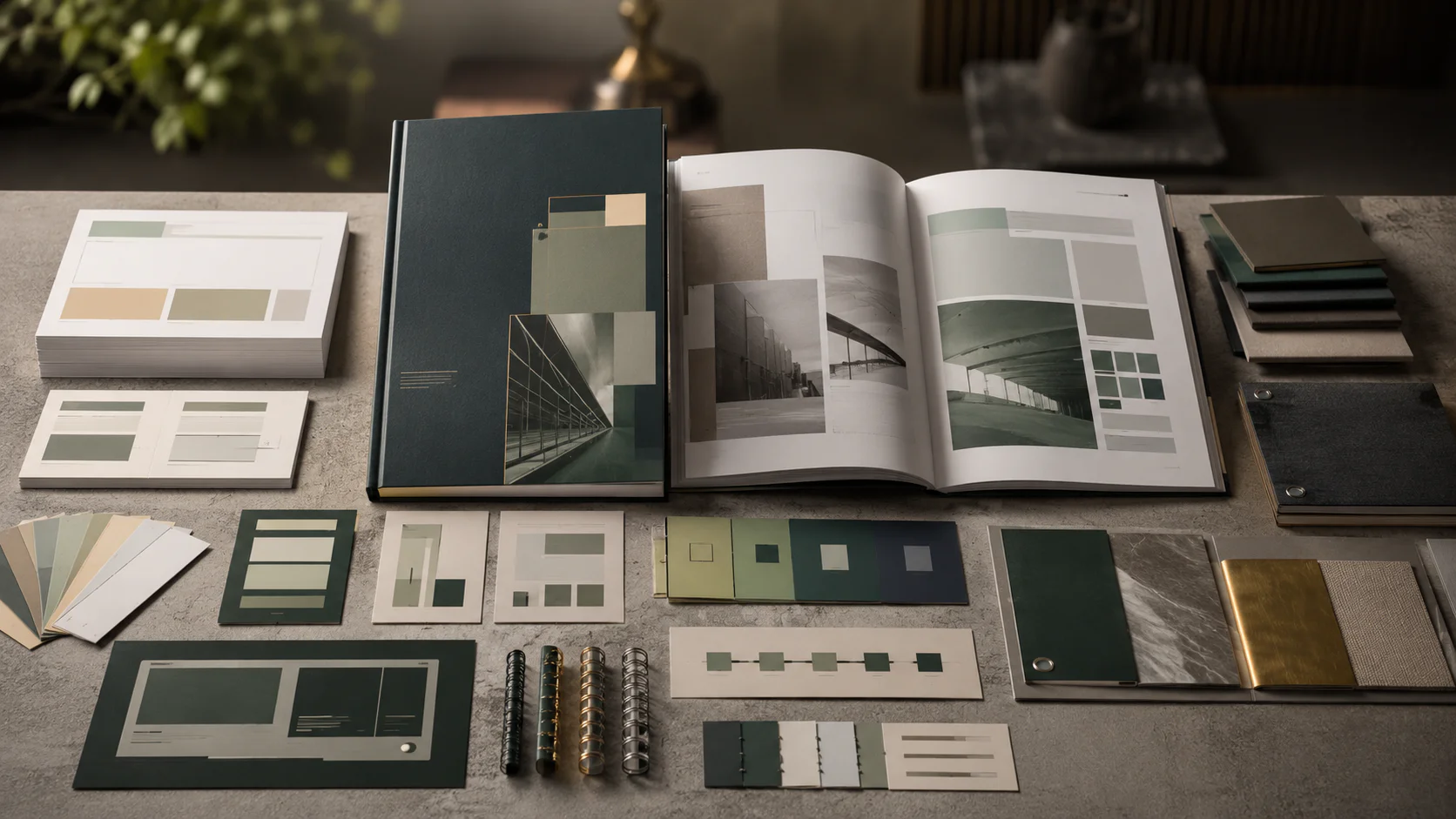
Printing paper types that work in Malaysian publications
Local printers carry a specific set of paper types, with names that do not always match international guides. Knowing the local terminology saves time at the quoting stage and avoids the wrong stock turning up on press. The 6 paper categories below cover most corporate publication work we ship.
1. Art paper (coated, inner pages)
Art paper is coated stock in the 80 to 170 GSM range, used primarily for inner pages of publications. It is coated on both sides (C2S) in either gloss, matt or silk. Malaysian printers stock art paper most commonly at 128 GSM and 157 GSM. This is the working choice for booklet interiors, magazine pages, brochure inserts, catalogue spreads and the inner pages of corporate annual reports.
Art paper reproduces photography and charts cleanly, holds vivid colour, and folds well for inserts. It is the default surface for any image-led inner page where colour fidelity matters more than tactile warmth.
2. Art card (coated, covers and standalone pieces)
Art card is the heavier sibling of art paper, ranging from 250 to 400 GSM. It is the cover stock for brochures, the body stock for business cards, postcards, presentation folders and any standalone printed piece that needs rigidity in the hand. Standard specifications in Malaysia are 250 GSM, 260 GSM, 310 GSM and 350 GSM.
The distinction between art paper and art card matters when ordering: art paper goes inside, art card goes on the outside. Mixing the terms on a quotation usually means a phone call from your printer to confirm what you actually want.
3. Simili paper (uncoated woodfree)
Simili is the Malaysian term for woodfree, uncoated offset paper. It ranges from 60 to 140 GSM and is made without mechanical wood pulp, giving it a smooth, natural surface that accepts pen and inkjet output well.
Simili is cost-effective, easy to read, lightweight and warm to the touch. It is the right choice for book interiors, training manuals, internal forms, letterheads and text-heavy reports where readability beats image reproduction. It is not the right choice for photo-led publications. Under press, ink absorbs into the fibres rather than sitting on top, so colours read softer and slightly muted compared to coated stock.
4. Premium textured papers (Conqueror, laid, linen, felt)
Textured stocks add a tactile dimension that no coated paper can replicate. Common Malaysian options include Conqueror laid, Conqueror wove, linen-finish board and felt-finish papers in the 100 to 350 GSM range. The texture is part of the brand impression: a Conqueror laid letterhead reads instantly as professional in a way that 80 GSM bond cannot match.
Textured paper hides minor print imperfections and adds sophistication to letterheads, certificates, premium business cards, invitations and limited-run anniversary publications. The trade-off is reduced image sharpness, so pair textured stock with typography-driven layouts rather than photo-heavy spreads.
5. Kraft and recycled paper
Kraft paper has a distinctive raw, unbleached brown appearance, ranges from 40 to 120 GSM, and is extremely durable. For corporate publications it works in niche applications: artisanal magazine covers, eco-conscious packaging inserts, gift wraps and zine-style booklets where the rough fibre is part of the visual story. Its texture limits fine detail, so keep designs simple when using it.
Recycled paper with post-consumer waste content sits next to kraft on the sustainability shelf. Recycled stock saves significant energy compared to virgin paper production and reduces landfill waste. The trade-off is slightly lower brightness and colour saturation, which suits text-focused sustainability reports better than photo-heavy promotional work.
6. Specialty stocks (synthetic, transparent, metallic)
For premium projects, Malaysian printers can source synthetic Yupo paper (waterproof, tear-resistant), translucent vellum (used as section dividers in coffee table books), pearlised papers and metallic-finish boards. These are short-run options that lift specific touchpoints in a publication: a translucent divider before a financial statements section in an annual report, a pearlised cover insert on a 50-copy commemorative book.
Specialty stocks should never carry an entire publication. Used sparingly and at the right moment, they create the production detail readers remember. Used across every spread, they read as overdesigned.
GSM weight: how to read the number on a print quote
GSM stands for grams per square metre, the universal weight measurement for paper across Malaysia and the rest of Southeast Asia. Higher GSM means thicker, heavier paper. Lower GSM means lighter, more flexible sheets. When a quotation says “157 GSM art paper inner, 310 GSM art card cover”, those two numbers together describe the entire body of the publication.
The breakdown below shows where each GSM band typically sits in corporate work.
| GSM range | What it is | Where it fits |
|---|---|---|
| 35 to 55 GSM | Newsprint | Newspapers, mass-printed periodicals |
| 60 to 90 GSM | Lightweight office paper | Internal memos, notebooks, basic book pages |
| 90 to 130 GSM | Standard letterhead and report paper | Letterheads, report interiors, booklet inserts |
| 130 to 170 GSM | Brochure inner stock | Flyers, leaflets, inner pages of brochures and annual reports |
| 170 to 200 GSM | Mid-range catalogue stock | Catalogue inner pages, premium flyers, double-sided handouts |
| 200 to 300 GSM | Light cardstock | Corporate report covers, premium flyers, magazine covers |
| 300 to 400+ GSM | Heavy cardstock | Business cards, hardcover wrappers, menus, premium folders |
When you specify GSM on a print order in Malaysia, there is no ambiguity about what you are asking for. “Premium feel” is a phrase printers cannot quote against. “310 GSM matt art card with matt lamination” is a specification a press operator can run.
Coated vs uncoated: the fundamental split
Every paper stock falls into one of two camps: coated or uncoated. This single decision shapes how your design reproduces under ink more than most other production variables.
Coated paper has a surface layer of clay or mineral coating. Ink sits on top of the coating rather than absorbing into the fibres, producing sharper images, brighter colours and higher contrast. Coated paper is the standard surface for brochure design, catalogue design, photography-led annual reports and any publication where photography and graphics need to reproduce with full clarity. It comes in three coating finishes: gloss, matt and silk.
Uncoated paper has no surface coating. Ink absorbs into the paper fibres, producing softer edges and more muted tones. The trade-off is readability: zero glare, comfortable for extended reading, accepts handwriting, embosses cleanly and feels warm in the hand. Uncoated stock is the right choice for letterheads, novels, training manuals, long-form reports and any publication where the reader spends 20+ minutes inside the document.
The 3 coating finishes inside the coated category each carry a different visual signal.
| Coating | Colour vibrancy | Readability | Fingerprint resistance | Recommended for |
|---|---|---|---|---|
| Gloss | High | Lower for long text | Lower (shows fingerprints) | Photo-heavy brochures, retail catalogues, posters |
| Matt | Moderate | High | Moderate | Annual reports, text-heavy publications, corporate folders |
| Silk or satin | High to moderate | High | Moderate | Mixed-content publications, magazines, modern annual reports |
For projects that blend financial charts with photography and narrative content, a matt or silk coating is the working default. It carries enough colour for the imagery without the glare that makes a glossy page hard to read under boardroom lighting. A 222-page integrated annual report like the Swift Haulage 2024 publication (covered in section 4 below) is a clean example of where a non-gloss coating earns its place.
3 real print production projects from Walk Production
The 3 projects below cover very different publication types: an integrated annual report, a healthcare commemorative coffee table book and a manufacturer’s product catalogue. The paper, finishing and binding specifications quoted in each case study are taken from Walk Production’s internal production records for that engagement. The same specification approach (driven by audience, environment and shelf life, not by personal preference) applies to every print job that leaves our office.
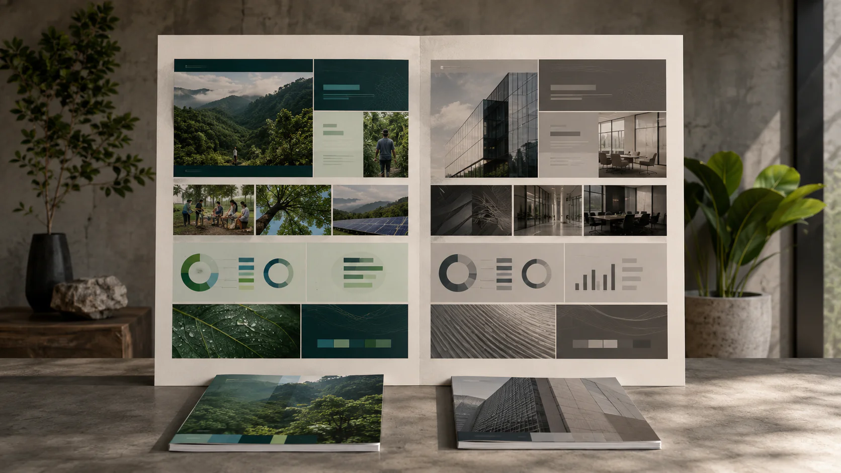
1. Swift Haulage Berhad 2024 Annual Report: an integrated report at 222 pages
Swift Haulage Berhad is a Bursa-listed integrated logistics provider. The 2024 annual report ran to 222 pages, combining traditional financial reporting with operational, sustainability and governance content in a single integrated publication. Walk Production handled the full scope: copywriting, sustainability statement writing, infographics, design and print production.
The print brief had to do two things at once. The financial section needed comfortable readability across dense data tables. The operational and sustainability sections needed clean photography and infographic reproduction. Our actual production specification was 120 GSM art paper for the inner pages, heavy enough to feel substantial on every spread and restrained enough to keep the audited financial statements glare-free under boardroom lighting. The cover ran on 310 GSM art card with matt lamination, the working corporate finish for a listed-company annual report intended for a boardroom shelf.
At 222 pages, this is a clear thread-sewn job (our working rule above 80 pages, applied to any annual report unless the client specifically requests perfect binding to lower the cost). The sewn block draws into a softcover spine that carries the company name, the reporting year and the corporate logo, all visible when the report is shelved next to the previous year’s edition. Print production on a project of this scope is managed end to end from pre-press through delivery, with colour proofs run on the production stock before the full press run is approved.
2. Medivest commemorative coffee table book: built for weight and longevity
Medivest is a healthcare facilities management provider serving Malaysia’s public hospitals. The commemorative coffee table book documented the company’s contribution to the national healthcare infrastructure: a publication built for stakeholders, client presentations and organisational archives, not for circulation as a marketing brochure.
The brief called for weight, longevity and tactile impression. Our actual production specification was a rigid hardcover, with matt lamination on the printed cover wrap and spot UV on the title block to draw the eye on a desk. The inner pages ran on 120 GSM matt art paper, heavy enough to feel solid on every page turn and matt enough to reproduce the curated hospital-operations photography without glare. The text block was bound with thread-sewn signatures (our default for publications above 80 pages and the only construction we trust on a book intended to last decades).
Case binding is the right format for a publication of this kind. The book has to last decades, sit on a desk as a credibility piece, and feel substantial when picked up. A hardcover construction with matt lamination, spot UV on the title and a thread-sewn 120 GSM matt art paper inner signals that the content inside is worth the reader’s attention before a single page is turned.
3. Samling Frontiera door catalogue: a photo-led catalogue for trade buyers
Samling is a Malaysian door manufacturer producing the Frontiera range for residential and commercial applications. The Frontiera catalogue is a sales tool used by trade buyers, architects and specifiers comparing door options across timber grain, finish and dimensional data.
The brief leaned hard on photographic consistency. Our actual production specification was a 310 GSM art card cover and 120 GSM art paper inner pages, chosen to keep colour reproduction consistent across all product finishes while giving each page enough weight to survive repeated handling on showroom counters and at trade exhibitions.
Generous safe zones, in the order of 7 mm from trim on all pages, protected the technical drawings and dimension specifications from being clipped at the trim. At this page count the catalogue ran on saddle-stitch binding (our working rule for any publication under 32 pages), which keeps the cost down, lets the catalogue lay flat on a counter and removes the spine-cracking risk that perfect binding introduces on a sales tool that gets opened all day. A thicker catalogue would shift to perfect binding (under 80 pages) or thread-sewn binding (above 80 pages).
The pattern across all 3 projects is consistent. The specification follows the use case. A 222-page listed annual report, a commemorative coffee table book and a trade-buyer catalogue need 3 different stocks, 3 different bindings and 3 different finishing approaches. There is no universal “premium” specification. There is only the right specification for the job. More projects across other sectors sit in the annual report portfolio, coffee table book portfolio and publication portfolio.
Paper specifications by publication type
Different corporate publications have different demands. The table below summarises the working specifications our production team uses as the starting point for each format. Final numbers move based on page count, photography density, distribution environment and budget.
| Publication | Cover stock | Inner stock | Coating | Typical binding |
|---|---|---|---|---|
| Annual report (any size) | 250 to 350 GSM coated | 100 to 150 GSM coated | Matt or silk | Thread-sewn (perfect bound only on client request) |
| Sustainability report (any size) | 250 to 300 GSM coated or recycled | 100 to 130 GSM coated or recycled | Matt or silk | Thread-sewn (perfect bound only on client request) |
| Company profile (under 32 pages) | 250 to 310 GSM coated | 128 to 157 GSM coated | Silk or matt | Saddle-stitch |
| Company profile (32 to 80 pages) | 250 to 310 GSM coated | 128 to 157 GSM coated | Silk or matt | Perfect bound |
| Company profile (above 80 pages) | 250 to 310 GSM coated | 128 to 157 GSM coated | Silk or matt | Thread-sewn |
| Coffee table book (under 80 pages) | 300 to 400 GSM coated | 120 to 170 GSM coated | Matt, silk or satin | Perfect bound or sewn softcover |
| Coffee table book (above 80 pages) | Hardcover board with printed wrap | 120 to 170 GSM coated | Matt, silk or satin | Case binding (hardcover) |
| Product catalogue (under 32 pages) | 250 to 310 GSM coated | 120 to 200 GSM coated | Silk or gloss | Saddle-stitch |
| Product catalogue (32 to 80 pages) | 250 to 310 GSM coated | 120 to 200 GSM coated | Silk or gloss | Perfect bound |
| Brochure (single fold) | 150 to 200 GSM coated, single stock | Same as cover | Gloss or silk | Folded, no binding |
| Letterhead | None | 90 to 100 GSM woodfree or premium bond | Uncoated | None |
| Business card | 260 to 350 GSM art card, single stock | Same as cover | Matt (with optional spot UV or foil) | None |
Three specification notes worth flagging. First, on annual reports and sustainability reports running heavy data, matt or silk coated paper handles charts and tables without the glare gloss introduces, and reads cleanly under the office and boardroom lighting where most readers will open the document. Second, all corporate reports (annual, sustainability and integrated) default to thread-sewn binding at any page count, not just above 80 pages: see the binding section below for the reasoning behind that rule. Third, on coffee table books above 80 pages, hardcover (case binding) is Walk Production’s working specification: the publication is intended to last decades on a desk, and only a hardcover construction over a sewn block survives that lifespan. Lay-flat binding is a separate question, layered on top of either a sewn softcover or a sewn hardcover block when the design relies heavily on full-spread photography that crosses the gutter.
Print finishing techniques that add a professional edge
Finishing is the layer between printed sheet and finished publication. The right finish turns an ordinary print job into a tactile object the reader keeps. The wrong finish, or the right finish on the wrong stock, looks cheap. The 6 finishing techniques below cover most corporate publication finishes we run.
1. Lamination (matt, gloss, soft-touch)
Lamination is a thin film bonded to the printed sheet, protecting the surface and changing the tactile feel. Three options dominate corporate work in Malaysia.
| Lamination | Effect | Typical use |
|---|---|---|
| Matt lamination | Reduced glare, corporate look, fingerprint-resistant | Annual report covers, business cards, brochure covers, folder covers |
| Gloss lamination | High shine, stronger colour contrast | Retail brochures, promotional flyers, photo-heavy catalogues |
| Soft-touch lamination | Velvety, suede-like surface | Premium covers, luxury brochures, high-end business cards, coffee table book covers |
Matt lamination is the most popular cover finish for Malaysian corporate publications. It reads as restrained and professional, holds up to handling, and serves as the base layer for spot UV contrast effects. Soft-touch lamination is increasingly the choice on premium covers where the unboxing moment matters, paired with foil or spot UV on the title block.
2. Spot UV coating
Spot UV applies a high-gloss varnish to selected areas of a matt-laminated surface. The contrast between matt ground and glossy raised varnish draws the eye to logos, headings, key graphics or background patterns. Spot UV works cleanly on coated art card but struggles on heavily textured uncoated stock, where the varnish does not bond evenly.
Expect 1 to 3 additional working days on the production schedule and a cost increase of roughly 20 to 50 percent over standard matt lamination. For a Malaysian annual report cover, matt lamination plus spot UV on the company logo and the year is one of the most common finishing combinations in current use.
3. Foil stamping
Foil stamping uses heat and pressure to bond a thin metallic or coloured foil to the paper surface. Gold, silver, rose gold, copper and holographic foils are widely available through Malaysian trade printers. Foil bonds cleanly to smooth coated surfaces and to firm uncoated boards, but adheres unevenly on rough textured stocks.
The cost includes both the foil run and a custom die. Small-format dies (business card size) typically run RM 80 to 200; larger dies (cover-format) run higher. Add 2 to 4 working days to the production schedule, plus an approximate 30 to 70 percent cost increase over the unfoiled version. Gold or silver foil on a matt cover creates an immediate premium impression and is the standard finishing choice for commemorative publications.
4. Embossing and debossing
Embossing raises elements from the paper surface. Debossing presses them in. Both techniques work on coated and uncoated stocks, though thicker coated papers (300 GSM and above) hold the impression more crisply. Both pair well with foil stamping for a layered tactile finish.
Add 2 to 4 working days for embossing or debossing, plus die fabrication costs. The cost increase is typically 10 to 25 percent above the unembossed version, plus the one-time die cost. Embossed monograms on Conqueror laid letterheads, debossed logos on cotton business cards, and blind embossing (no foil) on case-bound book covers are the three patterns we use most often.
5. Die-cutting and shaped pieces
Die-cutting allows the printed piece to be trimmed to a custom shape rather than rectangular dimensions. Common uses include shaped business cards, presentation folders with curved edges, stepped catalogue dividers and packaging templates. Add 1 to 3 working days and a die cost (RM 200 to 800 depending on complexity). Always request the cutter guide template from the printer before starting artwork on any die-cut piece.
6. Specialty finishes (edge painting, tipped-in inserts)
Edge painting (colour applied to the trimmed edges of a stack of pages) appears mostly on premium business cards and limited-edition publications. Tipped-in inserts (a separate sheet glued onto a host page) appear in coffee table books and corporate gift publications. Both are short-run finishes that sit outside standard production. Confirm capability with your printer before specifying.
Finishing turnaround summary
| Finish | Additional time | Approximate cost impact |
|---|---|---|
| Gloss or matt lamination | 0 to 1 day | Minimal |
| Soft-touch lamination | 1 to 2 days | +15 to 30 percent |
| Spot UV | 1 to 3 days | +20 to 50 percent |
| Foil stamping | 2 to 4 days | +30 to 70 percent (including die) |
| Embossing or debossing | 2 to 4 days | +10 to 25 percent plus die cost |
| Die-cutting | 1 to 3 days | Varies by die complexity |
Plan your timeline around these additions. A business card with matt lamination, spot UV on the logo and a foiled brand mark needs 4 to 6 extra working days compared to a plain printed card.
Booklet binding methods and when to use each
Binding is the first physical decision that shapes how a reader holds and opens a publication. Choose the wrong binding and the failures are visible. Pages crack on heavy folds. Spines have no room to print the company name. An annual report falls apart on its second year on the boardroom shelf. The 5 binding methods below cover most corporate publication work Walk Production runs in Malaysia, and the page-count rules are based on actual production practice in our office, not on the maximum a press can technically handle.
1. Saddle-stitch (under 32 pages)
Sheets are folded in half and stapled along the centre fold. Page count must be divisible by 4 (each physical sheet folds into 4 pages). The press limit goes higher, but Walk Production’s working rule is to stay under 32 pages on saddle-stitch, because thicker stitched booklets start to splay open, lose their shape on the shelf, and develop visible “creep” where inner pages appear shorter than outer ones after trim.
When to use: thin brochures, short company profiles under 32 pages, thin product catalogues, event programmes, catalogue inserts. The lowest-cost binding option. Pages open flat, full spreads cross the gutter cleanly, and there is no spine, which means no shelf presence.
2. Perfect binding (under 80 pages)
Pages are gathered as individual sheets, the spine edge is roughened, and the text block is glued into a wrap-around cover with flexible adhesive (typically PUR for better page-pull strength). The result is a flat spine that can carry a title and a logo.
Industry book printing references put the workable page-count range for perfect binding at 48 to 600+ pages, with the optimal range around 100 to 400 pages. The technical limit is generous. Walk Production’s working rule, based on years of supervising annual reports and corporate publications that get opened and re-opened across their boardroom life, is to stay under 80 pages on perfect binding. Above 80 pages, an adhesive-only spine carries enough risk over the publication’s life that we recommend thread-sewn binding instead, even where perfect binding is technically capable. This is our internal conservative threshold, not an industry-wide rule.
When to use: company profiles between 32 and 80 pages, product catalogues between 32 and 80 pages, and any non-corporate-report publication under 80 pages where cost matters more than 10-year durability. Spine width depends on paper caliper, leaf count, cover stock and binding style: ask the printer for a calculated spine width on the actual specification before locking the cover artwork. Note: annual, sustainability and integrated reports do not sit in this category. Walk Production specifies thread-sewn binding on every corporate report by default, regardless of page count, for the durability reasons covered in the thread-sewn section below.
3. Thread-sewn binding (corporate reports and long-life publications)
This is the binding method most corporate publication readers do not know by name but recognise immediately when they hold one. Pages are folded into signatures (typically 16 or 32 pages each), then a sewing machine drives thread through the fold of each signature and loops through to the next. The sewn text block is then either drawn into a softcover (sewn softcover) or cased into a hardcover board (sewn hardcover, also called Smyth-sewn case binding).
The difference at the spine matters. In perfect binding, only glue holds the page edges to the spine: repeated opening fatigues the glue line and pages eventually drop out. In thread-sewn binding, each page is mechanically locked into its signature by thread, and the signatures are locked to each other. Glue, where present, is supplementary, not load-bearing. This is why library and archival standards (ANSI/NISO/LBI Z39.78) specify section-sewn binding as the durable benchmark.
Walk Production strongly recommends thread-sewn binding for all corporate report clients (annual reports, sustainability reports and integrated reports), and for any publication above 80 pages. This is not a theoretical preference. We have seen perfect-bound corporate reports lose pages over their multi-year life on a boardroom shelf, where the adhesive spine fatigues under repeated opening and individual pages drop out of the block. Thread-sewn binding removes that risk: each page is mechanically locked into its signature, the signatures are locked to each other, and a report can be opened and re-opened for years without spine failure. It is the default we specify on every corporate report, unless a client specifically asks for perfect binding to lower the cost.
When to use: annual reports, sustainability reports, integrated reports (any page count), premium company profiles above 80 pages, and any publication intended to outlast standard perfect-bound shelf life. Pages lay significantly flatter than perfect-bound work, the spine survives daily handling, and the binding holds across the full page-count range that defeats perfect binding.
Cost and time: roughly 20 to 50 percent more per unit than perfect binding, with an additional 3 to 5 working days on the production schedule for the sewing step.
4. Case binding / hardcover (coffee table books above 80 pages)
Case binding refers to the cover construction: a sewn text block (or a glued one, on lower-end work) is cased into rigid boards wrapped in cloth, printed paper or specialist material. This is the classic hardcover book format. When paired with thread-sewn signatures inside, it is the most durable construction in commercial bookbinding.
Walk Production specifies hardcover (case binding) for any coffee table book above 80 pages, and routinely on commemorative publications, anniversary editions and flagship annual reports where the physical object itself needs to communicate significance. Endpapers, cover finishes (foil, deboss, soft-touch lamination) and spine treatments all become design opportunities the softcover formats do not offer.
When to use: coffee table books above 80 pages, anniversary publications, commemorative editions, premium corporate gifts, flagship annual reports where the brief calls for the publication to function as a corporate gift. Cost runs roughly 50 to 100 percent above the equivalent perfect-bound version. Heavier, takes longer to produce, not practical for internal documents or frequently updated materials.
5. Wire-O, spiral and lay-flat (special-purpose binding)
Three special-purpose binding formats round out the toolkit.
Wire-O and spiral thread continuous plastic coil or C-shaped metal wires through punched holes along the binding edge. Pages rotate 360 degrees and lie completely flat on a desk. Use for training manuals, operations handbooks, calendars and presentation packs where the document must stay open flat while the reader’s hands are occupied. Wire-O reads more professional than plastic spiral. Neither is appropriate for investor-facing or client-facing publications: the aesthetic reads as functional, not premium.
Lay-flat binding glues each signature to a cloth or paper spine strip rather than to the adjacent signature. Because no signature is attached directly to the next, each section opens completely flat with no gutter gap. A premium alternative for photo-heavy coffee table books and portfolio books where two-page image spreads must display without interruption. Costs more than standard case binding, takes longer, and is not a standard capability at every Malaysian printer. Confirm before specifying.
Quick decision table (Walk Production’s working rules)
| Publication | Page count | Recommended binding |
|---|---|---|
| Brochure or company profile | Under 32 pages | Saddle-stitch |
| Product catalogue | Under 32 pages | Saddle-stitch |
| Product catalogue | 32 to 80 pages | Perfect binding |
| Company profile | 32 to 80 pages | Perfect binding |
| Annual report (any size) | Any | Thread-sewn (perfect bound only on client request) |
| Sustainability report (any size) | Any | Thread-sewn (perfect bound only on client request) |
| Integrated report (any size) | Any | Thread-sewn (perfect bound only on client request) |
| Company profile | Above 80 pages | Thread-sewn (sewn softcover) |
| Coffee table book | Under 80 pages | Perfect binding or sewn softcover |
| Coffee table book | Above 80 pages | Case binding (hardcover) |
| Commemorative or anniversary publication | Any | Case binding (hardcover) |
| Training manual, calendar | Any | Wire-O or spiral |
| Photo-heavy publication needing flat spreads | Any | Lay-flat or sewn case |
LFG (Lianson Fleet Group Berhad) 2024 annual report is one example of a listed-company annual report where the spine carries the company name and reporting year alongside the corporate identity, then sits on a boardroom shelf for the next 12 months until the following year’s edition takes its place. The spine is part of the design brief, not an afterthought, and the binding has to outlast that 12-month cycle several times over. Thread-sewn binding is the construction that handles that lifespan.
Final artwork file preparation for Malaysian printers
Most reprint stories in our experience have nothing to do with creative quality. They are prepress failures: missing bleed, RGB files sent to a CMYK press, a black logo set with overprint enabled that vanished into the background, a font substitution that broke the layout. The 5 specifications below are the rules every Malaysian printer expects on every job.
1. Colour mode: CMYK for offset, RGB allowed on short digital runs
Standard offset print jobs in Malaysia run in CMYK (Cyan, Magenta, Yellow, Black). RGB is the colour model for screens. When an RGB file reaches an offset press, the RIP software converts it to CMYK automatically, and the conversion typically shifts saturated blues, vibrant greens and rich reds toward duller versions.
For offset runs, design in RGB if you need flexibility, then convert to CMYK using the correct ICC profile before exporting the final PDF. Converting with eyes on the file lets you correct any colours that drift during conversion. The two profiles to know:
- Coated stock: FOGRA39 (ISO Coated v2). The most widely accepted profile for gloss, matt and silk coated papers.
- Uncoated stock: FOGRA47 or FOGRA52. Produces flatter, warmer tones appropriate for uncoated surfaces.
The digital short-run exception. For print orders below 50 units, Walk Production usually runs the job on a digital press rather than offset, both because the per-unit cost is lower at that quantity and because modern digital presses (HP Indigo and similar) accept RGB files directly and produce noticeably brighter colour than 4-colour CMYK offset. The press’s RIP handles colour management with a media-specific ICC profile, and the press itself reaches a wider gamut than CMYK offset (HP Indigo, for example, supports up to 7 ink stations and reproduces around 97 percent of the Pantone solid coated library). Submitting RGB on a short digital run with an embedded sRGB or Adobe RGB profile is the working approach for short orders where colour vibrancy matters: business cards in small batches, sample brochures, prototype catalogues, internal-launch invitations.
If your brand uses Pantone spot colours, confirm whether the printer will run actual Pantone inks or simulate them through CMYK. Even an HP Indigo simulation gets close, but does not match true Pantone for brand-critical work. Request a colour proof on the production stock before approving a full run on either offset or digital.
2. Resolution: 300 DPI at final size
All images must be 300 DPI at the final printed size for standard commercial materials: brochures, business cards, catalogues, annual report inner pages, folder panels. Web images at 72 to 150 DPI print blurry and pixelated. Source the high-resolution originals before files reach the layout stage.
| Print type | Required DPI | Why |
|---|---|---|
| Standard commercial (cards, brochures, catalogues, reports) | 300 | Viewed at close range |
| Large format (billboards, exhibition backdrops) | 150 | Viewed from several metres away |
| Line art and technical drawings | 400 to 600 | Fine detail requires higher resolution |
3. Bleed: 3 mm on every edge
Bleed is the area extending beyond the final trim line. Malaysian printers as a rule require 3 mm bleed on all sides. An A4 flyer at 210 x 297 mm trim should measure 216 x 303 mm with bleed included. If a background image stops at the trim line, any cutting variation exposes a white strip along the edge: the flyer is unusable.
Safe zone (the inner margin where critical content must sit) varies by publication:
| Material | Safe zone (from trim) |
|---|---|
| Business cards | 4 mm on all sides |
| Flyers | 5 mm on all sides |
| Brochures | 5 mm from trim, 5 to 7 mm from fold lines |
| Annual reports and catalogues | 7 mm from trim, 10 mm from spine on perfect-bound work |
| Corporate folders | 7 to 10 mm from trim and fold lines |
4. PDF format: PDF/X-1a or PDF/X-4
PDF/X-1a is the safest, most widely accepted format across Malaysian print vendors. All colours must be CMYK or spot, transparency is flattened, and compatibility runs broadly across local RIP systems. PDF/X-4 supports live transparency and ICC colour management; preferred by newer print shops and the right call for gradient-heavy designs. Confirm with the printer which standard they expect before exporting.
Embed all fonts in the PDF or outline them. Avoid faux bold and faux italic styles where the software simulates a weight that does not exist in the font family. These break during output. If sending native files (InDesign or Illustrator), use the Package function to include all linked fonts and images.
5. Black settings: K100 for text, rich black for backgrounds
Small text and fine lines should run K100 only (C0 M0 Y0 K100) with overprint ON. Large solid black backgrounds should run rich black (C60 M40 Y40 K100) with overprint OFF. Mixing these up is one of the most common reprint causes we see.
| Element | Black formula | Overprint setting |
|---|---|---|
| Small text and fine lines | K100 only (C0 M0 Y0 K100) | Overprint ON |
| Large solid backgrounds | Rich black (C60 M40 Y40 K100) | Overprint OFF |
| Barcodes and QR codes | K100 only | Default |
Rich black on small text causes registration problems and fuzzy edges. Keep body copy at pure K100. Reserve rich black for large background areas where extra ink density creates deeper, more even coverage. Always check overprint preview in InDesign or Illustrator before exporting: white objects accidentally set to overprint will vanish on press.
Sample print specification: 100-page thread-sewn annual report
Corporate stationery suites: letterhead, namecard, envelope
A stationery suite (letterhead, business card, envelope, compliments slip, presentation folder) is a family of materials built from the same visual DNA. The technical specifications below are the standard for Malaysian corporate stationery work, used as part of full corporate identity rollouts our team handles for clients.
| Item | Standard size | Recommended GSM | Typical stock |
|---|---|---|---|
| Letterhead | 210 x 297 mm (A4) | 90 to 100 GSM | Woodfree or premium bond (Conqueror for premium brands) |
| Business card | 90 x 54 mm | 260 to 350 GSM | Coated art card, matt lamination standard |
| Compliments slip | 99 x 210 mm (DL) | 90 to 120 GSM | Woodfree to match letterhead |
| DL envelope | 110 x 220 mm | 80 to 100 GSM | Offset bond, often window envelope for invoices |
| C5 envelope | 162 x 229 mm | 80 to 100 GSM | Offset bond, fits A5 documents |
| C4 envelope | 229 x 324 mm | 100 to 120 GSM | Offset bond, fits A4 documents flat |
| Presentation folder | 220 x 310 mm closed | 300 to 350 GSM | Coated art card, matt lamination, often with spot UV or foil |
| Notepad cover | 148 x 210 mm (A5) | 250 to 300 GSM | Coated art card |
Three working notes on stationery production. First, the Malaysian business card standard is 90 x 54 mm, slightly different from the EU (85 x 55 mm) and US (89 x 51 mm) sizes. If designing cards for a multinational team, confirm which standard the printer will use before setting up artwork. Second, bilingual cards (English on one side, Bahasa Malaysia, Simplified Chinese or Tamil on the reverse) read as a gesture of cultural awareness in the Malaysian business environment and are increasingly common across professional services and B2B work. Third, official company stationery should display the company registration number from the Companies Commission of Malaysia (SSM), in line with display requirements under the Companies Act 2016. Confirm the exact placement and form with your printer or company secretary against current SSM guidance for your entity type.
Sample print specification: corporate stationery suite
The Malaysian humidity factor
Malaysia’s tropical climate is a production variable that international guides rarely cover. Relative humidity in Malaysia typically runs at 70 to 90 percent through most of the year, and rises further during the monsoon, as the Malaysian Meteorological Department records. Paper absorbs moisture readily at those levels, leading to four production problems we see on print runs that ignore the issue.
- Curling and buckling. Paper that has absorbed moisture from the warehouse air curls toward the wetter side. Sheets entering the press with curl jam in the feeder, mis-register on multi-pass jobs, and trim unevenly at the cutter.
- Ink adhesion failure. Coated stock that has absorbed moisture rejects ink at the trailing edge. The print looks fine on the first 100 sheets and drifts off-colour by sheet 500.
- Registration drift on multi-pass jobs. A 4/4 CMYK job runs the sheet through the press in 4 colour passes. If the paper expands between passes due to moisture, the colours register out of position and the image goes soft.
- Mould growth on stored stock. Print runs sitting in unconditioned warehouses for weeks before distribution can develop visible mould on the edges, especially during the November to February monsoon period.
The fix is acclimatisation discipline. Paper should be stored in climate-controlled environments below 50 percent relative humidity. Before a print run, the stock should sit in the press room for 24 to 48 hours to equalise to the ambient temperature and humidity. Long-distribution print runs, especially those bound for outdoor or coastal storage, benefit from lamination as a moisture barrier on the printed surface.
These are not theoretical concerns. On long monsoon-season print runs we have supervised, unacclimatised stock has caused sheet jams, uneven ink coverage and reprinted runs that pushed delivery past the AGM deadline. Spending a day on acclimatisation prevents days of production trouble.
Sustainable paper and inks for corporate publications
More Malaysian organisations now request environmentally responsible paper for corporate publications, particularly for annual reports, sustainability reports and CSR-led commemorative work. The 3 areas below are where production specifications can carry the sustainability story without compromising the finished publication.
FSC and PEFC certification. The Forest Stewardship Council (FSC) and the Programme for the Endorsement of Forest Certification (PEFC) are the two main frameworks for verifying responsibly managed forest sourcing, both recognised globally as the leading voluntary forest certification systems tracked by the FAO. FSC and PEFC use different certification approaches. FSC is often specified when the brief needs stronger chain-of-custody signalling; PEFC is also widely recognised through national certification systems and sits behind PaperOne, a brand of APRIL Group widely used in Malaysia. Specifying “FSC-certified 128 GSM silk art paper” on the print order is enough; the printer’s stock supplier carries the certification documentation.
Recycled paper with post-consumer waste content. Recycled stock saves significant energy compared to virgin paper and reduces landfill waste. The trade-off is slightly lower brightness and reduced colour saturation, which suits text-focused sustainability reports better than photo-heavy promotional brochures. Available in coated and uncoated grades through most Malaysian print vendors, often at a small premium over virgin equivalents.
Soy-based inks. Soy-based inks contain fewer volatile organic compounds than petroleum-based alternatives within the ink itself, a difference documented in US EPA research on soybean-based ink emissions. The same study notes that press-room cleaners and solvents account for a larger share of total air emissions than the ink, so switching to soy ink alone reduces overall press-room emissions by less than 1 percent in many setups. The benefit is real but narrow. Soy inks perform well on both coated and uncoated stocks and are available through most commercial Malaysian printers at minor cost difference. Pair soy inks with FSC-certified stock and lower-VOC cleaning solvents when the publication’s content is itself a sustainability statement: a sustainability report printed on virgin coated stock with petroleum-based inks reads as an unforced own-goal.
When sustainability is part of the publication’s message, the paper specification becomes part of the story. A printed colophon at the back of the publication noting “Printed on FSC-certified 128 GSM silk art paper with soy-based inks” reinforces the content with a tangible production commitment. For listed companies and GLCs producing annual and sustainability reports together, the print specification often sits inside a wider publication scope shaped by Bursa sustainability reporting requirements, where FSC certification, recycled content and soy-based ink decisions are part of how the corporate publication makes its environmental commitments tangible.
Common print production mistakes that cause reprints
After years of coordinating print production for Malaysian clients, the same mistakes appear on the files we receive at the start of new engagements. The 6 below cover most reprints we see.
1. Sending RGB files to an offset printer. The automatic CMYK conversion shifts colours unpredictably. For offset jobs (typically runs above 50 units), always convert to CMYK using the correct ICC profile before exporting the final PDF. If the brand uses a saturated blue or vibrant green, the colour shift on conversion will be visible. Short digital runs are the exception: see the colour-mode section above.
2. Missing or insufficient bleed. If a background image stops at the trim line, any cutting variation exposes a white strip along the edge. Add 3 mm bleed to every page on every edge, every time.
3. Low-resolution images. Visuals pulled from websites, email attachments or stock previews produce visible pixelation in print. Source high-resolution originals at 300 DPI minimum at final printed size. A 600 px wide web image cannot be enlarged to fill an A4 page without breaking apart on press.
4. Rich black on small body text. Four-colour black on small text causes registration problems, creating coloured halos around letters. Use K100 only for body text. Reserve rich black for large background areas only.
5. Ignoring fold cracking on heavy stock. Coated paper above 200 GSM can crack along fold lines, exposing white fibres along the spine of a folded brochure. Ask the printer to apply score lines before folding and request a crease test on the production stock before approving a full run.
6. PowerPoint or Canva exports sent to offset printers. These tools lack proper CMYK conversion, font embedding and bleed settings. Files exported from PowerPoint and dropped into a print quotation typically need to be rebuilt in InDesign or Illustrator before they are press-ready. Build print artwork in print-grade software from the start.
Walk Production’s print intake checklist
Before any print job moves to plate, our production team walks through 6 questions with the client. The answers determine the specification, the cost and the timeline. We do not quote a print job until these are answered, because quoting without them is a guess.
- Publication type and page count. Annual report, sustainability report, company profile, coffee table book, catalogue, brochure, stationery suite. Page count, including covers. Page count drives binding choice and cost more than any other variable.
- Audience and use case. Where the publication will be opened: boardroom, AGM hand-out, trade exhibition, post-meeting send-along, corporate gift, retail display. The use case drives stock weight, finishing and binding.
- Print run quantity. 50, 200, 500, 1,000, 5,000+. Below 50 copies, Walk Production runs the job on a digital press: lower per-unit cost at that quantity, and the press accepts RGB files for brighter colour. 50 to 500 copies, digital still handles most jobs cleanly with CMYK files. Above 1,000, offset becomes cost-effective. Above 5,000, offset is usually the working choice.
- Paper preferences and constraints. FSC certification required, recycled content required, specific brand stock (Conqueror, PaperOne) requested, weight constraints for postal mailing.
- Finishing requirements. Lamination type, spot UV, foil, embossing, die-cut shapes. Finishing decisions affect both timeline (each finish adds 1 to 4 working days) and cost (each finish adds 10 to 70 percent over the unfinished version).
- Delivery date and location. AGM date, tender submission deadline, exhibition open date, distribution address. Delivery date drives the entire production schedule backwards: design lock, file release, press date, finishing, delivery.
These 6 answers usually take a 30-minute scoping call to gather. The call also surfaces the constraints that matter most: board approval windows, listing-disclosure timing, tender deadlines, AGM dates, monsoon-season distribution risks.
Where to start
If your current print specification is being set by the printer rather than by the design brief, the publication is being shaped by what is convenient at press, not by what is right for the audience. The right specification on the right paper with the right finishing is not more expensive than guessing. It is usually less expensive, because it removes the reprint risk that comes from running a job no one specified properly.
Talk to us when you have a publication brief and a target delivery date. Or send the previous year’s printed copy, and we will use it as the reference for the intake call. The annual report portfolio, coffee table book portfolio, catalogue portfolio and wider publication portfolio show recent publication work across SMEs, corporates and government clients in Malaysia.