Introduction
The Asian Productivity Organization (APO) is an intergovernmental organisation in the Asia-Pacific region, working to improve productivity across its member economies. Walk Production was appointed to design its 2022 annual report.
The annual report design scope covered conceptualisation, art direction, layout design and infographic development. The objective was to present a year of productivity initiatives and outcomes through a publication that balances data clarity with visual storytelling across all sections.
Our Solutions
Concept and art direction
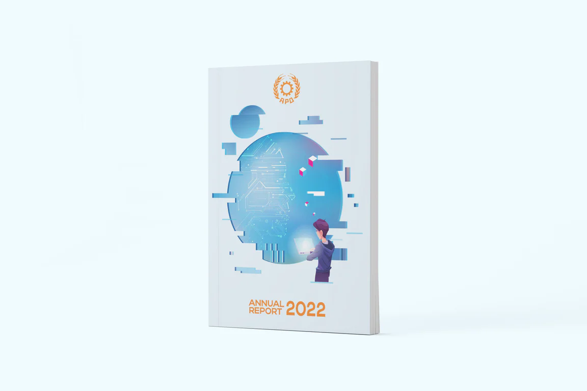
The design concept centred on the theme of productivity and regional progress, reflecting the organisation’s mission across diverse economies. A blue and teal colour palette was selected to convey trust and institutional stability. Clean geometric graphics provided a consistent visual language throughout the report, connecting section dividers and chapter openers into a unified treatment. Pattern elements drew from productivity-related imagery to reinforce the annual theme.
The art direction balanced corporate tone with accessibility, using structured layouts and clear typographic hierarchy to guide readers through programme summaries, regional data and cooperative highlights. Photography and graphic treatments represented the diversity of member economies while holding visual consistency across chapters. Spacing and white space were managed carefully to keep data-heavy sections from feeling crowded.
Layout design and visual narrative
The annual report layout was structured to present content across logical sections, from organisational overviews to programme-specific outcomes. Each section used consistent formatting to help readers navigate between topics such as governance, capacity building and multilateral cooperation. Chapter openers featured full-width imagery paired with introductory text to establish context before detailed content.
Photography and graphical elements humanised the data-heavy content, building a narrative that connects regional policy with on-the-ground initiatives. Pull quotes, sidebars and visual callouts highlighted individual country contributions and programme milestones. This layered approach lets readers scan for key information or read in depth depending on their needs, and the page grid held tables and charts without disrupting the reading flow.
Infographic development
Custom infographic design was developed to translate statistical data into visual summaries. These included programme participation figures, publication outputs and regional cooperation metrics presented through charts, icons and data callouts. Each infographic followed a consistent design system that matched the overall report aesthetic and colour palette.
The infographic approach makes productivity data accessible to a broad audience, from government officials to academic researchers, without oversimplifying the content. Comparison graphics show year-on-year trends while country-level data uses map-based visuals to communicate geographic distribution. Progress indicators track programme targets against actual outcomes, providing accountability and transparency for stakeholders reviewing the organisation’s annual performance.
The Results
The completed annual report presents the APO’s 2022 work through a structured visual format that communicates both breadth and depth of regional programmes. The publication covers training initiatives, research outputs and cooperative projects across member economies in a format that supports quick reference and detailed reading alike.
The report serves as a reference document for member economies, stakeholders and international partners. By combining data-driven content with structured design, the publication reflects the organisation’s role in Asia-Pacific productivity development. It provides a record of the year’s collaborative outcomes and sets a visual benchmark for future annual reporting cycles.
Related Questions
Why does APO publish an annual report for an international stakeholder base?
APO’s stakeholders include member economy governments, academic institutions, private sector organisations and international partners across the Asia-Pacific region. An annual report gives that stakeholder base a single document that records the year’s programmes, research and cooperative outcomes. It is also the reference document partners cite when working on follow-on initiatives with APO.
How does the APO annual report design handle multi-country data?
Country-level data uses map-based visuals to communicate geographic distribution, while comparison graphics show year-on-year trends across member economies. Progress indicators track programme targets against actual outcomes. Together these visual elements give readers both the regional view and the country-level detail without forcing them to read through long data tables.
What sits inside the APO 2022 annual report scope?
Conceptualisation, art direction, layout design and infographic development for the publication. The scope covers the visual production of the report from concept through to print-ready files. APO’s internal team contributes the editorial content, and Walk Production carries the design and infographic work end-to-end.
Why a blue and teal palette for an APO annual report?
Blue carries the trust signal expected of an intergovernmental organisation. Teal pulls the report slightly out of the default corporate-blue category that other international organisations also work in, while keeping the credibility intact. The palette was chosen so APO’s report reads as institutional without disappearing into a sea of similarly-branded peer publications.
How does the APO annual report serve stakeholders with different reading depths?
The layout supports both scanning and detailed reading. Chapter openers, pull quotes, infographics and visual callouts give readers quick access to the highlights. Underneath that surface, the structured body content carries the detail for stakeholders who are working through the report for analysis or programme planning. One publication serves both reads.