Introduction
Johnson Suisse is a sanitaryware brand based in Malaysia, specialising in bathroom fittings and bathroom design products.
Johnson Suisse approached Walk Production to create a desk calendar that would serve as both a refined desk accessory and a subtle product showcase. The brief was to produce something recipients would keep rather than set aside.
The team took on the concept development and design for this project. The focus was on creating an interactive calendar that blends brand storytelling with everyday utility.
Our Solutions
Creative concept and brand integration
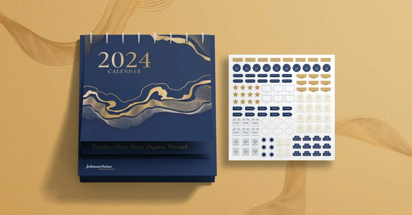
The concept centred on a deep blue and gold colour palette that conveys luxury and trust, keeping the calendar in the bathroom-design world without turning it into a product sheet. A split-layout annual calendar design format pairs client-supplied bathroom interior imagery on one side with a clean, legible calendar grid on the other.
Flowing abstract line elements inspired by water run through the design, creating a visual thread that connects each month back to the sanitaryware context while staying decorative rather than promotional.
Interactive design elements
To encourage daily use, we designed a custom sticker sheet featuring gold-foiled functional icons, with markers for meetings, important dates, holidays and reminders. Together they turn the calendar from a passive display piece into an active planning tool.
Metallic finishes and minimal iconography keep the sticker sheet consistent with the rest of the calendar, so the interactive layer feels part of the design rather than an add-on. That consistency gives recipients a reason to reach for the calendar every day.
Project management and production
With imagery layouts, sticker sheets, date grids and brand elements all needing to work together, the project called for careful coordination, and a structured approval process kept production on schedule.
Pre-press preparation accounted for the gold foil on the sticker elements. We coordinated with the printer on registration and finishing specifications to deliver the intended visual treatment across the full production run.
The Results
The finished calendar merges Johnson Suisse’s brand storytelling with functional interactivity. Between the sticker system and the finishing treatment, recipients have a reason to engage with it daily, which extends the brand’s presence throughout the year.
It shows how a corporate calendar can move beyond a conventional format. Adding interactive elements and finishing techniques turns the calendar into a useful branded tool rather than a standard promotional item.
Related Questions
Why did Johnson Suisse pair bathroom imagery with an interactive sticker sheet?
A sanitaryware desk calendar can drift towards being a product catalogue or a decorative photo book. Pairing the approved bathroom imagery with a functional sticker sheet keeps the calendar in daily use, which is when the brand is actually seen. The imagery handles the brand mood; the stickers handle the daily utility.
Why a deep blue and gold colour palette for Johnson Suisse?
Deep blue carries trust and the considered tone the brand’s bathroom-design segment expects. Gold accents lend a sense of refinement without making the calendar feel like a promotional piece. The combination was chosen to sit alongside the brand’s existing look rather than introduce a separate calendar treatment.
What does the Johnson Suisse interactive calendar actually contain?
A split-layout annual format with client-supplied bathroom interior imagery on one side and a calendar grid on the other, plus a gold-foiled sticker sheet with markers for meetings, important dates, holidays and reminders. Flowing abstract line elements run through the design as a visual thread back to the sanitaryware context.
Why include foil stamping on the sticker elements?
Foil stamping carries the visual language of Johnson Suisse’s wider brand into the calendar’s functional layer. It also distinguishes the sticker sheet from a generic planner accessory, which is the difference between a calendar that gets kept and one that goes into a drawer.
How does the Johnson Suisse calendar fit into a year of brand exposure?
A desk calendar sits on the recipient’s desk for twelve months. Used daily, it becomes a brand touchpoint that runs through the working year rather than a single-occasion gift. Adding the interactive sticker layer keeps the calendar in active use rather than in passive display, which extends the brand exposure across the year.