Introduction
AIA Shared Services (AIASS) is a shared services division based in Malaysia, providing operations support to AIA Group entities across the Asia-Pacific region.
Walk Production was appointed to develop a division logo, brand identity, and comprehensive brand guideline that aligns with the Group’s brand standards. The project scope covered logo creation, identity system development, and a governance document for consistent brand application across multiple countries.
Our Solutions
Division logo development
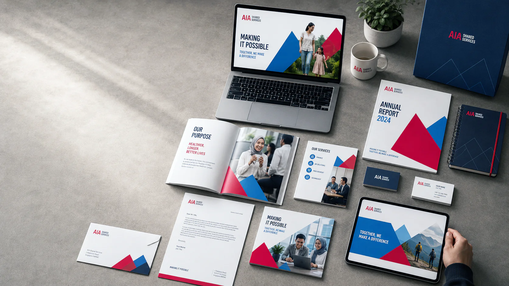
The logo development process created a division logo combining the AIA Logo with the official AIA Everest Font. This approach maintained instant recognition as part of the AIA family whilst giving AIASS a distinct identity. Three logo versions were developed to cover different use cases. The Primary Logo serves standard applications, the Secondary Logo works on low-contrast backgrounds, and the Tertiary Logo handles complex image backgrounds. This three-version system keeps the logo legible across all applications.
Each version follows strict proportional guidelines to maintain visual consistency whether applied to digital screens, printed stationery, or internal signage. Clear area rules and minimum size specifications protect the logo from being compromised in busy layouts. The responsive logo system gives internal teams flexibility without risking brand integrity across the many formats required by a regional operation.
Brand identity system
The brand identity system positions AIASS within a Branded House architecture as a sub-brand under the AIA parent brand. This structure was selected because AIASS serves internal entities, making parent brand association essential for credibility. The brand strategy defines purpose, promise, and personality traits that guide all communications. Brand values centre on collaboration, openness, and customer focus.
AIA Blue serves as the primary colour to differentiate AIASS from AIA’s signature red whilst maintaining brand family connection. Typography, imagery direction, and graphic treatments were developed to create a complete visual language. The identity system covers digital platforms, printed materials, and internal communications, providing a consistent framework for how AIASS presents itself to AIA Group entities.
Brand guidelines documentation
A comprehensive brand guidelines documentation governs all brand applications across the division. The guidelines cover logo usage rules, colour specifications, typography standards, Moving Mountain motif treatments, imagery direction, and alignment with the AIA Group brand standards. Application examples demonstrate correct implementation across common formats.
Given that AIASS operates across multiple countries, the documentation provides clear standards for consistent brand presentation regardless of location or team. The guidelines serve as a single reference point for internal designers, external vendors, and regional offices. Detailed specifications for print, digital, and merchandise applications support quality control across all brand touchpoints throughout the Asia-Pacific region.
The Results
The brand identity gave AIASS a distinct visual presence within the AIA ecosystem. The division can now present itself to AIA Group entities with a professional, recognisable identity that stays aligned to the parent brand, and the logo system flexes across digital and physical applications.
The guidelines govern consistent brand application across every touchpoint, from digital platforms to physical merchandise. Regional offices and external partners can reference the documentation to hold the standard across the Asia-Pacific region.
Related Questions
What is a division brand?
A division brand is a sub-brand operating under a parent company’s brand architecture. It maintains visual and strategic alignment with the parent brand whilst having its own identity to serve specific business functions. Division brands help internal audiences distinguish between corporate entities and build engagement with the services each division provides.
Why do shared services divisions need their own branding?
Shared services divisions benefit from distinct branding to strengthen recognition among internal stakeholders. A clear identity helps communicate their value proposition and build engagement with the entities they serve. Without a distinct visual presence, shared services teams risk being overlooked in favour of external providers, even when they offer comparable capabilities.
What is a Branded House architecture?
A Branded House architecture places sub-brands under a dominant master brand. All divisions share the parent brand’s visual identity with minor variations, creating a unified brand presence across the organisation. This approach works well when parent brand recognition provides credibility that individual divisions could not build independently.
How do brand guidelines support multi-country operations?
A brand guideline system provides governance for consistent application across multiple teams, locations, and touchpoints. They prevent brand dilution when different offices or vendors produce materials independently. For organisations operating across several countries, documented standards serve as the single reference point for maintaining visual consistency.