Introduction
Apex Equity Holdings Berhad is a securities and investment group in Malaysia. The existing brand lacked a unifying graphic element to connect the master brand with its subsidiaries. Walk Production was appointed to consolidate the group and its subsidiaries under one visual identity.
The company-wide branding programme covered brand strategy, logo, corporate identity, brand manual, company profile, presentation materials, and corporate website. The aim was a cohesive system that could unify all subsidiaries under one professional visual language.
Our Solutions
Brand strategy and logo design
The strategic branding programme established brand positioning to transition Apex from a legacy image to a modern, customer-focused identity. Research into competitor positioning and target audience preferences informed the direction for all visual and verbal elements.
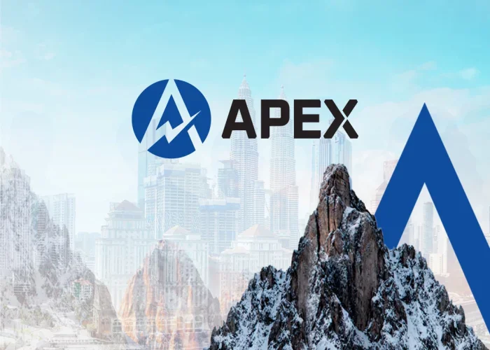
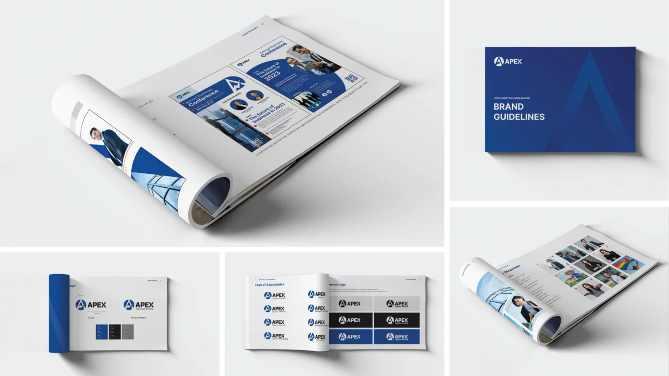
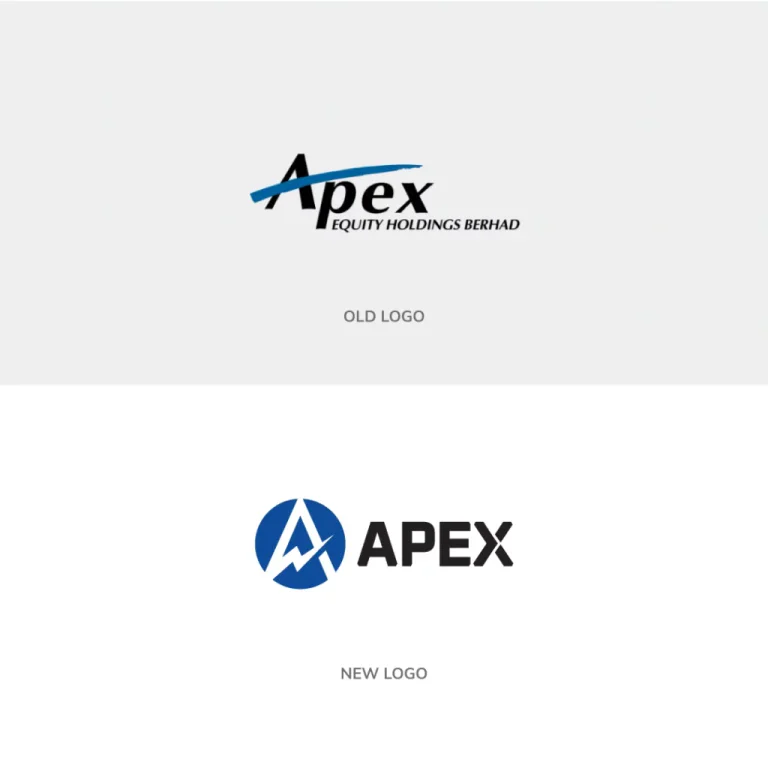
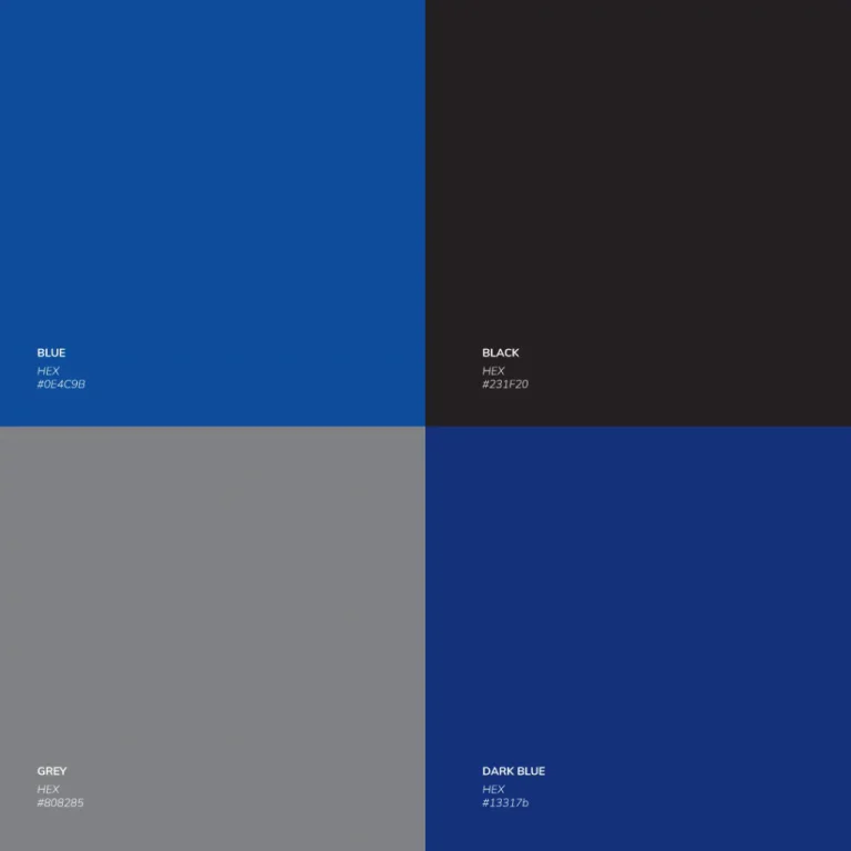
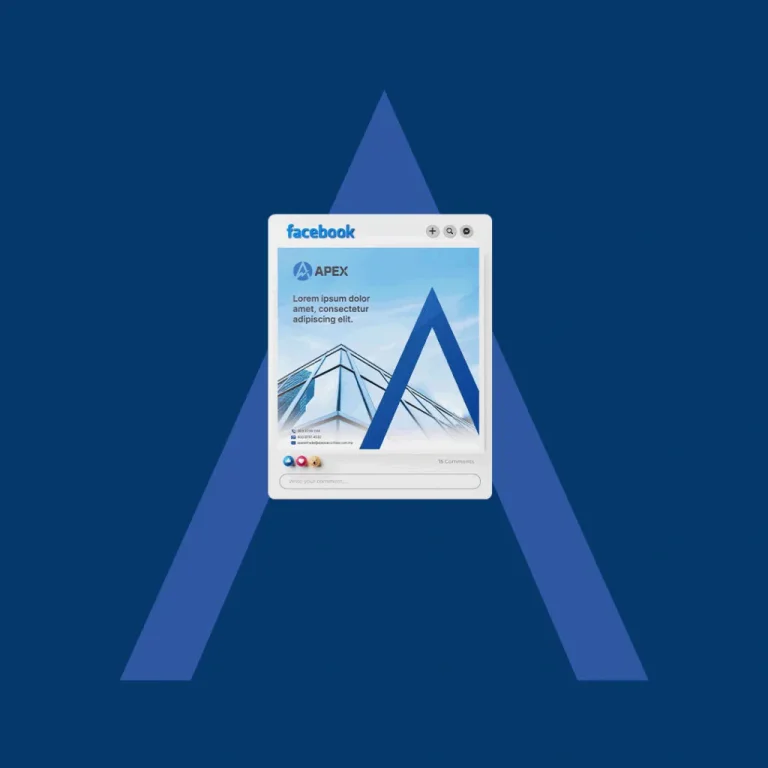
The custom logo design developed a combination mark built around the brand initial ‘A’, shaped into a summit with an ascending arrow rising through it and enclosed within a circle. The form reads as an upward climb, fitting for a group focused on building investor value, while the enclosing circle holds the subsidiaries together as one. Blue and black give the mark a high-contrast, dependable feel suited to a financial audience. Responsive logo versions include the full logo with tagline, standalone logomark, wordmark, and subsidiary logo adaptations for each business unit.
Corporate identity and brand manual
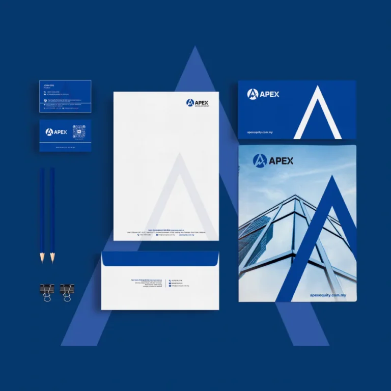
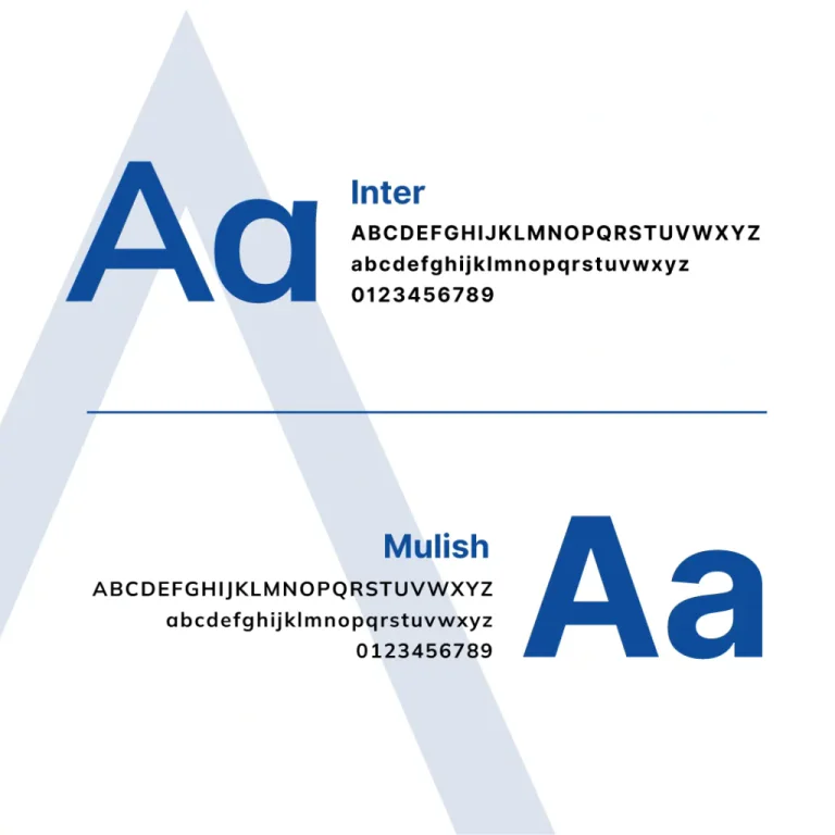
The corporate identity system introduced The Apex, a triangular graphic device derived from the logo, used across brochures and banners to create visual depth. Inter serves as the primary typeface with Mulish as secondary, providing a modern typographic system across all communications. The stationery suite covers business cards, letterheads, envelopes, and corporate folders.
A comprehensive brand standards manual documents all touchpoints from corporate shirt embroidery to email signatures. The manual provides governance for consistent brand application across all subsidiaries, with clear rules for sub-brand logo adaptations and co-branding scenarios. Internal teams and external vendors can reference the document to maintain visual standards.
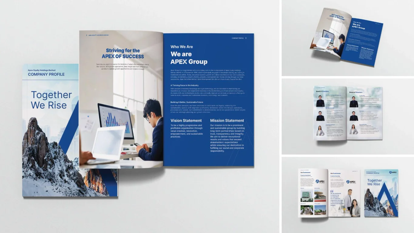
Company profile, presentations, and website
A company profile presents Apex’s corporate story, services, and value proposition with the refreshed visual identity. Presentation design includes branded PowerPoint slides for client engagements and master slide templates for internal use, allowing staff to create consistent presentations whilst maintaining brand standards across all business communications.
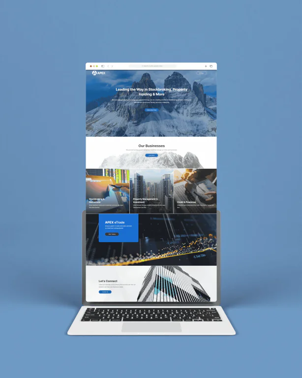
A responsive corporate website features a dedicated Investor Relations section to support stakeholder transparency. The site architecture supports both client acquisition and corporate communications through clear navigation. The website serves as the primary digital touchpoint for investors, clients, and partners seeking information about the group’s financial services offerings.
The Results
The rebranding gave Apex a single, cohesive financial brand system that aligns all subsidiaries under one visual identity. The new brand projects a professional, modern image whilst keeping its connection to the group’s established heritage in financial services.
The deliverables give Apex everything it needs to present the brand consistently across its touchpoints, from investor communications to client presentations.
Project Gallery

Related Questions
Why do financial groups need unified branding?
Financial groups with multiple subsidiaries benefit from unified corporate branding to build trust and recognition. Consistent visual identity across business units reinforces corporate stability and professionalism. Investors and clients expect coherent presentation from diversified groups, making brand cohesion a business requirement.
What is a secondary graphic device?
A secondary graphic device is a visual element derived from the logo used across marketing materials. It provides visual consistency and brand recognition without overusing the primary logo on every application. Common examples include geometric shapes, patterns, or line treatments drawn from the logomark.
Why are master slides important for corporate branding?
Master slides provide branded templates that staff can use to create presentations whilst maintaining visual consistency. They save time and prevent off-brand presentations that could dilute corporate identity. For financial groups with multiple teams, master slides help maintain professional standards across the organisation.
What should an Investor Relations website section include?
An Investor Relations section typically includes annual reports, financial statements, stock information, corporate announcements, and governance documents. The section provides transparency for shareholders and potential investors, supporting regulatory requirements and building confidence in corporate management.
How do subsidiary logos relate to a master brand?
Subsidiary logos share visual elements with the master brand such as colour palette, typography, or graphic devices. This creates brand cohesion whilst allowing each subsidiary its own distinct identity. Clear rules govern how subsidiaries use the parent brand alongside their own mark.