Video transcript
A brand guideline is the rulebook that keeps a company looking the same everywhere. Here is why most fail and how to build one people use. Part one. The problem: a logo is not a brand. A company gets a new logo, and everyone assumes the brand is done. But a logo file is not a brand. A brand is how you look everywhere, not one picture.
A medium company makes 30 to 50 branded materials a year. Made by staff and vendors, who are not designers. With no rules, everyone guesses, and the brand quietly drifts apart. Part two. The answer: build it to be used, not admired. Most companies have a guideline somewhere. The problem: it gets ignored.
Built to look beautiful, not to be used. So change what it is for. Not a showcase. A production manual. The test: can a non-designer apply the brand without a designer? Templates beat principles. A rule like "use generous spacing" gets argued.
A ready-made template does not. Ship the slide deck, social sizes, and letterhead, already built. Set bilingual rules: the brand holds in English and Malay. It also needs an owner. With no named owner, it belongs to nobody. Name that person. Give them a quarterly review, a check every three months.
And brief every vendor before they start. Part three. The takeaway: consistency is money. This is not cosmetic. Research reported by Lucidpress found consistent brand presentation can be linked to revenue increases of up to 33%. Consistency is a commercial result, not just a design preference. Treat it as a working tool, not a trophy.
Fill it with ready templates. Give it a named owner and quarterly review. Brief every vendor from it. It only protects the brand if people follow it. Rebuild it fully every 5 to 7 years, before the drift sets back in.
Open the brand guideline PDF most Malaysian companies have on their shared drive, and ask a marketing executive to brief a printer in Klang on a flyer due tomorrow. In our agency experience, the meeting usually goes one of two ways. Either the marketer flips to a clear-space diagram, decides it is not relevant, and emails the printer the logo file with no specification. Or the marketer cannot find the colour value in the right format, picks the closest one from the deck, and accepts whatever the printer produces. The guideline is on the desktop. It is not in the workflow.
That gap between owning a brand guideline and using one is the question this anchor is built around. The guideline is not a coffee-table book of the brand. It is the production manual a non-designer needs to render the brand correctly on their own, on a Friday afternoon, without phoning the agency that built it. If the document fails that test, the rest of the brand work is at risk every time a third party touches it.
Walk Production is an integrated creative agency in Kuala Lumpur and Selangor, Malaysia. Since 2018, our 40 in-house specialists have run more than 100 branding projects for SMEs, Bursa-listed companies, GLCs, and MNCs across Malaysia, Singapore, and the wider Asia-Pacific region. This guide covers what a working brand guideline document actually contains, where Malaysian guidelines tend to break, how the guideline is rolled out across internal teams and external vendors, the asset-library and portal layer that supports it, the RM cost bands we quote against, and three verified Walk Production projects where the guideline document was the central deliverable.
For the strategy work that sits above the guideline, see the corporate branding strategy practitioner playbook and the brand audit, strategy framework, positioning and architecture guide. For the visual and verbal identity that the guideline documents, see the brand identity and tone of voice playbook. For the change-management work that wraps around a guideline rebuild, see the rebranding checklist.
Brand guidelines, brand identity, and brand strategy: where the guideline document sits
The three terms get used interchangeably in Malaysian briefs, and the mix-up shows up later as a scope problem. Knowing which one you are commissioning tells you what the deliverable should contain.
Brand strategy is the upstream layer. It names the brand purpose, target audiences, value proposition, personality attributes, positioning statement, and architecture decision. It is the one-page document the creative team works from when deciding whether a colour, a tagline, or a layout is on-brief. The audit and strategy work that produces this document is covered in the brand audit, strategy framework, positioning, and architecture guide.
Brand identity is the design layer that translates strategy into a usable visual and verbal system: logo, colour, typography, imagery direction, voice attributes, and the corporate identity application that carries the system onto stationery, signage, and digital. The five-phase identity process and the seven elements of a corporate identity are covered in the brand identity and tone of voice playbook.
Brand guideline document is the deliverable that documents the brand identity decisions so non-designers can apply them correctly. The strategy says what the brand is. The identity says what it looks and sounds like. The guideline is the operational layer that lets a marketing intern, a junior printer, an outsourced agency in another city, and a regional partner render the brand the same way without phoning the original designer.
The three layers sit in sequence. Skip the strategy and the guideline reads as design preference rather than business decision. Skip the identity and the guideline has nothing systematic to document. Ship the guideline without a roll-out plan and the document sits unused on a shared drive. This anchor focuses on the third layer: the document itself, the application library that travels with it, and how the brand gets into the operational rhythm of an organisation in the year after launch.
The simple test we apply to every guideline we write is whether a non-designer can produce something correct from it without supervision. If a person who has never met the founder, never sat in the strategy session, and never seen the master files can still get the deck cover, the social grid, and the email signature right, the guideline is doing its job. If they cannot, it is a coffee-table book pretending to be a manual.
What a working brand guideline document actually contains
A working brand guideline is structured as a production manual rather than a brand showcase. It contains the rules a non-designer needs to make a correct decision on their own, in the order that decision is usually made. The headline sections below are stable across almost every Walk Production project; depth scales with the size and complexity of the organisation.
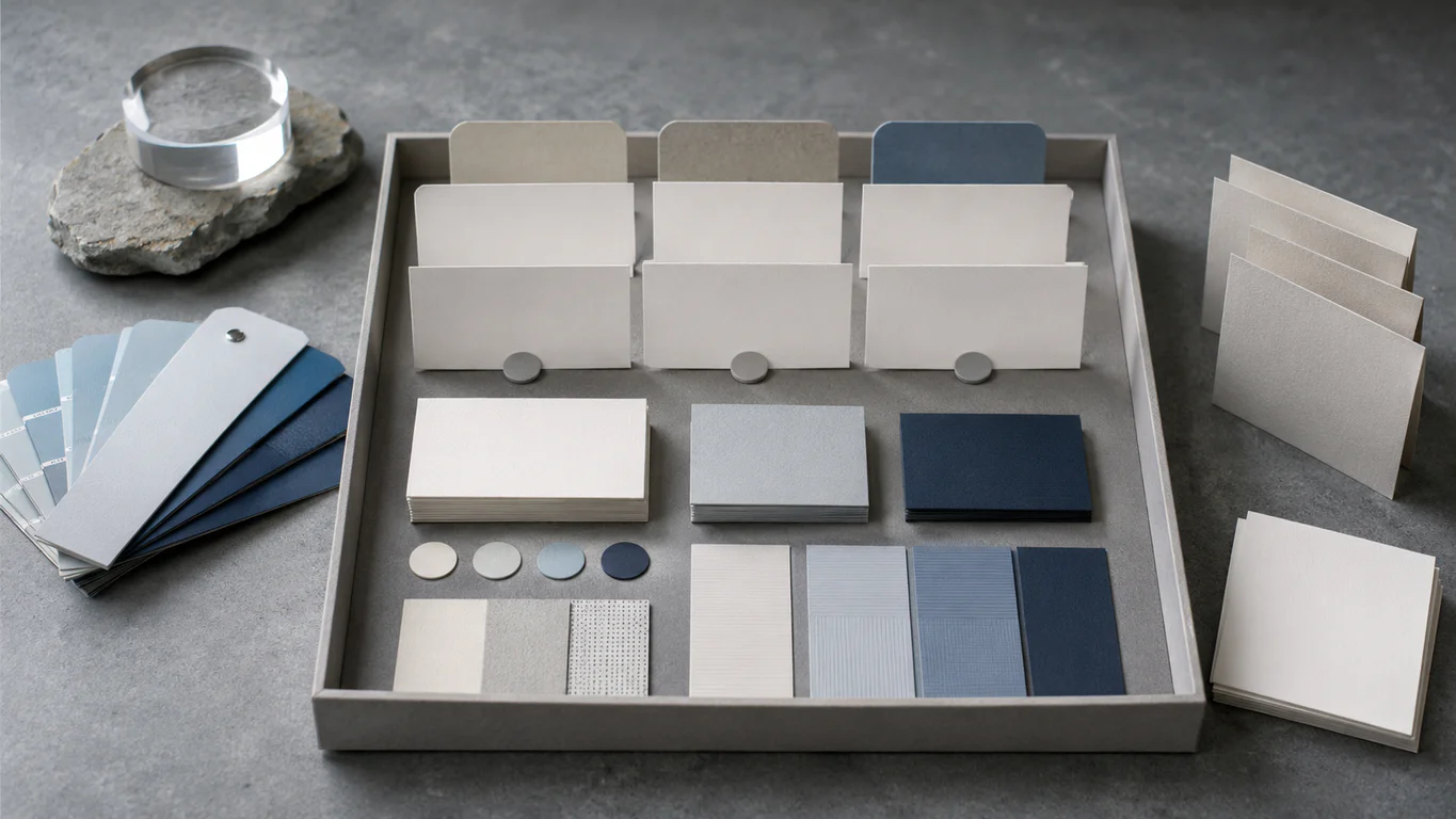
Logo system. Primary lockup, secondary lockup (usually a stacked or simplified version), monogram or icon mark for tight spaces, monochrome variants for embossing and single-colour print, and the rules for clear space and minimum size. Clear space is normally expressed in a unit derived from the mark itself so it scales with the logo. Minimum size is given separately for print and on-screen, because a logo that survives at 24 pixels on a phone can collapse at 8 millimetres on a name card. Bilingual or trilingual lockups are documented in the same section, drawn rather than translated, and weighted to read at the same visual scale as the English mark.
Typography. A primary typeface for headlines, a secondary typeface for body and supporting copy, and a named system fallback for when the licensed face is not installed. The fallback rule is the one most guidelines forget. If the brand font sits behind a paid licence, it will not be on every laptop; the moment someone opens a deck on a colleague’s machine, the layout reflows into Calibri. A named system fallback (Arial, Helvetica, Inter, or whatever the closest match is) keeps the hierarchy intact. Heading sizes, weight variations, and line spacing sit in this section.
Colour. Each brand colour expressed in CMYK, RGB, HEX, and Pantone (PMS), with a one-line note on which value to use in which medium. CMYK for offset print, RGB for screen, HEX for web and digital design tools, Pantone for spot-colour print and any branded merchandise where colour fidelity matters more than cost. Without all four values, the printer guesses, and the corporate blue drifts between cycles. For Malaysian brands, this section can also note cultural associations relevant to the category: red carries prosperity associations in Chinese contexts, green carries Islamic associations frequent in halal-certified and government-institution branding, and yellow is reserved for royalty in several states.
Photography and imagery direction. Mood, lighting, composition, and post-processing. The section that most often turns into a mood board and stops being useful. The version we ship pairs a short paragraph of direction with a row of yes images and a row of no images, so a marketer sourcing stock photography has a clear reject criterion. For brands that commission their own photography, the section also notes shot-list categories and the post-production look-up table that keeps separately commissioned shoots reading as one library.
Illustration, graphic elements, and layout grid. Line weight, fill behaviour, level of detail, and any reusable motif library, alongside the grid that defines margins, columns, spacing, and content hierarchy across print and digital. Secondary graphic elements drawn from the logomark anatomy belong here too. Without a defined grid, every new piece of collateral becomes an improvisation: the brand uses the right colours and fonts and still looks different every time because spacing and alignment shift. The section is paired with worked-example layouts for the formats the brand produces most often: A4 documents, business cards, social grid posts, deck slides, and signage typography blocks.
Voice and tone. Three to five adjectives that describe how the brand sounds, a short list of writing principles (sentence length, jargon policy, formality), and approved boilerplate. For Malaysian brands, this section also covers how the voice carries across Bahasa Malaysia and, where relevant, Mandarin and Tamil. The longer treatment of voice attributes, tone-by-channel matrices, and vocabulary guides sits in the brand identity and tone of voice playbook; the guideline codifies the headline rules in a form a non-writer can apply.
Application templates and corporate identity. The section that gets used most and written least. Pre-built deck templates, social post templates sized to current platform specifications, signage rules, packaging dielines, email signature formats, report covers, and proposal layouts. If the application section is thin, the rest of the guideline tends to be ignored.
Governance. A named role (not a named person) that owns the brand internally, the criteria for escalating an exception, and a contact path for vendors who are unsure. Without this, every interpretation eventually becomes a precedent, and there is no way to roll the brand back. Governance is short (often a single page) and most often missing from guidelines that drift inside the first year.
How thick is too thick: page-count tiers for Malaysian companies
Page count is a function of scope, not a target. In our agency experience, the tiers below cover most Malaysian engagements, and a brief that lands clearly in one tier is usually scoped correctly. Briefs that lean toward the next tier up tend to indicate that scope is being squeezed into a budget rather than the other way around.
| Tier | Page range | Suitable for | Typical content |
|---|---|---|---|
| Lite | 20-40 pages | SMEs at first roll-out, sub-brands inside a larger architecture | Logo, colour, type, short application section |
| Standard | 50-80 pages | Mid-market, listed companies preparing for refresh, GLC subsidiaries | Full visual and verbal system, applications, template library |
| Enterprise | 100+ pages, with digital portal | Group holding companies, multi-country operators, multi-brand portfolios | Multi-channel, multi-market governance, vendor-onboarding pack, ongoing custodianship |
A 100-page lite guideline is not a sign of thoroughness; it is usually a sign that the document is being asked to do strategy work it is not designed for. A 28-page enterprise guideline is not a sign of efficiency; it is usually a sign that the brand will drift across vendors within months because the application library is too thin to govern day-to-day decisions.
The more useful question at the scoping stage is which tier the brand actually has to govern, not where the budget happens to land. A Bursa-listed company with three subsidiaries, a regulated communications calendar, and a dual-language EN-BM presence cannot be governed by a lite guideline; an SME with one product line, one office, and one in-house designer does not need an enterprise engagement.
Why most Malaysian brand guidelines get ignored
We have audited a lot of guidelines that were never adopted. The same five problems show up repeatedly, and each is more expensive than the discipline that would have prevented it.
Written for a designer’s eye, not a non-designer reader. Pages of clear-space diagrams, baseline grids, and pull-quote treatments are necessary but not enough. A marketing executive who needs to brief a printer in the next hour cannot trade design vocabulary; the guideline has to translate design rules into instructions a non-designer can act on. When the only readers who can use the guideline are the designers who wrote it, the rest of the organisation defaults to whatever logo file is on the desktop.
No fallback rules for printers and vendors. The brand colour is a custom Pantone with a named CMYK match, but there is no instruction for what happens when the printer says they cannot hit the Pantone within budget. Without a written fallback, the printer makes the call and the colour drifts. The fix is a one-line rule per section: in this scenario, use this value; if not possible, escalate to the named brand owner.
No bilingual examples. Most Malaysian brand collateral runs in BM and English at some point. If the guideline only shows English layouts, the BM layout will be invented on the fly and tend to look like a different brand. Bilingual examples sit next to their English counterparts, drawn rather than translated, and weighted to read at the same visual scale.
No governance section. Nothing tells the reader who owns the brand internally, who approves an exception, or where to send a question. Without a named owner, the guideline becomes a static PDF and the brand drifts back to whatever each department prefers. Governance is the section that takes the least space and has the most operational impact.
Thin application section. Every other section has been carefully designed, but the slide template, the social grid, the email signature, and the proposal cover are afterthoughts. Production teams default to whatever they can find, and within a quarter the brand looks unrecognisable on the channels that matter most. Application thinness is the single best predictor of how fast a guideline gets abandoned.
The five sections Walk Production no longer ships without
Once those five failures repeat across enough projects, we stop shipping guidelines without the five sections below. None of them are exotic. Each one closes a specific failure mode we have watched land in a second-round project.
1. Decision logic for ambiguous cases. A short flowchart or rule set for the questions a non-designer cannot answer on their own. Which logo do I use on a dark background. What if my background image is busy. Can I tilt the logo for a sticker. The brand owner is not on call at 9pm before a tender deadline; the guideline has to be.
2. Bilingual lockup rules. How the logo, tagline, and key messages render in BM and English. Where lockups change, where line breaks differ because BM word count is longer, and which typeface and weight pair carries the BM voice at the same visual scale as English. Non-optional for any Malaysian brand operating beyond a single market, and required for any GLC or Bursa-listed company whose communications cycle includes BM-first regulated documents.
3. Third-party and partner co-branding rules. What happens when your logo sits next to a partner’s logo on a sponsorship board or event backdrop. Which side does your logo take. What is the minimum spacing between the two marks. Do you use a divider, a dot, or nothing. The default is improvisation, and improvisation tends to look cheap. The longer treatment sits in the co-branding examples guide; the guideline codifies the rules a non-designer needs to render them correctly.
4. Digital and social template library with worked examples. Editable templates for the platforms the brand actually uses, sized to current specifications, shown in context. Cover photo, post grid, story format, presentation deck cover, internal slide, email header, email footer, signature block. A pre-built template that already follows the rules removes the interpretation step.
5. Governance owner and escalation path. A named role (not a person) that owns the brand internally, the criteria for escalating an exception, and a contact path for vendors who are unsure. Without this, every interpretation eventually becomes a precedent, and there is no way to roll the brand back. The role sits with the marketing or corporate communications lead in most Malaysian organisations, with a delegated brand custodian who fields day-to-day questions; larger groups assign a custodian per business unit under a central framework.
Rolling out the guideline: internal training, templates, and vendor briefings
Most rebrand failures we are asked to second-opinion are not failures of design. They are failures of roll-out. The new mark is on the homepage but not on the email signature. The vehicle livery is still the old colours three months in. The proposal template in the sales team’s shared drive has not been swapped out. Each gap on its own looks small; together they cost real credibility, especially in B2B sectors where procurement officers and bank relationship managers notice every inconsistency.
Internal launch session. A one-to-two-hour all-hands session before any public-facing materials change. The session covers the rationale for the brand work, walks through the visual and verbal direction in plain language, and demonstrates the application library. The audience is not just the marketing team; it includes operations, sales, customer service, HR, and the executive leadership team. Frontline employees who deliver the brand promise to customers should hear the brand story before customers do.
Role-specific training. Marketing, sales, and customer service use the brand differently and need different training. Marketing needs the application library and the escalation path. Sales needs the deck template, the proposal cover, and the rules for editing them. Customer service needs the tone-of-voice guidance and the approved boilerplate. A single generic training session lands as background noise; role-specific sessions land as work tools.
Onboarding for new hires. Brand orientation belongs in the first-week induction. A branded welcome kit, a brand orientation hour, a quick-reference one-pager at the desk, and access to the asset library on day one are the baseline. For organisations with significant Bahasa Malaysia, Mandarin, or Tamil-speaking populations, the onboarding materials should be available in those languages too.
Vendor briefing pack. Print shops, digital agencies, event companies, and freelancers all need clear brand specifications. The vendor briefing pack we ship covers the guideline document, the asset library credentials, a one-page rule sheet for the format the vendor is producing, and a contact for the named brand owner. A vendor briefed before the first quote is faster, cheaper, and more accurate than one sent a 60-page PDF and asked to figure it out.
Internal review cadence. A quarterly consistency review keeps the brand on the rails. The review covers materials produced in the previous quarter, flags anything off-brand, and produces a short list of fixes. Without a cadence, drift is invisible until it is too late to fix without rework.
For organisations with significant frontline operations (retail, hospitality, healthcare, financial services), the rollout extends into customer-facing behaviour. A bank can spend six months on a refreshed visual identity and still lose the promise at the counter when a tired officer asks a walk-in to come back another day. That gap is closed by training and culture work that sits alongside, not inside, the guideline document. Walk Production’s branding services cover both the guideline and the activation materials (onboarding kits, internal campaign assets, vendor briefing packs) so the external promise and the internal culture stay aligned in the year after launch.
Consistency: the day-to-day test of the guideline document
A brand guideline is judged by how the brand looks twelve months after delivery, in materials the agency that built it did not produce. That is the only test that matters. The five conditions below tend to determine whether the brand holds or drifts.
One source of truth. The current guideline and asset library live in one location every team and vendor can reach, with version control that makes the current revision visible at a glance. When materials are scattered across personal drives, email threads, and folders named “FINAL_v3”, people grab whatever version is most convenient, not necessarily the correct one. A single named location, named owner, and named version is the baseline.
Templates beat principles. Twenty marketing executives applying twenty different interpretations of a principle produce twenty different outputs. The same team filling content into a pre-built template produces twenty consistent outputs. For the materials a Malaysian brand produces most often (decks, social posts, proposals, email signatures, invoices, report covers), pre-built templates do more work than the guideline that defines them.
Named brand owner. A single role with the authority to approve an exception, decide an ambiguous case, and roll back an off-brand application. The role is the more durable assignment than the person, because people change roles and the brand has to outlast that.
Quarterly review cadence. A short review that audits materials produced in the previous quarter, flags off-brand applications, and produces a list of fixes. Inside the first 90 days after launch, the review runs weekly; after the first quarter, monthly; after the first year, quarterly.
Vendor compliance. Print shops, digital agencies, and event companies will reach for whatever brand assets they have on file. A vendor briefing pack, a current asset library, and a named contact close the gap. The single largest gap we are asked to fix in audit engagements is between the in-house brand work (well-controlled) and the vendor-produced brand work (often months out of date and using last year’s logo).
Research from Lucidpress, reported by PRNewswire, found that consistent brand presentation can be associated with revenue increases of up to 33 percent, while many companies still struggle with off-brand content. In our agency experience, the gap between owning a guideline and applying it is a training and culture problem rather than a documentation problem, and the five conditions above tend to be the difference between a brand that holds across vendors and a brand that fragments inside a year.
Brand asset libraries and the portal question
The guideline covers the rules. The asset library covers the files. For organisations producing 30 to 50 distinct branded materials a year, the asset library is where the rules become operational, because most brand decisions are made at the file-pull stage rather than the file-build stage.
A working asset library covers the core set: logo files in every required format (AI, EPS, SVG, PNG, JPG) and every approved colour variant, font files (or a named licence path), the colour palette as a swatch file, the photography library, illustration source files, secondary graphic elements, and the editable application templates for the formats the brand produces most often. The library is structured around the decisions a non-designer makes, not the categories a designer thinks in.
The portal question is whether the library is delivered as a folder structure or as a hosted digital portal. A folder structure is enough for a single-office SME with one or two regular vendors; a hosted portal becomes useful at the point where regional teams, dozens of vendors, and rotating freelancers all need self-served access without a designer in the middle. Most enterprise engagements Walk Production scopes for Bursa-listed groups, multi-subsidiary GLCs, and multi-country operators include a digital portal with access tiers, version control, an audit trail, and an integrated approvals workflow.
The harder governance question is what happens when the asset library and the live brand drift apart. Files get updated on someone’s laptop. Vendors save local copies that get used for years. Old letterhead PDFs end up on a regional partner’s email. The discipline that holds the library together is the same as the discipline that holds the brand together: one source of truth, named owner, quarterly review, vendor compliance. The portal makes that discipline easier to enforce; it does not replace it.
Brand guideline cost bands in Malaysia
The bands below are the working ranges Walk Production quotes against in scoping conversations, based on our recent project history. They cover production of the guideline document and the asset library, not the upstream strategy or brand identity work, which are scoped separately and covered in the corporate branding strategy practitioner playbook.
Lite guideline. Logo, colour, typography, and a short application section. Around 20 to 40 pages. Suitable for SMEs at first-rollout stage, sub-brands inside a larger architecture, or a documentation-only refresh. RM 5,000 to RM 8,000.
Standard brand book. Full visual and verbal system, applications, and a working template library. Around 50 to 80 pages. Suitable for mid-market companies, Bursa-listed companies preparing for an identity refresh, and most GLC subsidiaries. RM 15,000 to RM 20,000.
Enterprise brand engagement. Multi-channel, multi-market governance with a digital brand portal, vendor-onboarding pack, and ongoing custodianship. 100 pages or more, paired with the portal. Suitable for group holding companies, multi-country operators, and any brand that has to govern dozens of internal teams and external vendors at once. RM 20,000 to RM 35,000.
These are starting ranges. Scope changes, additional language adaptations, regulated-industry compliance work, bespoke template builds, and digital-portal builds move the number. The more useful question at scoping is which tier the brand actually needs to govern, not where the budget happens to land.
Selected Walk Production brand guideline work
Three Walk Production projects below show how the same brand guideline discipline adapts to very different organisations. In each, the guideline document and the asset library were central deliverables rather than an afterthought to the visual identity work. More projects sit in the branding portfolio.
1. TGA: a brand manual written for a self-executing client team
TGA is a Malaysian automotive detailing operator that had grown into a corporate-client base and needed an identity that read at corporate-buyer standard. Walk Production ran a rebrand covering logo, corporate identity, brand manual, company profile, master slides, product packaging, and website.
The brand manual was written for a client whose internal team would self-execute most future collateral, with colour and typography specified by usage scenarios rather than as a flat palette swatch. Logo lockup rules covered the application range from print to digital, including the bilingual considerations relevant to the corporate-buyer audience the rebrand was built around. The packaging system uses a single decision rule documented in the manual: same logomark, same typography, palette varied only by product category, so new SKUs can be added without rebriefing the agency. The manual is the section of the deliverable that does the work in year two and onward, because the TGA team produces most of its day-to-day collateral internally rather than commissioning each piece.
2. GET Trustee Group: a bilingual EN-CN brand guideline for a fiduciary firm
GET Trustee Group is a Malaysian fiduciary firm handling trust and estate planning for individual clients and family principals. The brief asked for an identity that read as credible to high-net-worth audiences from launch, and a guideline document and dual-language EN-CN application library that worked across the firm’s client-facing surfaces. Walk Production delivered logo, corporate identity, company profile, master deck, brand guidelines, marketing collateral, copywriting, and a bilingual EN-CN website with translation.
The brand guidelines document covers logo usage, the colour palette, Inter as the primary typeface, imagery direction for internal and external communications, secondary graphics, and templates for print and digital collateral. A separate Chinese-name version of the logo was drawn alongside the English mark, weighted to read at the same visual scale rather than as a smaller subtitle, and the guideline codifies the application rules for both marks side by side. Application standards extend to the regulated client-facing paperwork the firm produces, so the marketing surface and the regulated paperwork hold the same visual language without forcing a designer to set up each template from scratch.
3. Lianson Fleet Group Berhad: brand guidelines for a Bursa-listed corporate communications calendar
Lianson Fleet Group Berhad (LFG) is a Bursa Malaysia-listed marine logistics and offshore support company, formerly listed as ICON Offshore Berhad. The brief was to deliver the new corporate identity and the brand guidelines on the same day as the Bursa name-change announcement, so investors reading the announcement landed on a website, company profile, and master deck that already wore the new identity.
The brand guidelines document covers logo applications, typography, colour specifications, imagery direction, and stationery standards. Application standards extend to the regulated communications a Bursa-listed company produces on a fixed calendar, so the in-house IR and corporate secretarial teams stay aligned across annual reports, integrated reports, sustainability disclosures, AGM circulars, and quarterly results. The CARE values (Communication, Appreciation, Reliable, Efficiency) were written to translate into both internal culture and external posture, and the guideline carries the verbal direction alongside the visual rules so writers and designers work from the same brief.
The pattern across the three projects is consistent. The guideline document is a working tool, not a showpiece. The application library is sized to the materials the client actually produces. The governance section names a role rather than a person, so the brand can survive a personnel change without losing its rulebook.
When to update the guideline
A brand guideline does not need to be rewritten on a schedule. It needs to be updated when one of the signals below appears. The cadence is event-driven rather than calendar-driven, and missing an update window tends to be a more expensive mistake than the update itself.
M&A activity. The moment a merger, acquisition, or divestment changes the corporate structure, the brand architecture in the existing guideline becomes wrong. The architecture section is the first to update; the application library follows.
Major leadership change. A new CEO or CMO almost always brings a different point of view on what the brand stands for. The guideline should be reviewed inside the first six months so the team works from the same script rather than each department defaulting to its own interpretation.
Expansion into a new ASEAN market. Entering Indonesia, Vietnam, Thailand, or the Philippines forces decisions on language adaptation that the original BM and English guideline did not anticipate. Bahasa Indonesia is close to BM but not identical, and the lockup, tone, and tagline often need re-cutting.
Visible brand drift across departments. When sales, HR, and operations are each producing materials that look like different brands, the guideline is either out of date or no longer being followed. A rebranding checklist tracks the touchpoints that have to update in lockstep.
New digital channels. A guideline written before the brand had a TikTok account, a podcast, an in-product UI, or a mobile app cannot govern what those channels look like. The update is usually a section addition rather than a full rewrite.
Regulatory or compliance triggers. For listed companies, regulated industries, or brands operating under specific licensing regimes, a regulatory update can require changes to disclaimer treatment, mark usage, or co-branding rules. Bursa-listed companies, financial services under BNM oversight, telecommunications under MCMC, and healthcare under MOH and the Medicine Advertisements Board all have application-layer rules that flow through the guideline.
Full rebuilds are reserved for moments where the strategy, identity, or architecture has changed enough that the existing document no longer maps to the brand. In our agency experience, full rebuilds happen on five-to-seven-year cycles for stable corporate brands and three-to-four-year cycles for consumer brands moving faster.
Common brand guideline mistakes
Four mistakes show up across most of the second-round conversations we have with Malaysian companies after another agency has wrapped a brand-guideline engagement. Each is recoverable, but each is also more expensive than the discipline that would have prevented it.
Treating the guideline as a deliverable rather than a working tool. A beautifully designed 120-page PDF that nobody opens after the launch event has done none of the work the guideline is meant to do. The fix is to scope the application library, the template set, and the roll-out plan into the same engagement that produces the document.
Skipping the bilingual layer. A Malaysian guideline that only shows English layouts will produce BM, Mandarin, or Tamil layouts that look like a different brand the first time a translation deadline lands. The fix is to draw the bilingual versions in the same engagement, weighted to read at the same visual scale.
No governance owner. A guideline that does not name a role responsible for it ages quickly. The document gets out of date, the asset library drifts, and every interpretation becomes a precedent. The fix is a named role, a quarterly review cadence, and the criteria for escalating an exception.
A thin application library. Every other section has been carefully designed, but the slide template, the social grid, the email signature, and the proposal cover are afterthoughts. The fix is to size the application library to the materials the client actually produces, with pre-built templates for the formats used most.
A related discipline that sits outside this anchor but matters for brand-asset governance is trademark protection. SSM registration gives a Malaysian company the right to trade under a name; only a MyIPO trademark registration protects the registered mark for the goods and services in the classes it is filed under. The guideline should reference the registered marks and their classes, but the registration itself is a separate workstream covered in the corporate branding strategy playbook.
Where to start
If your current brand is leaking credibility (on the proposal cover, the investor deck, the careers page, or the customer-service email), and your existing guideline is either too thin to govern day-to-day decisions or too thick to be opened by a non-designer, the fix is rarely a longer document. It is a guideline scoped to the materials the team actually produces, with a roll-out plan that puts the document into the operational rhythm rather than onto a shared drive.
Walk Production runs branding services from our KL and Selangor offices, with 40 in-house specialists across strategy, design, copywriting, and content marketing. The strategy work, identity exploration, guideline document, and activation materials all happen on the same team in the same office, which keeps the visual and the verbal aligned in the year after launch rather than drifting apart across two suppliers.
To see the work in context, review the branding portfolio or talk to our team.