Introduction
GET Trustee Group is a Malaysian trustee and estate planning firm. It needed a brand identity that read as credible from launch, alongside a website that spoke to both English and Chinese-speaking audiences in a single user journey.
Walk Production was appointed to develop the brand identity: logo, corporate identity, company profile, PowerPoint master deck, brand guidelines, marketing collateral and a dual-language English plus Chinese website with translation.
Our Solutions
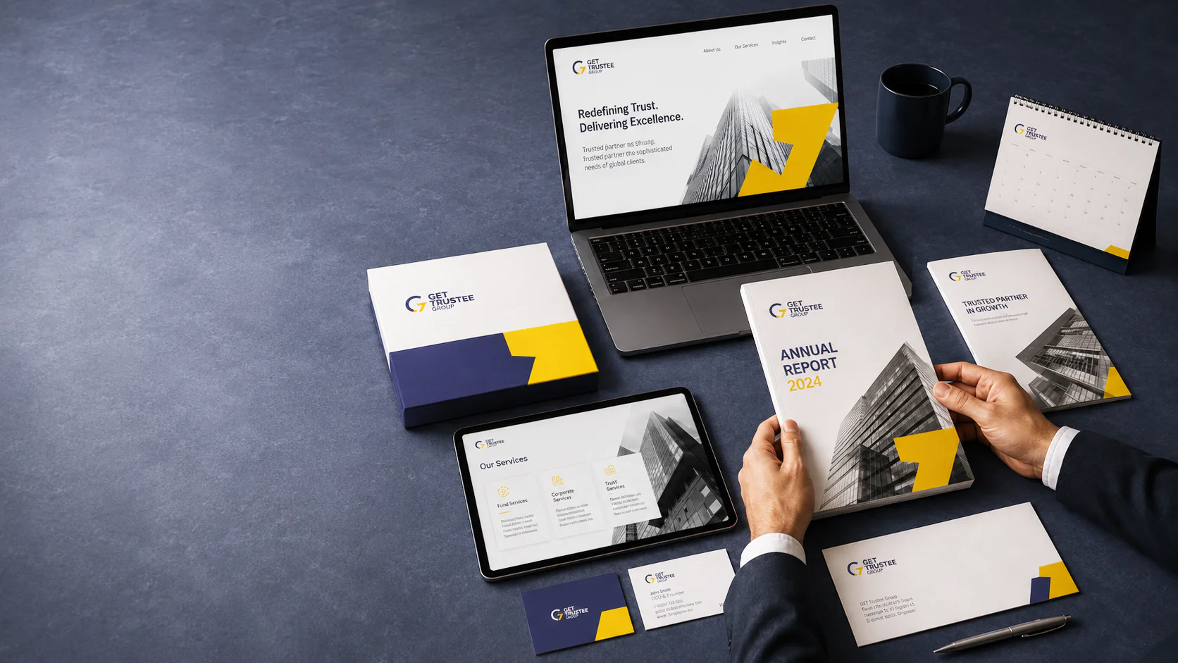
Logo and visual identity
The logomark was designed as a responsive system with full-logo, wordmark and logomark variants for different application sizes. A separate Chinese-name version was drawn alongside the English mark, weighted to read at the same visual scale rather than reading like a smaller subtitle. We kept blue as the base, since it carries the credibility a trustee letterhead is expected to hold, and added yellow to pull the firm clear of the dark-blue financial-services template that larger competitors default to.
The tagline “Protecting Trust, Securing Futures” was written to be readable in both English and Chinese without either version feeling like the secondary read. Typography was specified with hierarchies the firm could carry across its client-facing materials.
Corporate identity, company profile and collateral
The identity system covers stationery, uniform options for client meetings and signing events, indoor and outdoor signage for the firm’s office, plus email signatures and social media templates that extend the identity onto digital channels.
A company profile and a master PowerPoint deck were written and designed as the firm’s day-one client toolkit: the document the team opens in a first meeting, and the deck they present from. Both were built to be edited internally as services and case examples evolve, so the firm is not pinging the agency every time a service tier is renamed.
Brand guidelines and bilingual website
The brand guidelines document logo usage, the colour palette, Inter as the primary typeface, imagery direction for internal and external communications, secondary graphics, and templates for print and digital collateral. Application standards address the client-facing paperwork the firm produces, so the marketing surface and the regulated paperwork hold the same visual language.
The website was built in English and Chinese as a single experience rather than two parallel sites with different navigation. Copy was written with bilingual structure in mind so paragraphs translate cleanly without rewrite. Walk Production’s translation team produced the Chinese version, working through the legal and fiduciary terms with care given the regulated nature of the service.
The Results
The branding programme launched GET Trustee with a complete client toolkit: a logo system, a corporate identity, a company profile, master slides, brand guidelines, marketing collateral and a bilingual website. The firm could walk into its first client meetings carrying the same kit a long-established trustee would carry.
The bilingual website widened the firm’s reach to Chinese-reading audiences without forcing those clients into an English-only journey.
Related Questions
Why did GET Trustee launch in two languages from day one rather than adding Chinese later?
A large share of clients in this market read and contract in Chinese. Adding it later would put those clients on a second-language read of the firm’s marketing for a year, which is an unforced disadvantage against trustees who launched bilingual.
Why blue and yellow rather than the dark-blue-only palette common in financial services?
Dark blue alone is the default look for the financial-services category, which makes it harder for a new firm to stand out in a search-result line-up or on a billboard. Adding yellow creates a recognisable contrast pair that holds across the application range while the blue keeps the trust signal intact.
What does the tagline “Protecting Trust, Securing Futures” actually do?
It puts protection and succession at the front, which is what a fiduciary client is actually buying. For trust and estate planning, the buying mindset is “safeguard what I am leaving my family,” not “sell me a financial product.” The tagline frames the firm in the buyer’s language and reads back cleanly in both English and Chinese.
Why include a Chinese version of the logo alongside the English mark?
A translated version of an English logo can read as an afterthought. A separately drawn Chinese version, weighted to match the English mark visually, signals that the firm did not just bolt translation onto an English brand. For a trustee firm whose Chinese-speaking clients will hold the relationship for decades, that detail matters.
How does the brand guidelines document help a trustee firm specifically?
Trustee firms produce regulated, client-facing paperwork that the firm needs to set consistently. The guidelines specify how the marketing surface and the paperwork surface stay visually aligned, so the firm can produce its own templates without needing the agency to set up each one.