Video transcript
You would not tile a bathroom before the walls are framed. Yet most company websites get designed first and structured later. This is how to plan the structure first, and why it saves the whole build. Website architecture is your site's floor plan: what pages exist, how they group, how visitors move. Design is the interior you add on top. Get the floor plan wrong and everything above it has to move.
Content, templates, menus and URLs all sit on the structure. Change it after design starts, and a 6-8 week build quietly becomes 12. So we settle it first, in 6 steps. First, list every page and decide: keep, merge, rewrite or kill. Then sort the pages by the visitor's task, not your org chart. Once the groups are named, they become a shape.
That shape is a tree: home at the top, sections beneath, children under them. Keep every important page within about 3 clicks. It's a usability rule, not a Google ranking one. Next, draft the planning sitemap and sign it off. That signed-off map is what design finally builds against. Let each URL mirror the tree, in short, lowercase words, not page-id numbers.
Now the visible layer: a primary menu of 5 to 7 items, a footer for the deliberate pages, breadcrumbs once you go 2 levels deep. Then one last check before anyone builds. Run 5 quick checks: crawl depth, orphans, a tree test, the key journeys, completeness. That's the whole method. Two things bilingual sites always need on top of it.
For bilingual sites, mirror the structure across languages, never fork it. One domain, /en/ and /ms/, joined by hreflang. And plan the sections teams forget: investor relations, careers, sustainability, tenders. Each serves an audience marketing doesn't reach.
We've done both. A materials supplier who needed a product taxonomy so buyers find items fast, and a listed group who needed one structure for investors, clients and media at once. Same discipline, different shape. Start with the structure, and the design, the content and the timeline all fall into place, on schedule. Structure first. Then design. Plan yours with Walk Production.
You would not let a contractor tile the bathroom before the walls are framed, yet that is roughly what happens on most Malaysian website projects. The homepage mockup gets approved, the colours and photography signed off, and only then, halfway into the build, does someone in the boardroom ask where the careers page lives, whether each product line needs its own section, and how investors will find the annual report. None of it was decided, because the structure was never planned. So the build stalls, the menu is redrawn, two approved templates are scrapped, and a 6 to 8 week build quietly becomes a 12 week one.
That gap, between a site that looks finished and a site that was structured before it was designed, is where Malaysian web projects quietly overrun. The fix is to plan the architecture first, before anyone opens a design tool.
Website architecture is the planned structure of a site: how every page is grouped, named, ranked into a hierarchy, linked together, and reached through navigation, all decided before a single screen is designed. Get it right and the design, the content, the URLs, the menus, the SEO crawl path, and the second language all fall into place on top of one stable foundation. Get it wrong, or skip it, and every one of those layers carries the cost of the missing plan.
I am Vivien Chiew, Technology Director at Walk Production. Since 2018, my team in Kuala Lumpur and Selangor has structured and built websites for Malaysian SMEs, MNCs, listed groups, B2B manufacturers, and regulated firms. The work that decides whether a website project runs smoothly happens before the design tools open: on a whiteboard, with sticky notes, in a planning sitemap. This guide is the pre-build companion to our web design cost, brief, and agency-choice hub and our landing page execution guide. It stays in the planning lane: what architecture is and how it differs from the sitemap and navigation, why structure comes before design, and a six-step method to plan it, from content audit to card sort to hierarchy to sitemap to navigation to a pre-build validation pass, with the SEO crawl-depth tie, the bilingual BM/EN structure, and the Malaysian corporate sections that catch teams out.
Before any mockup gets approved, the information architecture workshop described in this guide runs on every corporate build at Walk Production, an integrated creative agency in Kuala Lumpur and Selangor, founded in 2018 by Evans Hu, with 40 in-house specialists across brand, design, copywriting, web, video, and digital. Our website work spans 16 portfolio engagements built on that same structure-first method.
What website architecture actually is
Website architecture is the planned structure of a site. It is the answer to four questions, settled before design: what pages exist, how they are grouped and named, how they rank in a hierarchy of parents and children, and how a visitor or a crawler moves between them. Everything visual sits on top of that. The architecture is the floor plan; the design is the interior.
The reason the term gets muddled is that three related things often get used as if they were the same thing. They are not. Information architecture is the discipline of organising and labelling content so people can find it. A sitemap is the document that records the planned pages and their parent-child relationships. Navigation is the live menu, footer, and breadcrumb system that exposes the structure to visitors. The URL structure is the address pattern that mirrors the hierarchy. Architecture is the whole; the others are parts of it, produced at different stages and read by different audiences.
| Term | What it is | When it is made | Who reads it |
|---|---|---|---|
| Website architecture | The overall planned structure: grouping, hierarchy, linking, naming | Planning, before design | Your team and agency |
| Information architecture | The discipline of organising and labelling the content | Planning, before design | Your team and agency |
| Planning sitemap | The human-readable map of planned pages and their hierarchy | End of planning | Your team and agency |
| Navigation | The live menu, footer, and breadcrumb system | Built after structure is set | Human visitors |
| URL structure | The address pattern that mirrors the hierarchy | Set with the sitemap | Visitors and crawlers |
| XML sitemap | The machine-readable file listing live URLs | Generated at launch | Search crawlers |
The practical takeaway from the table is that all of these flow from one decision. Settle the hierarchy once, properly, and the planning sitemap, the navigation, the URLs, and the XML sitemap all fall out of it without contradiction. Skip the hierarchy decision and each artefact ends up improvised, and they start to disagree with each other. A menu that says one thing, URLs that say another, and a footer that lists a third set of sections is the visible symptom of an architecture that was never planned.
Why structure comes before design
The order is not a matter of taste. Structure is the dependency that everything else is built on, so it has to be settled first or the work built on top of it has to be redone.
Consider what depends on the page hierarchy. The content plan depends on it, because you cannot brief a writer for a page that has not been defined. The page templates depend on it, because a designer needs to know how many unique page types exist and what each one holds. The navigation depends on it, because a menu is a view of the hierarchy. The URLs depend on it, because a clean URL mirrors the structure. The internal linking depends on it, and so does the crawl path a search engine follows. Change the structure after design has started, and every one of those layers carries a change cost.
The cost is real and it compounds. The single most expensive way to run a Malaysian website project is to approve visual mockups on an unsettled structure, then discover three weeks into the build that a fourth product category needs its own section, or that the investor relations area needs to sit one level higher. At that point the menu is redrawn, page templates are reworked, the writer re-briefs, and any URLs already provisioned need redirects. The same change, made on a sticky note during planning, costs a few minutes and no money.
This is also why the web design brief and cost guide treats a locked scope at kickoff as the most important output of discovery. A locked scope is, in large part, a locked structure. The brief, the quote, and the timeline all assume a known set of pages in a known hierarchy. Leave the structure open and the quote is a guess, because nobody yet knows how many unique templates, pages of content, or menu levels the project contains. The relationship runs in one direction: architecture first, then a brief that can be costed, then a design that can be built once.
Step 1: inventory and audit your content
Start by listing what you already have and what you actually need. You cannot organise content you have not listed.
For a redesign, run a full content inventory of the current site. Export the live URL list from Google Search Console or a crawler, and for every page record four things: the URL, the page title, whether the page earns traffic or enquiries, and a keep, merge, rewrite, or kill decision. Most established Malaysian corporate sites carry a surprising amount of dead weight: an event page from a 2021 webinar, three near-duplicate service descriptions, a careers page nobody has updated, a news section that stops in 2022. The audit surfaces all of it before you carry it into a new structure by accident.
For a new build, the inventory is forward-looking instead. List every page the business needs the site to have, sourced from three places: the commercial goals (what must convert), the audiences (what each one comes to find), and the regulatory or corporate obligations (what a listed entity or a regulated firm is expected to publish). Write each page on its own line, or its own sticky note, so the next step can move them around freely.
A short inventory table is enough to make the keep, merge, rewrite, kill decisions visible to everyone who needs to sign off:
| Existing page | Traffic or enquiries | Decision | Reason |
|---|---|---|---|
| Homepage | High | Rewrite | Structure changes, content largely sound |
| Services overview | Medium | Keep | Performs, becomes a hub parent |
| Service A, B, C (near-duplicate) | Low | Merge | Three thin pages become one strong section |
| 2021 webinar landing page | None | Kill | Campaign ended, redirect to closest topic |
| Annual report archive | Medium | Keep | Regulatory obligation, becomes IR child |
The output of step one is a clean list: every page that will exist in the new structure, with the dead weight already removed and the duplicates already merged. That list is the raw material for the card sort. Skipping the audit is how teams rebuild their old problems inside a shiny new design.
Step 2: card sorting and the workshop
Card sorting is the method that turns a flat list of pages into a grouped, named hierarchy. It is simple, it is cheap, and it is the single most useful hour in the whole project. Write each page from your inventory on a card or a sticky note, then group the cards into clusters that belong together, name each cluster, and you have the skeleton of your navigation.
There are two ways to run it. In an open card sort, participants create and name the groups themselves, which is best when you are discovering how people naturally think about the content. In a closed card sort, you give participants the group names and ask them to file the pages into them, which is best when the top-level sections are largely fixed (an investor relations area, for example, is not negotiable for a listed company) and you only need to confirm where each page belongs. Most Malaysian corporate projects use a hybrid: a few fixed top-level groups, plus open sorting for everything else.
The Walk Production information architecture workshop is how we run this in practice. It is a single working session with the decision-makers in the room, and it follows the same shape on every project:
- Get the right people in the room. The internal decision-maker, someone from sales or business development who hears what prospects ask for, and where relevant someone from the investor relations, HR, or compliance side. Architecture decided by the marketing team alone tends to miss the sections other departments depend on.
- Lay out the inventory. Every page from step one goes up on the wall as a sticky note. Seeing the whole content set at once, physically, changes the conversation. People spot duplicates and gaps that a spreadsheet hides.
- Group by what the visitor came to do. The most common structural mistake is to mirror the company’s internal departments in the menu. Visitors do not care which department owns a page. They arrive with a task. Group the cards by the jobs visitors come to do.
- Name the groups in plain language. A group called “Solutions” that contains what everyone else calls “Services” costs you clarity and search relevance. Use the words your audience uses. Test each label against the question: would a stranger know what is inside this before clicking?
- Pressure-test against real journeys. Walk three or four real visitor journeys through the proposed structure out loud. A trade buyer looking for a material spec. An investor looking for the latest quarterly result. A candidate looking for open roles. If any journey takes more than a few obvious clicks, the grouping needs work.
The output of the workshop is a grouped, named hierarchy: top-level sections, the pages inside each, and a rough sense of which pages are parents and which are children. That is the input to step three, where the hierarchy gets formalised and tested against crawl depth.
Step 3: set the page hierarchy and crawl depth
A hierarchy is the parent-child structure of the site: which pages are top level, which sit beneath them, and how many levels deep the deepest pages go. The card sort produced a rough version. Step three turns it into a deliberate one, with crawl depth as the discipline that keeps it from sprawling.
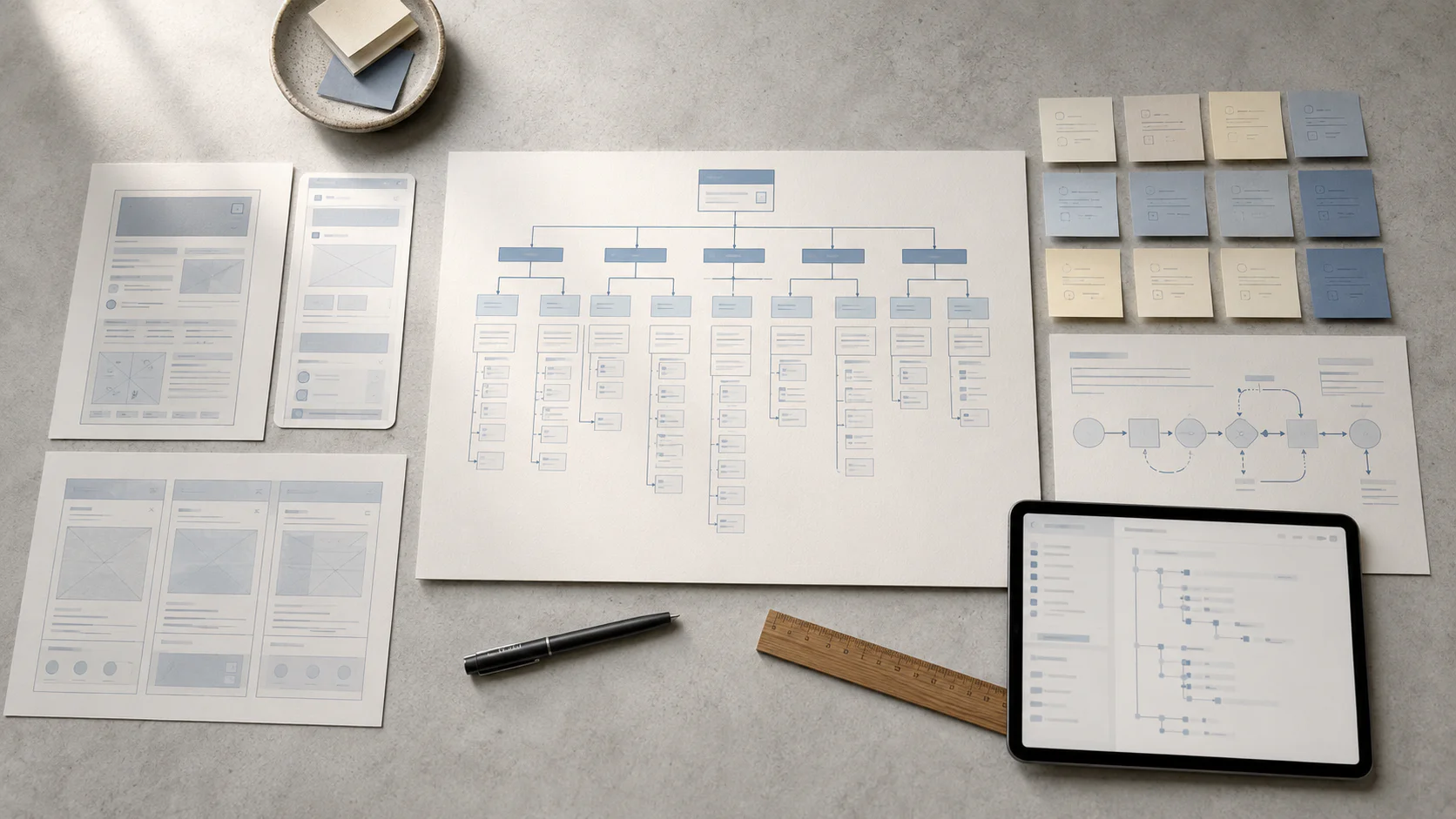
Represent the hierarchy as a simple tree. A corporate site for a Malaysian SME might look like this:
Home
├── About
│   ├── Our Story
│   ├── Team
│   └── Careers
├── Services
│   ├── Service One
│   ├── Service Two
│   └── Service Three
├── Our Work
│   ├── Case Study A
│   └── Case Study B
├── Insights (Blog)
│   └── Article pages
└── Contact
The depth of a page is the number of clicks from the homepage to reach it. In the tree above, “Team” is two clicks deep (Home, About, Team). As a planning rule of thumb we use, keep every important page within three clicks of the homepage, and keep the menu hierarchy to roughly two or three levels. This is a usability and crawl-priority heuristic. There is no fixed click count that Google rewards or penalises; the point is that pages buried deep tend to be found later, linked to less, and treated as lower priority by both people and crawlers.
The link to search runs through internal linking as much as menu depth. A page is reachable in few clicks because something links to it. The homepage, the section hubs, and high-traffic pages are the strongest internal linkers, so the pages you most want found should be linked from them. A page that exists in the structure but has nothing pointing at it is an orphan: technically present, practically invisible. The technical layer beneath this, how crawlers discover and prioritise pages, is covered in Layer 1 of our technical SEO guide and handled by our SEO service; this guide stays on the structural decision that feeds it.
Two patterns help keep the hierarchy shallow without losing content:
- Hub-and-spoke grouping. A section hub page (Services) links down to its children (each service) and back up. The hub keeps the children shallow and gives crawlers and visitors a clear parent. This is the same pattern that organises a well-built blog cluster.
- Flatten before you deepen. When a section grows past comfortable depth, the instinct is to add another sub-level. Usually the better move is to regroup. If “Services > Category > Sub-category > Page” is four levels, ask whether the category and sub-category can merge, or whether a few pages can move up.
The output of step three is a finalised hierarchy tree with depth checked: every important page within reach, no section deeper than it needs to be, and a clear parent for every child.
Step 4: draft the planning sitemap and URL rules
The planning sitemap is the document that records the finalised hierarchy as a clean, signed-off map of pages. It is the artefact the brief, the quote, and the design are all built against, which is why it is the thing the client signs off before design begins.
Be clear about which sitemap this is. The planning sitemap is human-readable, made before the build, and read by your team and your agency. It is not the XML sitemap, which is a machine-readable file generated at launch that lists live URLs for crawlers. They share a name and a hierarchy, but they are made at opposite ends of the project for different audiences. A common point of confusion, worth settling once: planning sitemap now, XML sitemap at launch.
The planning sitemap is also where URL rules get decided, because a URL should mirror the hierarchy. Settle the pattern before any page is built, because changing a URL after launch means a redirect, and a site full of avoidable redirects is a self-inflicted maintenance burden. The URL rules we apply on Malaysian corporate builds:
- Mirror the hierarchy. A service page under the Services section reads
/services/service-name/, not/page-id-4821/. The URL should tell a visitor and a crawler where the page sits. - Keep slugs short, lowercase, and hyphenated.
/our-work/website/reads cleanly;/Our_Work/Website_Projects_2026/does not. - Use words in the path. A readable slug describes the page. Avoid query strings and ID numbers in public URLs where a clean path will do.
- Decide trailing-slash and case conventions once, and apply them everywhere, so you do not create two URLs for the same page.
- Plan redirects for a redesign up front. If the new structure changes existing URLs, every changed URL needs a one-to-one 301 to its closest new equivalent, mapped in a spreadsheet alongside the sitemap. The migration discipline that protects rankings through that cutover is covered in the web design hub’s redesign section.
The output of step four is a signed-off planning sitemap with a URL pattern attached. That is the structural contract. From here, navigation and design have a fixed foundation to build on.
Step 5: plan the navigation system
Navigation is how the structure becomes usable. The hierarchy is the truth of the site; navigation is the visible interface to that truth. Plan three navigation systems together, because each does a different job and a good architecture uses all three.
The primary menu is the top-level navigation, and its job is to expose the main sections. A common Malaysian corporate pattern is five to seven top-level items: a clear primary action set such as About, Services, Our Work, Insights, and Contact, with dropdowns revealing the children of sections that have them. Two rules keep it usable. First, label items in the words your audience uses, the same labels confirmed in the card sort. Second, resist the pressure to add a top-level item for every internal stakeholder; a menu with twelve top-level items is a structure that was never prioritised.
The footer is the secondary navigation and the catch-all for pages that matter but do not belong in the primary menu. This is where the privacy notice, terms, careers, sitemap link, and contact details live, and on a Malaysian site the footer is also where the local trust signals sit: the Kuala Lumpur and Selangor location line, the business registration where relevant, and the bilingual privacy notice link. The footer carries the pages a visitor looks for deliberately rather than browses for.
Breadcrumbs show the visitor where they are in the hierarchy and give them a one-click path back up. On a site more than two levels deep, breadcrumbs become the orientation system. Home > Our Work > Website > Project Name tells a visitor exactly where they landed from a search result and lets them step up to the parent section. They also reinforce the parent-child structure for crawlers. Plan breadcrumbs into any structure deeper than two levels.
A quick note on what navigation is not for. A landing page deliberately strips the primary menu to keep a campaign visitor on one conversion path, which is a conversion-design decision; that pattern is covered in our landing page guide. The structural navigation planned here is for the main site, where the visitor’s job is to explore and find.
The output of step five is a navigation plan: the primary menu items and their dropdowns, the footer groups, and the breadcrumb pattern, all flowing from the signed-off hierarchy.
Structuring a bilingual BM, EN, CN site
A large share of Malaysian corporate sites serve more than one language, and language is a structural decision that has to be made at planning time, before the English site is built. The structural choice is simple to state and expensive to get wrong: mirror the structure across languages.
Mirroring means every English page has a counterpart at a parallel position in the hierarchy, with the same parent, the same children, and the same navigation order. An English page at /en/services/web-design/ has a Bahasa Malaysia counterpart at /ms/services/reka-bentuk-web/ sitting in the same place in the tree. The recommended pattern for a Malaysian business targeting one country in multiple languages is one domain with language subdirectories (/en/, /ms/, and /zh/ where Chinese is in scope), which keeps all the site’s authority on a single domain. The matching pages are then connected with hreflang annotations, which is the setup Google recommends for localised pages so search engines can serve the right language version. The hreflang implementation detail, the tag syntax and the bidirectional rules, is covered in the multilingual section of our landing page guide; the structural decision is the one to settle here.
Two planning decisions decide whether a bilingual structure works:
- Decide the scope of each language up front. Not every site is fully trilingual. A listed company might publish its corporate and investor sections in English and Bahasa Malaysia, with a Chinese version of only the marketing pages. Decide which sections are bilingual, which are trilingual, and which stay single-language during planning, because the answer shapes the sitemap, the URL plan, and the content budget. Retrofitting a second language onto a structure that was not planned for it means rebuilding the navigation and the URL plan, which is the costly path.
- Plan the language switcher into the navigation. The switcher belongs in the global header, labelled in each language’s own script, and it should keep the visitor on the equivalent page rather than dumping them back on the homepage. A visitor reading the English services page who switches to Bahasa Malaysia should land on the Bahasa Malaysia services page, which only works if the structure is mirrored.
The structural output is a sitemap that exists in parallel per language, with the language scope of each section decided, the URL pattern set, and the switcher planned into the navigation. The translation and content uplift sit on top of that structure.
The Malaysian corporate sections teams forget
Malaysian corporate and listed-company sites carry sections that a generic website template does not anticipate, and these are the sections most often missed in the card sort, because the marketing team planning the site does not own them internally. Plan for them during the information architecture workshop, with the relevant department in the room, or they get bolted on later at the cost of the structure.
The sections that catch Malaysian teams out:
- Investor relations (for listed entities). A Bursa-listed company is expected to publish an investor landing area covering annual reports, quarterly results, material announcements, corporate governance, and board composition, organised with clear categorisation and chronological filing. This is a structural commitment: it has its own hub, its own children, and its own content workflow so the IR team can publish announcements without a developer. It usually sits as a top-level or near-top-level section because investors arrive looking specifically for it.
- Careers. Often forgotten until late, then squeezed in under About. For companies actively hiring, careers deserves a planned position with room for role listings and an application path.
- CSR and sustainability. Increasingly expected of larger Malaysian companies, and for listed groups tied to sustainability reporting obligations. It needs a home in the structure, frequently as a child of About or its own section, planned rather than appended.
- Tenders, vendor registration, or procurement. Common for construction, property, and supply-chain businesses, where partners and subcontractors arrive specifically to register or to find tender information. If your business has this audience, it needs a planned path.
- News and announcements. Distinct from a marketing blog. Corporate announcements, press releases, and media contacts serve a different audience than insight articles and often need their own section and their own publishing workflow.
The common thread is that each of these sections serves a non-marketing audience: an investor, a candidate, a subcontractor, a journalist. The reason they get forgotten is that the team planning the site rarely represents those audiences. The fix is the workshop discipline from step two: get the right people in the room, group by what the visitor came to do, and these sections surface during planning, where they are cheap to place, instead of during the build, where they are not.
Step 6: validate the structure before the build
The last planning step is to test the structure before anyone designs or develops against it. Validation is cheap at this stage and expensive at every later one, so it is worth a deliberate pass.
Run the structure through five checks:
- Crawl-depth check. Walk the tree and confirm every important page is within about three clicks of the homepage. Anything deeper either needs to move up, or needs strong internal links from high-authority pages to compensate. Note which pages those are while the structure is still on paper.
- Orphan check. Confirm every page has at least one other page linking to it. A page in the sitemap that nothing links to will be hard for visitors and crawlers to find. Decide its internal links now, as part of the structure.
- Tree test. Give a few people who were not in the workshop the bare hierarchy, with no visual design, and ask them to find specific things: the latest annual report, an open role, a particular service. If they take wrong turns, the labels or the grouping need another pass. This catches naming problems that the team, too close to the content, cannot see.
- Journey check. Re-walk the key visitor journeys end to end on the finalised structure. Trade buyer to material spec. Investor to quarterly result. Candidate to application. Each should be short and obvious.
- Completeness check against obligations. Confirm the corporate and regulatory sections are all present and correctly placed: investor relations, careers, CSR, the bilingual privacy notice, anything the business is expected to publish. This is the last cheap moment to find a missing section.
The output of step six is a validated structure: a hierarchy, a planning sitemap, a URL plan, and a navigation plan that have all been tested before a designer or developer touches them. That validated structure is what gets signed off and handed to design. Everything from here, the visual design, the content, the build, sits on a foundation that has already been pressure-tested.
Two real Walk Production engagements
The two engagements below sit at different ends of the information architecture spectrum: a product-catalogue structure built for findability, and a multi-stakeholder listed-company structure built for several audiences at once. Scope details are drawn from Walk Production’s project records.
Kintex: catalogue taxonomy for a B2B supplier
Kintex is a Malaysian upholstery and covering materials supplier, providing fabric, PVC and PU leather, and related materials to furniture, automotive, and commercial clients. The engagement covered UI/UX design, web content writing, website development, SEO, blog management, and cloud hosting support, and the structural problem was a familiar one: the existing site lacked the structure and content depth to compete in organic search, so a complete rebuild was required.
The architecture decision was a product taxonomy that lets trade buyers find materials by type, application, or specification. Modular layouts organise the product categories, with dedicated landing pages for each category and individual product pages beneath them carrying material details, specifications, and application guidance. That is a deliberate hub-and-spoke hierarchy: category hubs as parents, product pages as children, each reachable in a couple of clicks from the homepage. The blog sits as its own section, reinforcing the category pages through internal linking rather than competing with them.
The information architecture lesson is that for a catalogue business, the structure is the product taxonomy. Getting the grouping right, by type, application, and specification, is what lets a trade buyer land from a search result and reach the right material quickly, and it is what gives the SEO work a clean set of category pages to target. Search performance depends on factors outside any single project and cannot be guaranteed, but a structure built around how buyers search is the foundation the rest of the work stands on.
MGB Berhad: multi-stakeholder structure for a listed company
MGB Berhad is a Bursa-listed company in the construction and property development sector, and the revamp covered UI/UX design, website development, web content writing, website maintenance, and hosting support. As a listed entity, its website serves several stakeholder groups at once: shareholders, institutional investors, business partners, media contacts, and commercial clients. That is the defining information architecture challenge, organising one structure that works for several audiences who arrive looking for very different things.
The architecture organises content into clear sections for investors, potential clients, media, and corporate partners, so each audience has a direct path to what it came for. The investor relations section is the structural centrepiece: it organises annual reports, quarterly results, material announcements, and board composition with clear categorisation and chronological filing. Crucially, the modular WordPress structure lets the internal team publish announcements, update project statuses, and add financial documents without developer support, which is an architecture decision as much as a CMS one, because the publishing workflow has to be designed into the structure.
The information architecture lesson is that listed-company structure carries complexity that a standard corporate site does not. Investor relations, governance, announcements, and disclosure each need a planned home, a clear parent, and a publishing path, and they have to coexist with the commercial sections without burying either. That is exactly the kind of multi-audience structure the information architecture workshop in step two is built to settle, with the investor relations side of the business represented in the room.
Common structure mistakes we keep fixing
The mistakes below account for most of the structural problems we audit on Malaysian websites. None are sector-specific. All are preventable at the planning stage.
Mirroring the org chart instead of the visitor. The most common mistake. The menu reflects the company’s internal departments, so a visitor with a task has to know which department owns the answer before they can find it. Group by the jobs visitors come to do.
Designing before the structure is signed off. Approving mockups on an unsettled hierarchy guarantees rework when the structure changes. Lock the planning sitemap first. The design is built against the structure.
A menu that grew instead of being planned. Twelve top-level items, each added because a stakeholder insisted, is a structure that was never prioritised. Five to seven top-level items, chosen deliberately, is a structure that was. The menu is a prioritisation decision.
Burying important pages too deep. A page four or five clicks down is a page that visitors and crawlers find late and value less. The fix is rarely a deeper menu; it is better grouping, a flatter hierarchy, or stronger internal links from high-authority pages.
Forgetting the non-marketing sections. Investor relations, careers, CSR, tenders, and announcements get missed because the team planning the site does not own them. Get the right departments in the information architecture workshop and these surface during planning, where they are cheap to place.
Treating the second language as a translation job. Bolting a second language onto a finished English site means rebuilding the navigation and URL plan. Decide the language scope of each section at planning time and mirror the structure from the start.
Improvising URLs. Page IDs and inconsistent slugs in public URLs are a self-inflicted SEO and maintenance cost. Set the URL pattern with the planning sitemap, mirror the hierarchy, and decide the conventions once.
Where to start
If you are planning a new website or a redesign, the structure is the first work to do, before the brief is finalised and well before any design begins. The practical sequence:
- Inventory the content. For a redesign, audit every existing page with a keep, merge, rewrite, or kill decision. For a new build, list every page the business needs, sourced from commercial goals, audiences, and obligations.
- Run a card sort. Group the pages into named sections, with the right people in the room and the visitor’s tasks as the guide.
- Set the hierarchy. Turn the groups into a tree of parents and children, and check that every important page is within about three clicks of the homepage.
- Draft the planning sitemap and URL rules. Record the finalised hierarchy as a signed-off map, with a clean URL pattern that mirrors it.
- Plan the navigation. Primary menu, footer, and breadcrumbs, all flowing from the hierarchy, plus the language switcher if the site is bilingual.
- Validate before the build. Crawl-depth, orphan, tree test, journey, and completeness checks, all run before a designer or developer touches the structure.
With a validated structure in hand, the web design brief and cost guide covers how to turn it into a brief that can be costed accurately and an agency shortlist that can quote like-for-like.
How Walk Production plans website structure
Walk Production runs web design, content marketing, and SEO as one discipline from Kuala Lumpur and Selangor, and the structure work described in this guide is the first phase of every corporate website engagement we take on. The information architecture workshop, the content audit, the card sort, the hierarchy, the planning sitemap, the navigation plan, and the pre-build validation all happen before a designer opens a page, which is what lets the design, the content, and the build sit on one stable foundation.
Our 40 in-house specialists across content, design, development, and SEO mean the people who plan the structure are the same people who write the content, design the templates, and build the site, so the structure that gets signed off is the structure that gets built.
If you are planning a new website or a redesign and want the structure settled properly before the build, talk to our team. The website portfolio shows how the structural approach plays out across catalogue businesses, multi-stakeholder listed groups, and bilingual corporate sites.