Introduction
Eat.Me.Go. is a ready-to-eat convenience store concept based in Malaysia.
Walk Production was appointed to build the brand from the ground up, covering brand strategy, logo design, corporate identity, packaging design, and brand guidelines. The work took the brand from concept through to market-ready visual assets.
Our Solutions
Brand strategy and logo design
The branding programme set positioning around cultural food from around the world alongside local delicacies. The brand promise ‘Your Necessity, Our Priority’ speaks to convenient, quality meals. Audience research pointed to working professionals after a quick bite and value-conscious shoppers, and the brand personality was set as friendly, energetic and approachable.
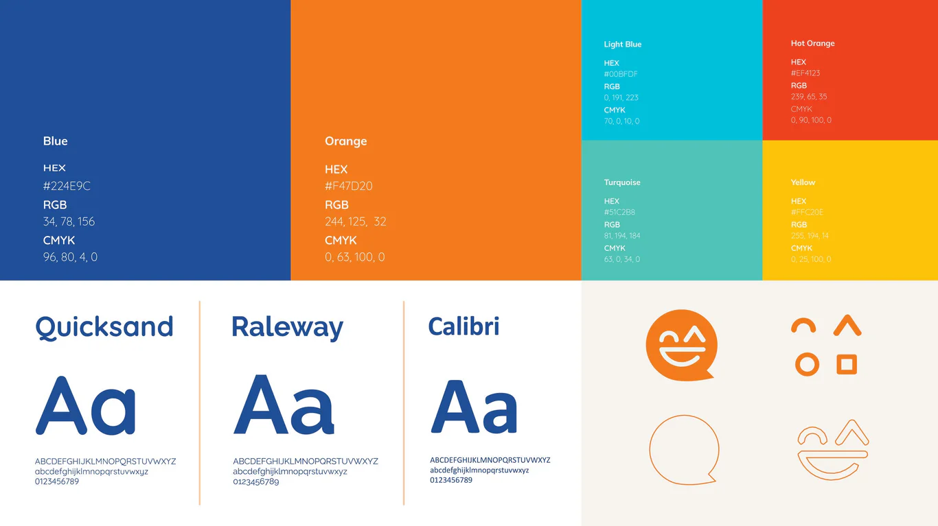
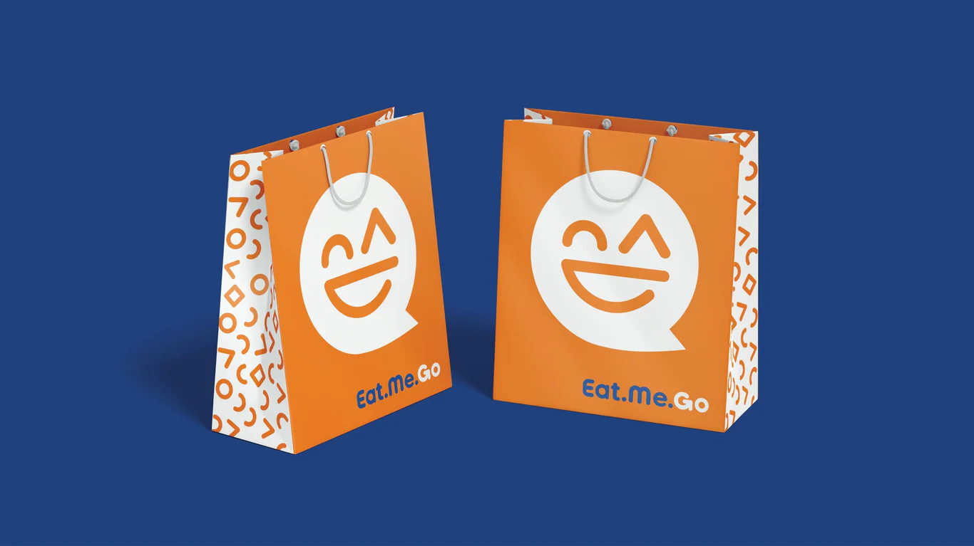
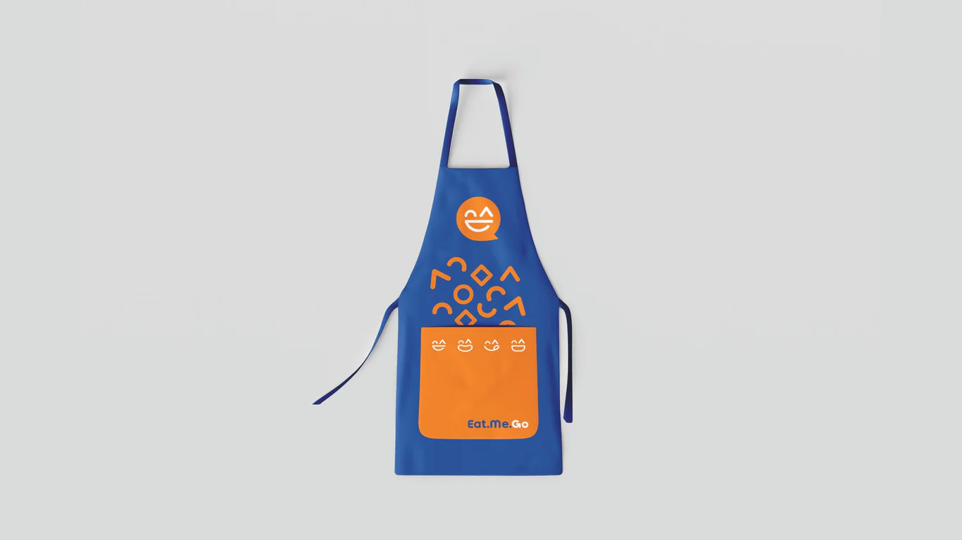
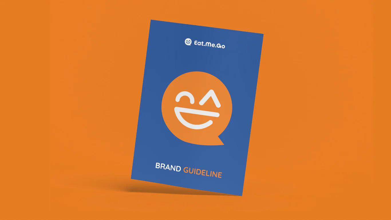
The professional logo design is a clean logotype set in bold, thick lettering with rounded edges for a friendly feel. The word ‘Go’ sits in orange to play up the food-to-go idea, and the ‘G’ carries a circular arrow that nods to global cuisine. The logomark pairs a happy face with a speech bubble, a fit for the command-style brand name. Blue brings a sense of trust, while orange adds warmth and energy.
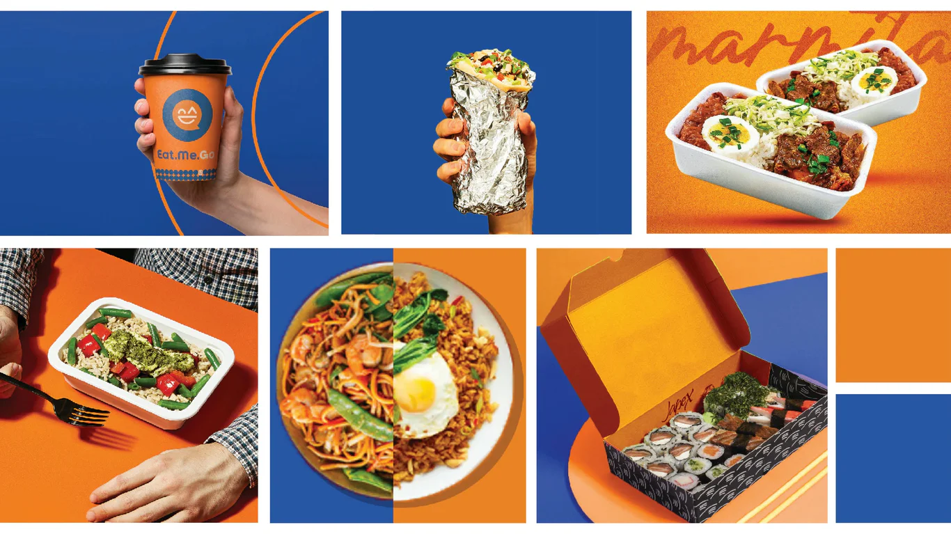
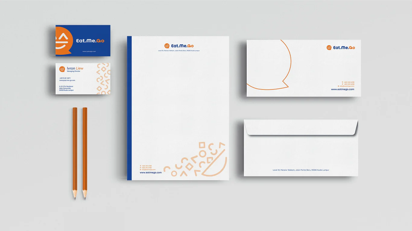
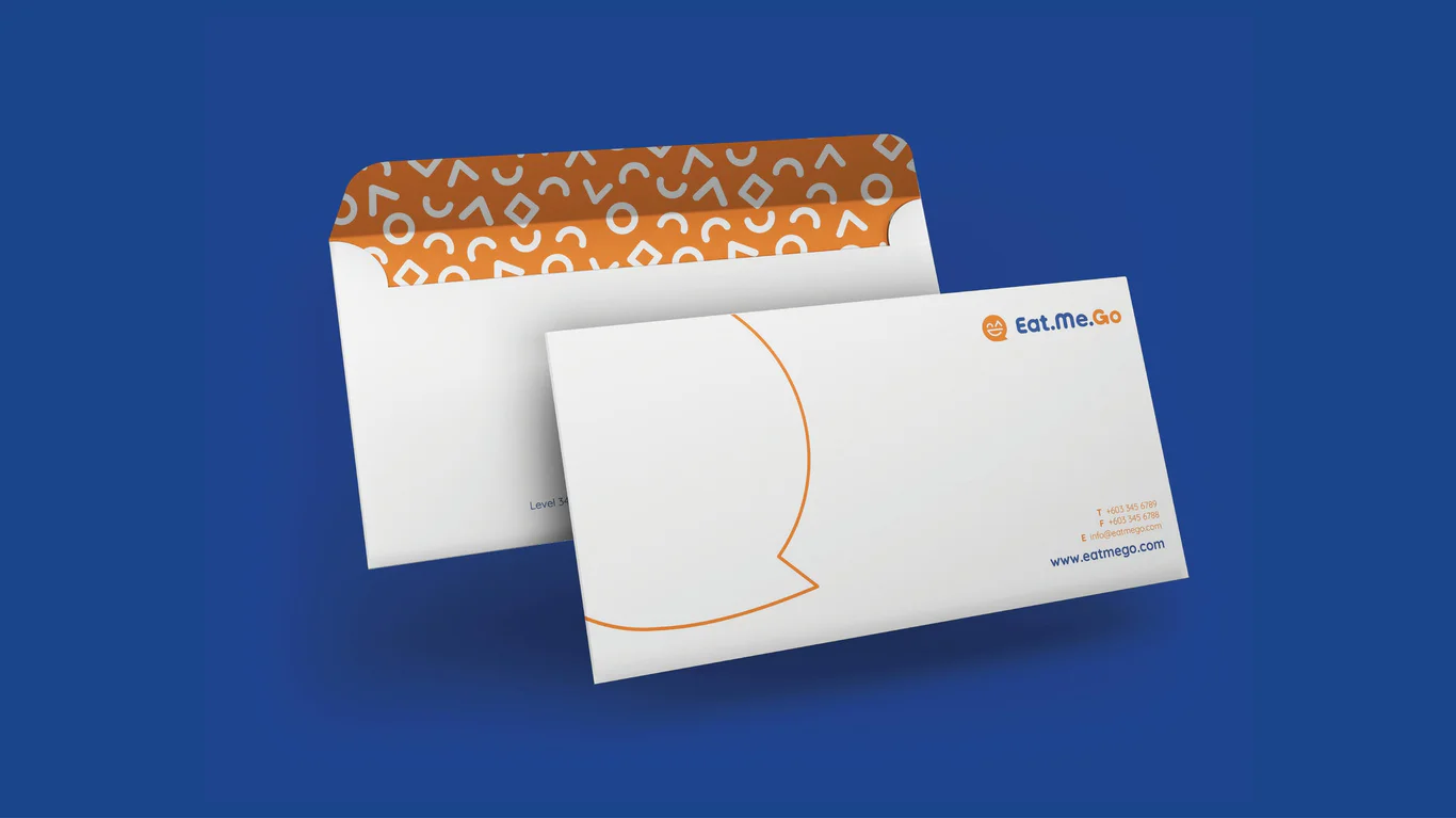
Corporate identity and packaging
The brand identity design extends across all customer touchpoints including store signage, staff uniforms, and marketing materials. The visual system creates a cohesive look that customers can recognise across all store locations and promotional channels.
The packaging design covers food containers, bags, cups and wrapping, all kept visually consistent while signalling freshness and quality. Each piece carries the friendly, energetic brand personality, and the formats are practical for eating on the move.
Brand guidelines
A retail brand standards document sets out logo usage with horizontal and vertical lockups, the colour palette, and typography. Application rules run across brand touchpoints from store signage to digital advertising templates.
The guidelines govern consistent brand presentation as Eat.Me.Go. expands its store network. Clear rules for colour application, typography hierarchy, and logo placement help franchise operators and internal teams maintain the brand identity across new locations and seasonal marketing campaigns.
The Results
The branding programme gave Eat.Me.Go. a fresh, contemporary identity aimed at busy urban consumers. The friendly, energetic visual system helps the brand stand out in a competitive convenience food market.
The brand assets cover what is needed for a consistent store rollout, from signage to packaging. The brand standards manual supports growth by giving franchise operators clear guidance on keeping the visual identity consistent across locations.
Project Gallery

Related Questions
Why is brand strategy important for new F&B concepts?
Brand positioning work establishes audience, personality, and direction before visual design begins. For F&B concepts, this foundation guides everything from store design to menu presentation, creating coherent customer experiences that support repeat visits.
How does colour psychology apply to food branding?
Colours trigger emotional responses affecting food perception. Orange stimulates appetite and conveys energy. Blue builds trust. The combination creates an inviting yet reliable impression for quick-service food brands targeting busy consumers.
What makes effective convenience store packaging?
Effective convenience store packaging balances functionality with brand communication. It must be practical for on-the-go consumption whilst visually reinforcing brand identity. Materials should maintain food quality and the design must communicate freshness to customers.
Why use friendly brand personality for food retail?
Friendly brand personality creates approachability and encourages repeat visits. For daily convenience purchases, customers prefer brands that feel welcoming rather than formal or distant. A warm personality builds familiarity that drives regular customer habits.
How do brand guidelines support retail expansion?
Brand guidelines provide governance for consistent presentation across multiple locations. They prevent visual inconsistency as different teams implement the brand, protecting brand equity during growth and helping new locations launch with the correct visual standards.