Introduction
Kaotim is a digital takaful platform in Malaysia. Walk Production was engaged to build the brand from the ground up, from strategy through visual identity and corporate applications.
The brand needed an identity that read as approachable and modern while keeping the credibility a takaful business carries. The work ran across brand strategy, visual identity, corporate applications and marketing collateral.
Our Solutions
Brand strategy and positioning
The brand work positioned Kaotim as a digital takaful brand that reads as both modern and trustworthy. Four brand personality traits were defined to guide all communications: Innovative, Visionary, Collaborative and Active. These traits inform tone of voice, visual treatment and messaging across every touchpoint.
The brand promise centres on simplifying the insurance experience for customers. Target audiences include personal customers, corporate clients and prospective customers seeking accessible takaful products. Positioning statements were developed in both English and Bahasa Malaysia to support bilingual communications and reflect the local market.
Visual identity and logo design
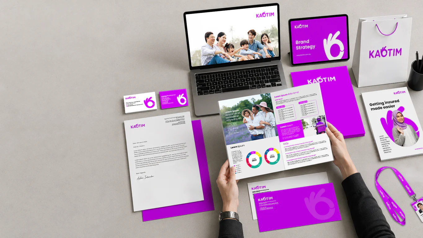
The visual identity centres on a purple palette that reads as modern and distinct, with secondary colours giving the system room to flex across digital and print applications. Purple was chosen partly to stand apart from the blue most of the financial services category defaults to.
The logomark and identity was designed to be responsive across applications from mobile screens to printed stationery. A secondary graphic element called the Kaotim Contour was derived from the logo to provide visual consistency across marketing materials, social media templates and advertising formats.
Corporate identity and brand guidelines
A corporate identity programme was developed covering stationery and marketing collateral. The stationery suite includes business cards, letterhead, envelopes, corporate folders, notebooks and PowerPoint templates for client and investor presentations.
Marketing materials span offline and online channels including brochures, flyers, banners, billboards and social media templates. The brand reference document provides governance for logo usage, colour specifications, typography and imagery direction across all application formats.
The Results
The brand identity positioned Kaotim as a modern digital takaful platform while keeping the credibility expected within the takaful sector. The visual system carries across digital-first applications while remaining suited to formal corporate communications.
The brand guidelines support consistent application across internal teams and external partners as the platform scales.
Related Questions
Why purple for Kaotim as a digital takaful platform?
Blue is the default colour for financial services, which makes it harder for a new digital brand to stand out in the category. Purple reads as modern and fits a digital-first platform aimed at tech-savvy consumers, while the rest of the Kaotim system keeps the credibility cues a regulated takaful brand needs.
What is the Kaotim Contour and why include it?
The Kaotim Contour is a secondary graphic element derived from the logo. It gives the brand a recognisable visual signature across marketing materials, social media templates and advertising without overusing the primary Kaotim logo on every surface.
Why launch Kaotim bilingual in English and Bahasa Malaysia from the start?
Both languages are part of how Kaotim’s customers and partners read insurance content in Malaysia. Building positioning statements in both languages from the start means the brand reads naturally to either audience without translation feeling like an afterthought.
How does Kaotim’s visual system carry across digital and print at the same time?
The Kaotim logomark was designed to remain readable from mobile screens to printed stationery, and the colour palette includes secondary colours that provide flexibility for different application formats. The brand guidelines define usage rules for both media types.
What do Kaotim’s four brand traits actually do for the team?
Kaotim’s four traits, Innovative, Visionary, Collaborative and Active, give the team a written reference for tone of voice and visual choices when producing new collateral. They keep the brand’s communications consistent as more people across the business start producing customer-facing materials.