Introduction
Mirack Technologies Sdn Bhd (MirackTech) is a Malaysian system integrator working in media technology. As the company scaled its specialist media-tech positioning, the brief was a brand audit followed by a rebrand to bring the brand into line with where the business was heading.
Walk Production was engaged for the audit and the rebrand. The engagement ran around three months and covered the audit, brand strategy, logo enhancement, corporate identity, company profile, PowerPoint master deck, marketing collateral and copywriting.
Our Solutions
Brand audit
The brand audit reviewed MirackTech’s existing brand against three checks: visual identity performance across digital and print, market perception against specialist competitors, and practical limitations the in-house team had run into with the existing assets. The audit documented findings as a written report with side-by-side examples, so the rebrand brief was grounded in evidence rather than opinion.
Brand strategy and positioning
The strategy work repositioned MirackTech as a specialist media technology partner first, with the broader IT-integrator capability second. Key positioning lines were written around the company’s specialist capabilities, and these fed directly into the company profile and the PowerPoint master deck so the new positioning carried into the documents the sales team uses.
Logo enhancement, corporate identity and company profile
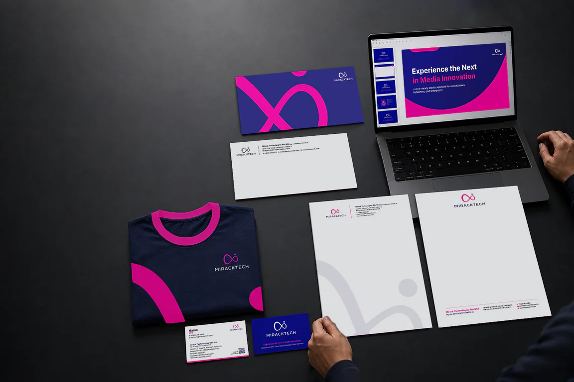
The logo work refined the existing infinity symbol rather than replacing it. The infinity mark already carried recognition with current clients, so the call was to re-proportion and re-balance it, refresh the palette and add variants for the application range the legacy logo could not handle.
The corporate identity system covers stationery, technical documentation templates, sales materials and digital application templates. Templates were specified so the in-house team could produce documents in the new brand without going back to design for every job.
The company profile was written and laid out around the specialist positioning. Service offerings are presented in the order the company wants tender readers to see them, followed by certifications and named partnerships. The profile reads as a procurement document, not a marketing brochure.
The Results
After the rebrand, MirackTech had a brand audit on file, a refreshed logo system, an identity system the in-house team could roll out without case-by-case design, and a company profile and master deck written to land in tender-style reads. The legacy infinity symbol carried forward into the new mark, so existing client recognition stayed intact.
Related Questions
Why did Walk Production keep MirackTech’s infinity logomark instead of redrawing it?
The infinity mark was already carrying recognition with existing clients. Replacing it would have introduced a second logo to reconcile across active accounts. The audit pointed to the mark’s flexibility issues, not its concept, so the call was to refine the mark and rebuild around it rather than start from zero.
What did the brand audit find that led to the rebrand scope?
Two recurring problems. The legacy logo did not hold across the application range, particularly at smaller sizes. The existing palette did not survive the application range either. Both pointed at production-level limitations rather than a positioning issue, so the rebrand scope sat at the system level rather than at the conceptual level.
Why reposition MirackTech as a specialist before a generalist?
Specialist procurement reads the specialist line first when shortlisting vendors. A generalist read keeps the company in a wider integrator pile, which is a harder shortlist to get out of. Repositioning as a specialist first surfaces the company alongside specialist competitors at the right step of the procurement funnel.
What ships with the new MirackTech corporate identity that an off-the-shelf identity system would not include?
Application templates for the documents the in-house team produces day-to-day. Those were the surfaces the legacy identity had been struggling on, so they got their own rules in the new identity rather than being treated as edge cases.
How long did the MirackTech rebrand take from audit kickoff to delivery?
Around three months, including the audit, brand strategy, logo enhancement, corporate identity, company profile, PowerPoint master deck, marketing collateral and copywriting. The audit and the rebrand were run as a continuous engagement so the audit findings fed directly into the strategy phase without a re-brief in between.