Introduction
SuperDNA is a genetic testing service based in Malaysia. The company required a complete brand identity that communicates scientific precision whilst being accessible to consumers seeking insights about their genetic information.
Walk Production built the brand from scratch. The scope covered strategy, visual identity, packaging, brand guidelines, and a genetic testing report template.
Our Solutions
Brand strategy and logo design
The branding programme positioned SuperDNA around accuracy, privacy, and the value of the insights it gives people. The brand personality balances scientific credibility with approachability, helping set the service apart in the genetic testing market. Audience research informed the visual direction and the way the brand speaks.
The brand mark design folds several ideas into one symbol. It carries the brand initial ‘S’ and a DNA helix for the science behind the service, with an infinity loop for the depth of what a genome can reveal and arrows held within a square for stability. The tagline ‘Unlock the power of your DNA’ carries the brand promise.
Visual identity and packaging
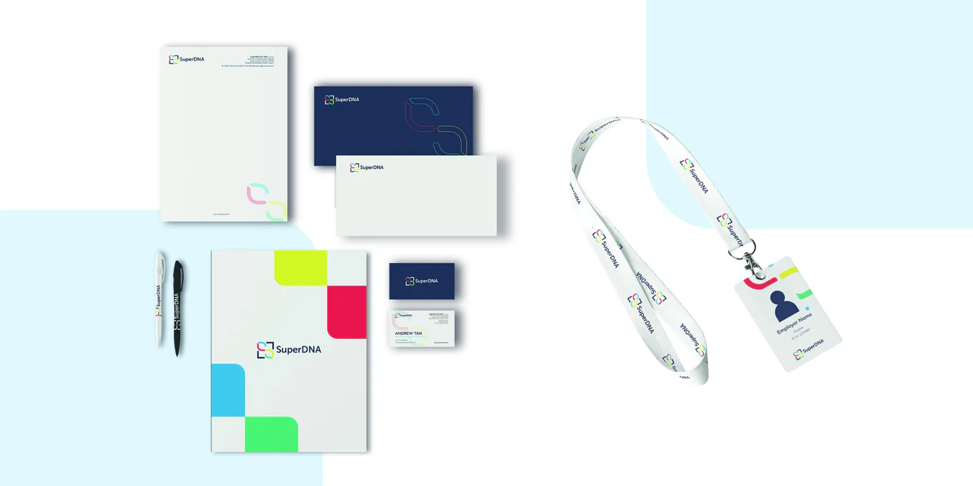
The colour palette uses the blue, red, yellow, and green of the DNA nucleotides, tying the visual system straight back to the science behind the service. Grey provides professional balance. The healthcare brand identity extends across stationery, signage, uniforms, and digital applications.
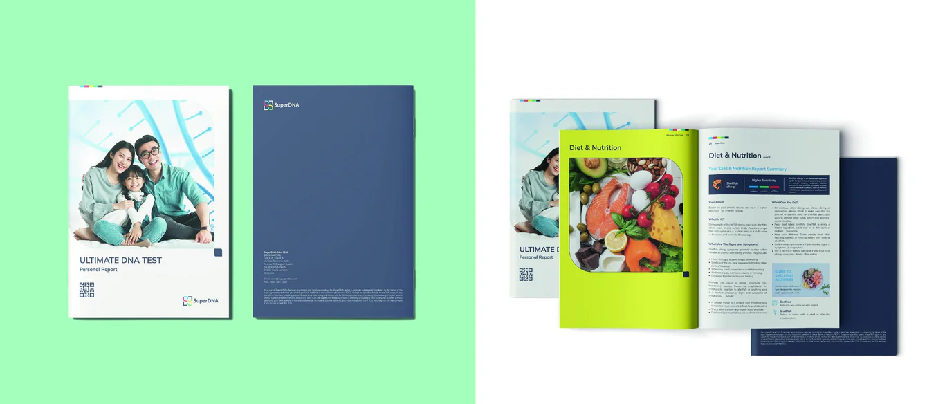
Secondary graphics were developed from the DNA helix shape, providing pattern options for backgrounds and marketing materials. Label and packaging for test kits extends the brand identity to consumer touchpoints, maintaining visual consistency throughout the customer journey from purchase to results delivery.
Genetic testing report and brand guidelines
A distinctive genetic testing report template was designed to present complex data as clear, accessible insights. The report structure balances scientific accuracy with visual clarity, using intuitive layouts, infographics, and plain-language explanations. Each section uses consistent visual hierarchy and colour-coded results indicators.
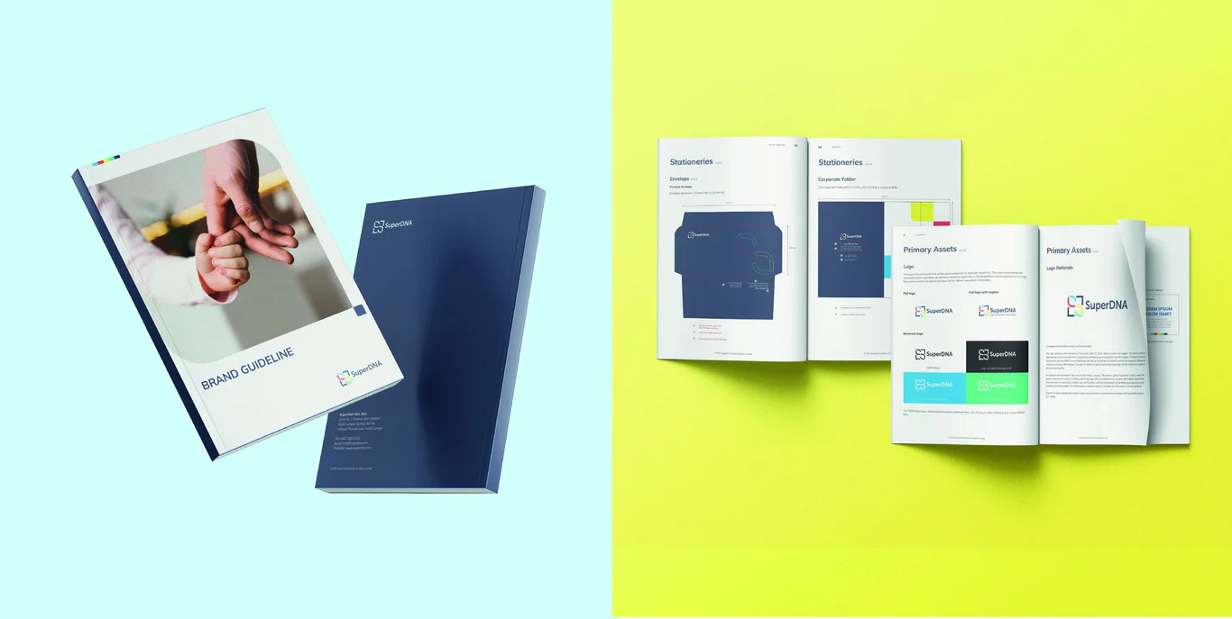
Comprehensive healthcare brand guidelines cover logo usage, colour specifications, typography, secondary graphics, imagery direction, and application rules. The guidelines support consistent brand presentation across all platforms and customer touchpoints as SuperDNA expands its service offerings.
The Results
The branding established SuperDNA with a distinctive identity that communicates scientific credibility whilst remaining accessible to consumers. The DNA nucleotide colour palette creates immediate visual association with genetic science, differentiating the brand in the healthcare market.
The genetic testing report design converts a technical deliverable into a valuable customer asset, supporting understanding and engagement with results. The comprehensive brand system provides governance for consistent application as the company grows.
Project Gallery


Related Questions
How should genetic testing brands balance science and accessibility?
Visual identity for genetic testing brands needs to convey scientific credibility without intimidating consumers. Using recognisable science symbols with approachable colours and clear typography helps bridge the gap between technical precision and consumer understanding.
What makes an effective genetic testing report?
Effective genetic testing reports balance scientific accuracy with visual clarity. They use consistent hierarchy, colour-coded indicators, infographics, and plain-language explanations to help users understand results and their implications without specialised knowledge.
Why use DNA nucleotide colours in genetic testing branding?
The four DNA nucleotide colours create immediate visual association with genetic science. This palette differentiates genetic testing brands from general healthcare companies and provides a meaningful scientific foundation for the visual identity system.
What role does packaging play in healthcare consumer products?
Packaging for healthcare consumer products must convey trustworthiness and professionalism whilst providing clear usage information. For test kits, packaging is often the first physical brand touchpoint and sets expectations for the testing experience.
How do secondary graphics support brand consistency?
Secondary graphics derived from logo elements provide visual flexibility for marketing and packaging without overusing the primary logo. They can be applied as patterns, backgrounds, or accent elements across touchpoints whilst maintaining brand recognition.