Introduction
Sutra Medi-Environ is a medical equipment distributor based in Malaysia, specialising in devices for interventional pain treatment and management.
Walk Production was appointed to lead a rebrand that modernised the company’s visual presence and strengthened its digital footprint, supporting business development in a specialised healthcare segment.
Our Solutions
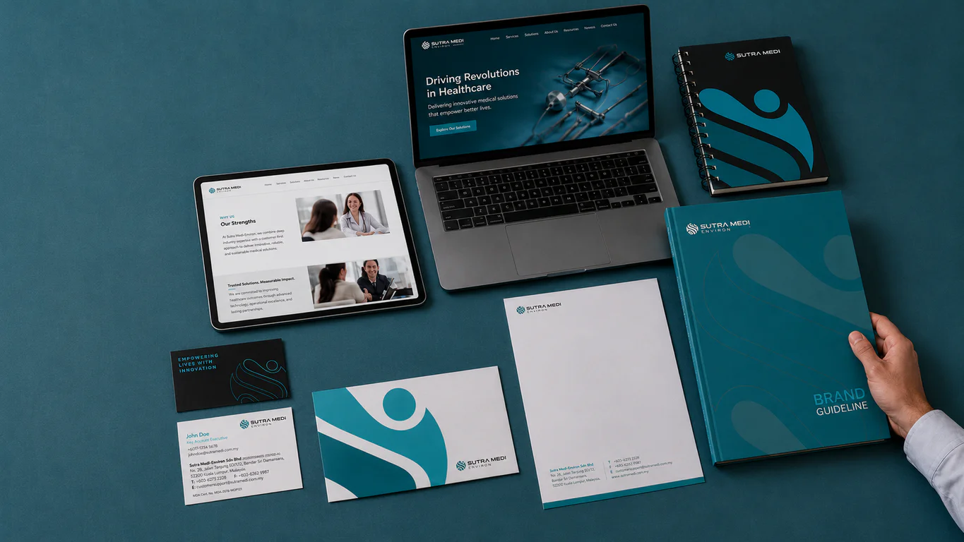
Brand logo and visual identity
The logo design developed a combination mark integrating multiple symbolic elements. The design combines a globe motif representing connectivity, the brand initial ‘S’ and a people-centric form within a circular shape symbolising complete medical care.
The new logo improves on the original through better proportional balance between logomark and wordmark, a more responsive treatment across media, and a modern visual treatment that reflects the company’s positioning. The bold sans-serif wordmark provides legibility and recognition across both clinical and corporate environments.
Corporate identity system
A corporate identity programme was developed covering healthcare-relevant applications. The identity extends to email signatures, brochures, envelopes, social media templates, uniforms, signage, diaries, folders and medical scrubs.
The typography system uses Lato as the primary typeface for corporate communications and Montserrat as a secondary face for titles and headers. Secondary graphics derived from the logo provide visual flexibility for marketing materials and slide deck design templates used during product presentations to medical audiences.
Company profile, brand guidelines and website
A business profile design communicates Sutra Medi’s role in interventional pain medicine. The profile highlights the company’s work in interventional pain medicine, its manufacturer partnerships and commitment to patient care. The medical brand guidelines document the visual system covering all application rules.
A company website was developed to strengthen digital presence and support business development. The site presents the company’s product portfolio, treatment approaches and commitment to healthcare providers, giving medical audiences a resource for evaluating products and capabilities.
The Results
The rebrand established Sutra Medi with a modern identity that reflects its position in interventional pain medicine. The visual system communicates the company’s people-centric approach and commitment to patient care in the specialised pain management field.
The identity system provides consistent brand application across all touchpoints, from clinical environments to digital platforms. The website and company profile support business development activities with healthcare providers across Malaysia.
Related Questions
Why combine a globe motif, the ‘S’ initial and a people-centric form into Sutra Medi’s mark?
Each element points to a piece of what Sutra Medi actually does. The globe carries connectivity within the medical field. The ‘S’ anchors the brand initial. The people-centric form inside a circle reads as complete care for patients. Combining them gives the mark visible meaning rather than a decorative shape.
Why pair Lato with Montserrat as Sutra Medi’s typography system?
Lato carries the body type for Sutra Medi’s corporate communications, where readability across long-form documents matters. Montserrat handles titles and headers, where presence is more important than long-form readability. Two faces with clear roles keep the brand’s long documents and short-form materials visually consistent.
What does the Sutra Medi rebrand carry forward from the old identity?
The brand initial and the broader positioning around interventional pain medicine carry forward. What changes is proportional balance, responsiveness across media and the visual treatment, so the identity reads modern without breaking recognition with Sutra Medi’s existing healthcare partners.
Why include a website in the Sutra Medi rebrand scope?
Healthcare providers and medical audiences research distributors before reaching out. A website lets them review the product portfolio and treatment approaches at their own pace. Building it into the rebrand kept Sutra Medi’s digital presence aligned with the new identity rather than running on the old visual system.
How long has Sutra Medi-Environ been working in this field?
The rebrand brief was clear on one point: modernise the visual presence without breaking the trust Sutra Medi holds with its existing healthcare partners.