Introduction
WI Edu Sdn Bhd is a Malaysian education provider running courses in AI, data science, digital marketing and cybersecurity.
The brief was to deliver a brand identity that read credibly across both the corporate and the learner-facing surface, and a website that explained the offering clearly without sounding like a sales pitch.
Walk Production was appointed to deliver the brand identity, company profile, master slide deck, marketing collateral, copywriting and corporate website over a three-month engagement, working from the client’s existing W logomark.
Our Solutions
Brand identity system
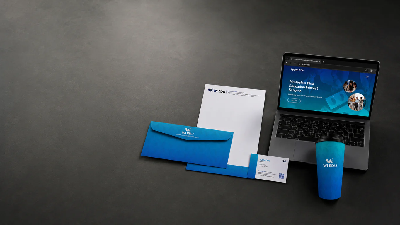
The identity system was built around the existing W mark, which the client wanted to retain as the heritage anchor of the brand. The diagonal cut in the wordmark was carried through into a secondary graphic system that runs across collateral, slide decks and signage. Black plus blue is the primary palette, deliberately understated for the corporate context.
The identity covers stationery, corporate gifts, uniforms and templates for marketing collateral, so the team could roll the brand out from a single source set.
Company profile, master slide deck and copywriting
The company profile was written and designed to do the explainer job the brand needs: what the organisation offers, how the programme is structured, and how courses fit into the participant journey. The profile is written to brief corporate audiences as much as prospective learners.
The master PowerPoint deck mirrors the same structure, so the team can present consistently across audiences without rebuilding slides for every occasion.
Brand guidelines
The brand guidelines document logo usage rules, the black and blue palette, typography hierarchy, imagery direction, secondary graphics and templates for print and digital collateral. Personality traits are defined as client-centric, practical and trusted, written so the team can pick up a piece of new collateral and check whether it sounds like the brand should sound.
Website
The corporate website was built from scratch: web copy, UX, design, development and hosting support. Architecture leads with who the organisation is and how the programme is structured before the course catalogue, because that is the order the audience reads it in.
The visual rhythm is calmer than a typical edtech site, with course detail underneath, which matches the credibility the brand needed to project.
The Results
WI Edu launched with a full set of brand assets that read consistently across the corporate and learner-facing surfaces: logo system, corporate identity, company profile, master deck, marketing collateral, brand guidelines and the corporate website.
Working from the client’s existing W mark rather than redrawing it kept any prior approvals and prior printed materials usable. New touchpoints stack on top of the heritage mark instead of forcing a brand reset.
Related Questions
Why did Walk Production keep the existing W logomark instead of redesigning it?
The W mark already carried the brand’s identity into existing materials and prior approvals. Redrawing it would have created a second set of historical assets to reconcile, with no upside to learners or partners. Keeping the mark and building the system around it was the lower-risk call for the launch.
Why a calmer black-and-blue palette rather than a brighter edtech look?
Bright edtech palettes signal “course platform.” WI Edu wanted a more measured, corporate read. A calmer palette puts the brand into a more understated visual neighbourhood, which is the tone the company wanted to project.
Why does the website lead with the organisation before the course catalogue?
That is the order the buyer is asking the questions in. Someone reading the site for the first time wants to understand who the organisation is before they read the syllabus.
What sits inside WI Edu’s brand guidelines that other education brands often skip?
Voice rules that distinguish the corporate-side copy from the courses-side copy, so a corporate stakeholder and a learner reading the syllabus are not getting the same tone-deaf marketing voice across both. Plus secondary-graphic rules drawn from the W mark, so the team can produce templated collateral without overusing the primary logo.
How long did the WI Edu rollout take from kickoff to launch?
Around three months, covering the identity system, company profile, master deck, brand guidelines, marketing collateral and corporate website in a single workstream. Delivering them together meant the launch could go live with the corporate explainer and the learner-facing materials on the same date.