A stroll around Bukit Bintang at night, and you will be immediately bombarded with a sea of lit-up logos.
Logos are everywhere. From the luxurious clothing line you visit at a shopping mall to a local restaurant near your residence, you will be sure to see various types of logos.
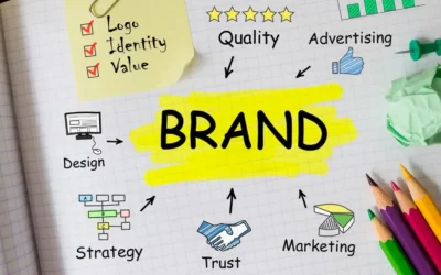
But what exactly is a logo?
Think of it this way: a logo is to a business entity what your name is to you. In other words, a logo is part of the corporate identity elements.
It usually exists as a graphical symbol that represents a company, organisation, or brand.
With a strong brand identity, a logo can also be a visual representation of the values, mission, and brand objectives. A strong brand identity can only exist if you have a good logo design that captures people’s attention and is memorable.
Therefore, it is essential that you know what you need for your logo.
However, there are different types of logos, each with its unique design elements and characteristics. To have a better idea of what type of logo is the most suitable for your brand, check out these 6 different types of logos.
1. Wordmark logos
Compared with the other types of logos, wordmark logos, also known as logotypes, are probably the most straightforward.
These logos consist of the company or brand name written in a distinctive font or typeface. They are simple, easy to read, and highly recognisable.
Wordmark logos are popular among companies with short and memorable names, such as Coca-Cola, Google, and FedEx.
Wordmark logos can be further divided into two categories: serif and sans-serif.
Serif fonts have small decorative lines at the end of each character, while sans-serif fonts don’t. Thus, serif fonts are often used for traditional or formal brands, while sans-serif fonts are for modern and sleek brands.
Some brands, on the other hand, use custom fonts to accentuate their distinctive brand image.
Aside from Coca-Cola, you must have known about the shopping mall Aeon. Instead of using normal and readily available sans-serif fonts, the brand Aeon adds a little touch of customisation to its logotype.
There is a horizontal circle that crosses the characters A and E of the brand’s name. Such a little change makes the logo more unique and, therefore, more recognisable.
2. Lettermark logos
Instead of spelling out the full name of your brand, you can consider using lettermark logos, also known as monogram logos.
Lettermark logos use the initials of a company or brand to create a unique symbol. These types of logos are often used by companies with long and complicated names.
Therefore, if your company or brand has a rather long brand name that is hard to pronounce, lettermark logos might be your ideal option.
Lettermark logos are simple, yet highly recognisable, and can be easily adapted to different media. They are often used in combination with other design elements, such as shapes or colours, to create a more unique and memorable logo.
For example, next time when you visit any H&M clothing Malaysia outlet, keep in mind that its full name is Hennes & Mauritz.
Since it is a foreign name that is quite difficult to pronounce, it makes sense for the company to adopt a lettermark logo of just H&M.
3. Pictorial logos
Pictorial logos are logos that use a simple graphic or symbol to represent a company or brand.
These types of logos are highly recognisable and can be easily identified even without the company name. Pictorial logos are often used by companies with simple and memorable visual identities.
These include, for example, the bitten apple of Apple, the double golden arches of McDonald’s, or Microsoft’s windows of 4 different colours.
Pictorial logos can be further divided into two categories: abstract and literal.
Abstract logos use a simple shape or graphic to represent a company or brand, while literal logos use a more detailed and realistic image to represent a company or brand.
Zus Coffee, a famous premium coffee brand in Malaysia, chooses a pictorial logo as its brand logo. As its name is “Zus”, phonetically resembling Zeus, the brand has an old man with a long white beard (a typical image of Zeus) as its logo.
4. Abstract logos
Abstract logos use simple shapes or graphics to represent a company or brand.
These types of logos are often used by companies with modern and innovative visual identities. Abstract logos are highly adaptable and can be easily modified to suit different media and applications.
Abstract logos differ from abstract pictorial logos in their graphic illustration. For abstract pictorial logos, you can still tell that the abstract visual represents either company’s product, services, or brand name.
On the other hand, abstract logos illustration doesn’t necessarily have to represent the said elements.
Examples include Pepsi’s Globe, MasterCard’s two overlapping circles, and more.
5. Emblems
Some might subsume emblems as part of the pictorial logo. Although it has pictorial elements, the design has a distinct nature that deserves its own category.
Emblems are commonly known as badge logos, as it resembles the kind of badge you can pin to your shirt.
It usually has a crest-like shape with symbolic imagery and sometimes text of the brand’s name.
The aesthetic of these types of logos leans towards a more traditional, serious tone.
For example, you can spot the emblems in Sunway University’s logo and Malaysia’s Coat of Arms. Both logos have a crest-like design and, hence, exude a more traditional feel.
6. Combination logos
Combination logos combine different design elements, such as text, graphics, and symbols, to create a unique and memorable logo.
Compared with the other types of logos, combination logos are the most common. It is not without some valid reason.
The amalgam of graphics and text enjoys the benefit both elements possess. As the graphics help accentuate the brand’s uniqueness, the text allows people to know the brand’s name and hence higher brand awareness.
This explains why combination logos are often the option among brands that are new to the game.
A pictorial element is insufficient unless your brand is already well-established, and wordmark logos might be too simple to your liking and have lower recognition. For that, combination logos will be your best choice.